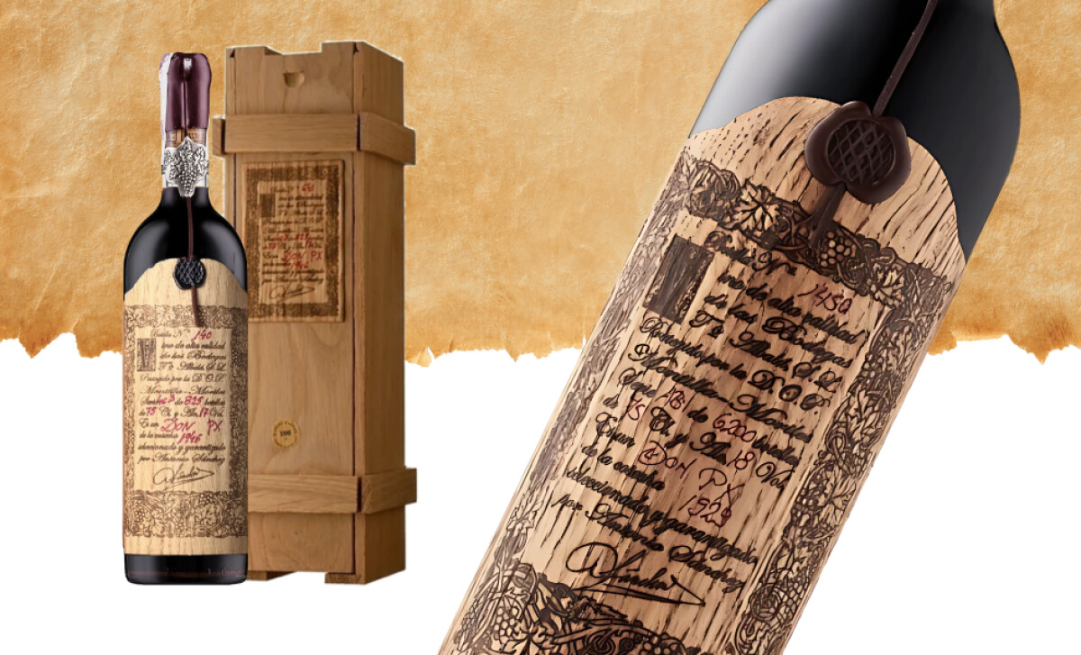
Standout Features:
- Engraved wood-style label mimicking vintage crates
- Handwritten typography and signature
- Wax seal and glass-encased closure
Before you taste a drop, Don PX Convento Selección logo design already tells its story. The bottle looks like it was pulled from a monastery archive: woodgrain texture, wax seal, dense handwritten script. Every element of the logo and surrounding graphics signals age, rarity, and reverence, aligning perfectly with the wine’s century-spanning aging process.
The Don PX logo design mimics hand-engraved wooden crate markings, a nod to how wine was historically shipped and catalogued. This approach transforms the logo into an emblem of tradition. The handwritten-style logotype and dense typographic treatment evoke vintage record-keeping and artisan craftsmanship, reinforcing the wine’s rarity and authenticity.
The layout of the logo is intentionally dense, filled with layered elements like vine borders, seals, and signatures that suggest heritage and complexity. There’s virtually no negative space. Every inch of the design communicates value. The result is a visual identity that feels archival and ceremonial, designed to be preserved as much as consumed.
While the wax seal and glass-like capsule add finishing touches to the presentation, it’s the Don PX logo design that carries the narrative. Even across newer vintages, the logo retains its historic visual language, ensuring consistency and elevating perception across all offerings.
The Don PX Convento Selección logo design is a study in heritage branding. By layering visual density, calligraphic typography, and old-world symbolism, it turns a bottle into a time capsule — earning its place among the best wine bottle logo designs for timeless storytelling.