Standout Features:
- Crimson letter mark symbol
- Old-manuscript label texture
- Angel-devil theme symbolism
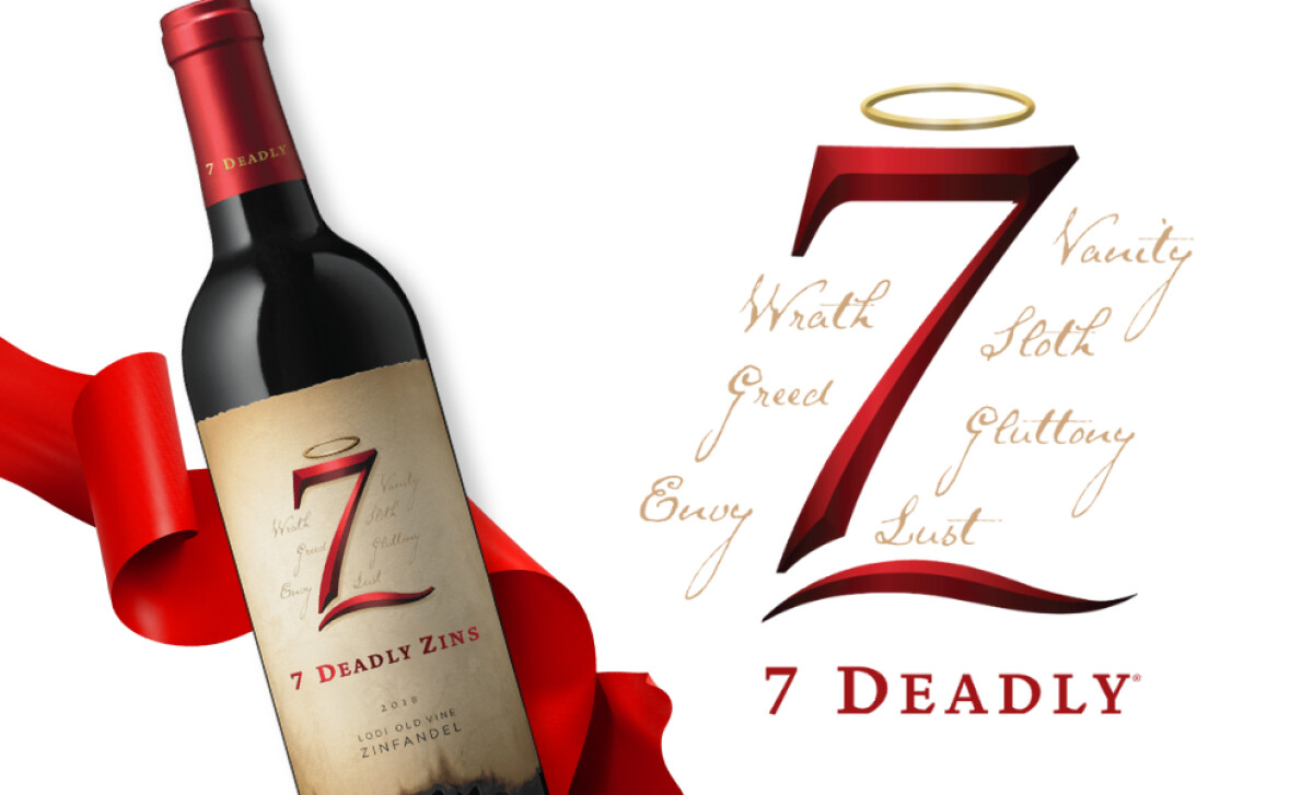
With a bold name and clever visual puns, the 7 Deadly Zins logo design by Michael and David Winery delivers more than just wine — it delivers a statement. Through its tongue-in-cheek wordplay and layered visual cues, this bottle speaks directly to the curious and the connoisseur alike.
The most prominent design element is its crimson red lettermark, where the number 7 seamlessly forms a stylized “Z” for Zinfandel. This symbol gleams with a seductive gradient and curves that feel almost hand-carved. Topping it off is a simple halo — a nod to the wine’s duality of sin and sanctity.
Supporting this logo is a label designed like an aged manuscript, visually reinforcing the wine’s heritage while echoing the earthy, spicy complexity of what’s inside the bottle. Its burnt edges and parchment-like texture act as symbolic flourishes — an allusion to fire, smoke, and the indulgence of sin.
The angel-versus-devil motif carries through the typography and surrounding visual cues. Sharp, serifed characters complement the logo’s contrast-driven concept, suggesting that the wine — like its branding — is layered, zesty, and slightly unruly. The 7 Deadly Zins logo design transforms the wine into a statement piece. With its playful symbolism, a clever monogram, and textured storytelling, the logo captures the wine's irreverent tone and unforgettable character. It’s a visual experience that mirrors the tasting one — complex, bold, and unforgettable.