Standout Features:
- Glossy finish
- Mixed typeface
- Multicolor iterations
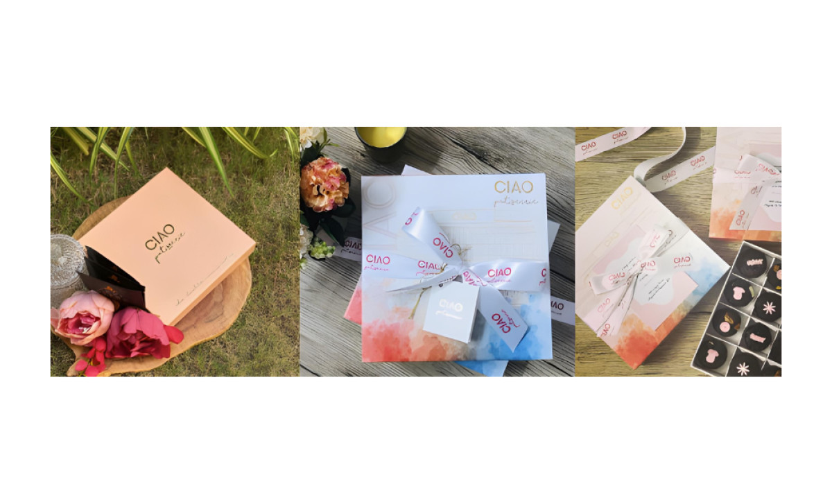
The CIAO Patisserie logo design, crafted by ColorWhistle, represents everything a distinctive sweets vendor needs: short, sweet, and stylish.
The emblem consists of a capitalized sans serif font style that spells out the brand name and an elegant cursive font style that spells out the second word of the name placed below the CIAO.
The simple, modern aesthetics can quickly adapt to different colors, including pink and gold. The agency also added a glossy finish that exudes glamour and sophistication, making the glyphs stand out.
If you like foodie industry emblems, you’ll love browsing our best bakery logo designs.
Get a chance to become the next Design Award winner.
SUBMIT YOUR DESIGN