Cleveland Browns Logo Evolution: Key Points
- Minimalism Boosts Memorability: Simpler, color-centric logos tend to be easier for audiences to recognize quickly because they rely on fewer visual elements competing for attention.
- Strategic Consistency Builds Equity: Decades of consistent evolution have helped grow the Browns into one of the NFL's most valuable franchises. According to Forbes' 2024 NFL team valuations, the team is valued at approximately $5.15 billion, up 11% year-over-year.
- Subtle Tweaks Can Signal Innovation: Small updates like the matte finish introduced in 2015 and the white facemask added in 2024 refreshed the helmet's appearance while preserving the team's traditional orange identity.
The Cleveland Browns are the only NFL franchise that has never placed a logo on their helmet. That is not a gap in the brand system. That is the brand system.
For over 75 years, the team has maintained a visual identity built on bold minimalism and heritage, centered almost entirely on a plain orange helmet.
From the playful Brownie Elf of the early decades to the stripped-down design that endures today, each chapter of this evolution reflects a franchise that understood, perhaps before anyone else did, that restraint can be a brand position.
The Modern Browns Logo: Grit, Heritage, and Minimalist Power
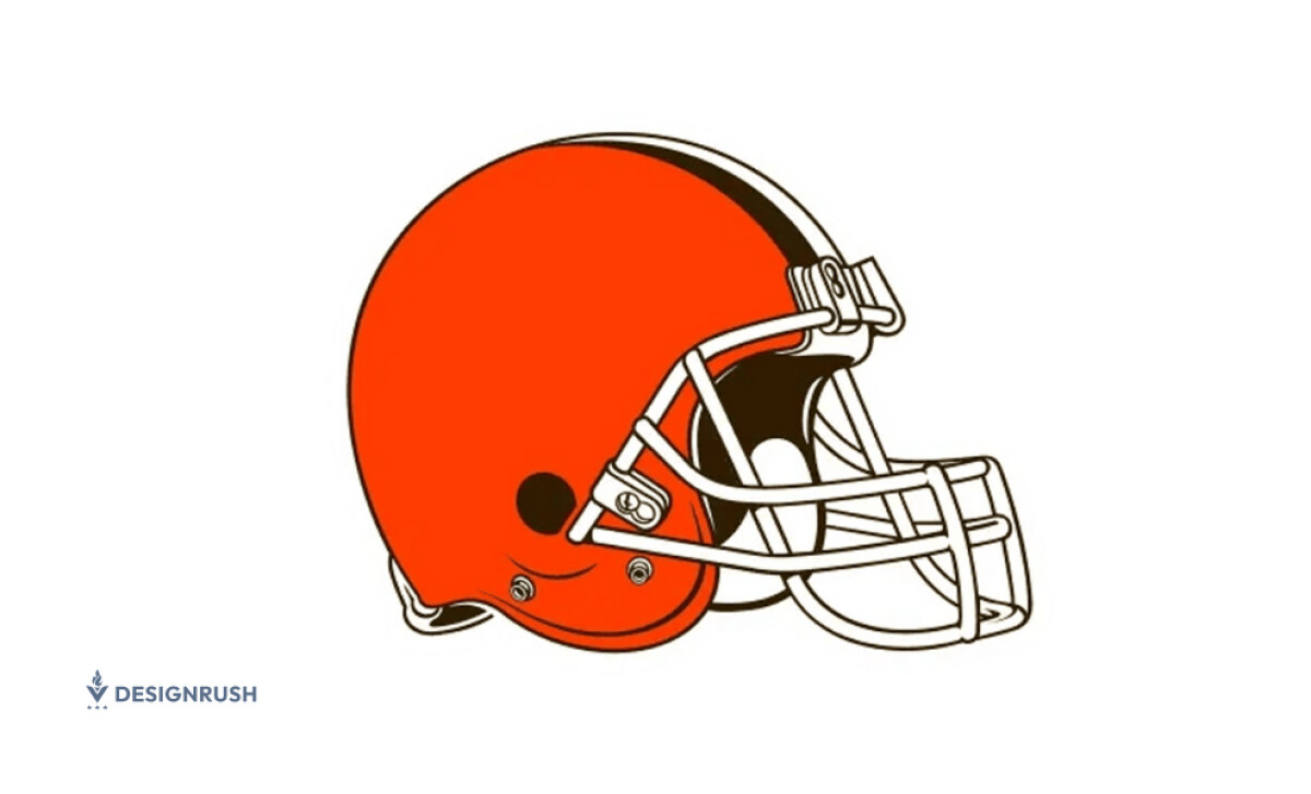
The current Cleveland Browns logo, introduced in 2015 as part of a full Nike uniform redesign, is the unmistakable burnt-orange football helmet with a brown facemask and twin white stripes flanked by brown, an evolution of the team's longstanding aesthetic.
- Burnt-Orange Shell – A richer, matte orange chosen to reflect the passion of the Dawg Pound and the city's resilience.
- Twin Stripes (brown-white-brown) – A nod to heritage, striking a visual balance that enhances horizontal framing and brand recognition.
- Brown Facemask – Upgraded from gray in 2015, adding depth and reinforcing Cleveland's visual identity without introducing new symbols.
The Browns' helmet is unusual in professional sports because it relies entirely on color and shape rather than a mascot or wordmark. This minimalist approach makes the design instantly recognizable even without typography, a principle that design researchers refer to as silhouette recognition.
When a camera catches a Browns helmet from thirty rows back in bad stadium lighting, the orange reads instantly. There is no competing visual information. There is just color, doing its job.
Cleveland Browns Logo Design Evolution
1946 – 1959: The Brownie Elf Debuts
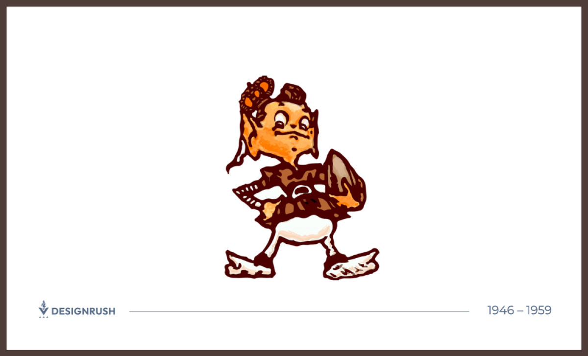
The Browns launched in the All-America Football Conference wearing plain white leather helmets and a lighthearted mascot: the Brownie Elf, a brown-and-white cartoon figure clutching a football that reflected the personality of founder and coach Paul Brown, after whom the team was named.
According to the Cleveland Browns' official team history, Brownie appeared extensively on promotional materials and fan engagement items throughout this period. He was never placed on the helmet.
The helmet's own story was still developing. When the Browns joined the NFL in 1950, a league rule required helmets that contrasted with the white football used in night games, so the team introduced orange helmets for evening contests while still wearing white for most day games.
By 1952, orange became the full-time helmet color, with a white stripe added down the middle. The Brownie Elf and the plain orange helmet now existed side by side, each operating in its own lane, the mascot on paper and merchandise, the helmet on the field.
1959 – 1960: Elf in Orange
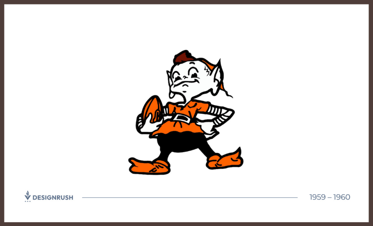
By 1959, the Brownie Elf was reimagined with bolder orange and white coloring, with lines refined for modern print. This repositioned the character as a team mascot rather than a corporate emblem. It was a refinement that acknowledged the franchise's growing color identity.
It would also be the mascot's last significant evolution for decades, though not by design. A change in ownership was about to settle the question of which mark would lead.
1961 – 1986: The Helmet Holds
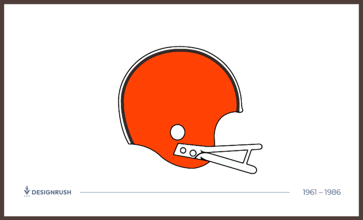
When Art Modell bought the team in 1961, his first act was to phase out the Brownie Elf entirely. He made no secret of it. The mascot era was over. What remained, and what Modell never touched, was the plain orange helmet.
For nearly a quarter century after that, the helmet did not change. The orange shell, the brown-white-brown stripe, and a gray facemask stayed intact while everything around it was reworked. Jerseys were redesigned. A widely disliked 1984 uniform overhaul was reversed the following season after fans rejected it. In 1975, the facemask switched from gray to white, the only adjustment the helmet saw across this entire stretch.
Even that restraint was tested. In 1964, Modell commissioned a stylized "CB" logo for the helmet. It never made it to a game. Players from that era were clear about why: "We don't want them to look like automobile racers out there."
The orange shell proved to be the one thing nobody, not even its own owner, could change.
1986 – 1992: Volume and Perspective
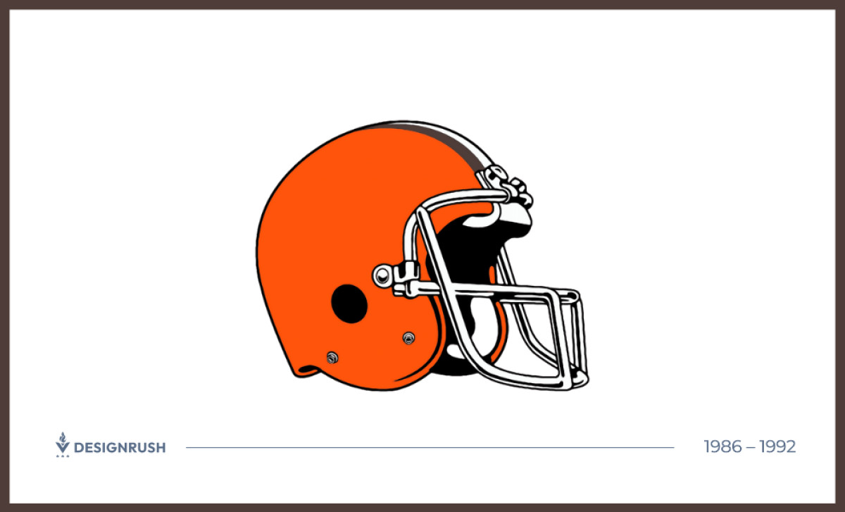
As the Browns entered one of their most competitive eras, led by quarterback Bernie Kosar and three AFC Championship appearances, their helmet representation began to reflect the visual language of the period. Illustrated depictions of the helmet shifted toward a more dimensional look, with realistic three-dimensional shading, a three-quarter angle view, a darker orange hue, and enhanced facemask detail.
This adaptation balanced nostalgia with modern visual depth, responding to evolving broadcast and print standards without altering the physical helmet itself.
1992 – 2006: Facemask Refinement
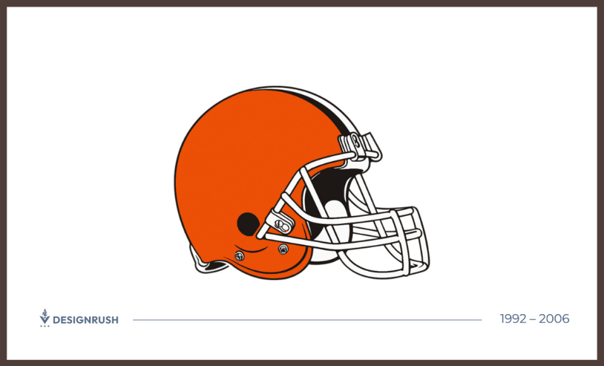
The 1992 update brought simplified facemask geometry, muted color tones, and a subtle structural adjustment with an extra lower bolt, enhancing realism in logo representations without disrupting recognition.
When the franchise returned to Cleveland in 1999 after Art Modell's controversial relocation to Baltimore, it did so wearing essentially the same helmet it had left with in 1995, a deliberate signal to a fan base that had never stopped identifying with the orange.
Small tweaks can refresh a brand while preserving what makes it distinctive, and the Browns had understood that principle longer than most.
2006 – 2015: A Return to Boldness
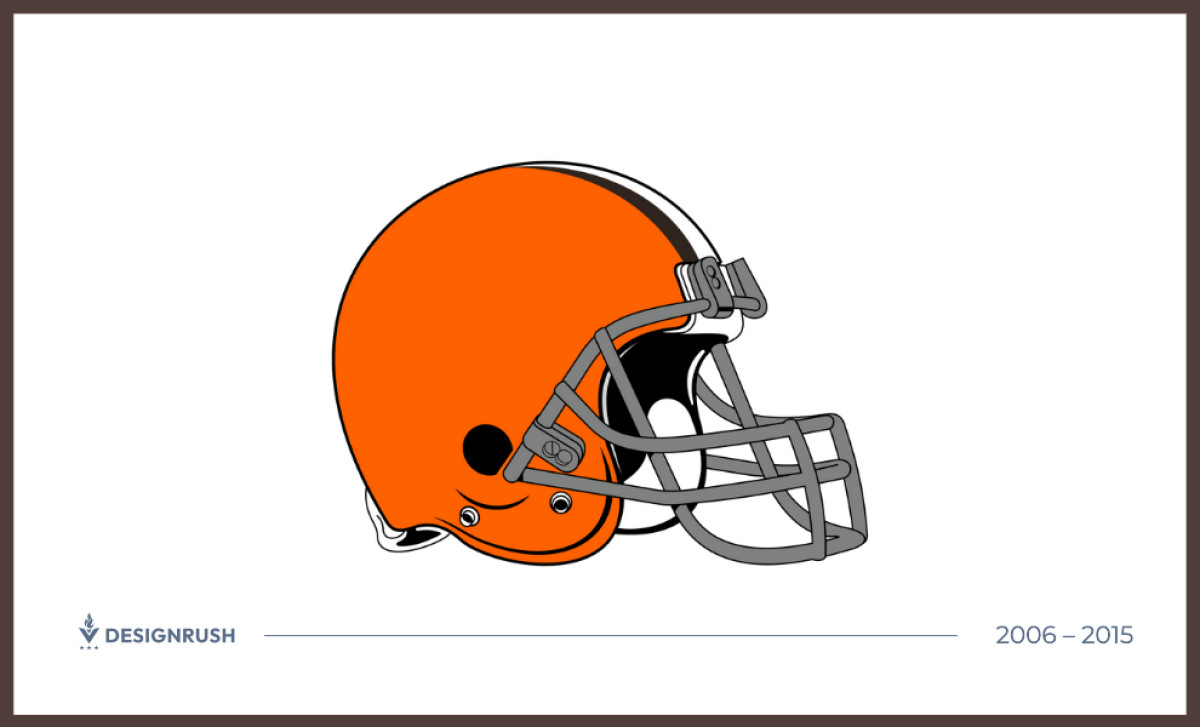
The 2006 season brought a uniform update that reintroduced a gray facemask, reverting to the look worn from 1961 through 1974 as part of the franchise's 60th anniversary celebration.
The orange shell was reinvigorated with a richer, more saturated tone. The palette reinvigoration aligned with fan nostalgia and the growing cultural momentum of the Dawg Pound, the passionate fan culture that had formed in Cleveland's bleacher section in the 1980s around players like Hanford Dixon and Bernie Kosar and had never really gone quiet.
The orange helmet had become synonymous with that identity, and keeping it vivid kept that connection alive.
Uncover the essentials behind timeless brand marks and learn what makes a good logo.
2015 – 2024: Matte Rebrand & Brown Facemask
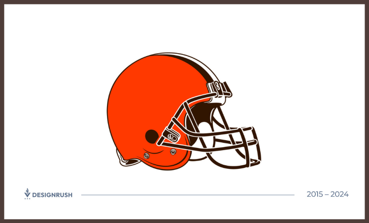
In 2015, the Browns partnered with Nike on a full uniform overhaul, darkening the orange to a matte finish and swapping the gray facemask for brown, the first time brown had ever appeared on the helmet's facemask in franchise history.
A fresh secondary logo inspired by the helmet was introduced for use on merchandise and secondary applications. The helmet itself remained plain. The changes were confident rather than radical, exactly the kind of incremental refinement that preserves brand equity rather than gambling it away.
Simpler logo designs tend to improve memorability because they rely on fewer visual elements, and the 2015 rebrand leaned into that principle by clarifying the color system rather than complicating it.
2024: Facemask Goes White
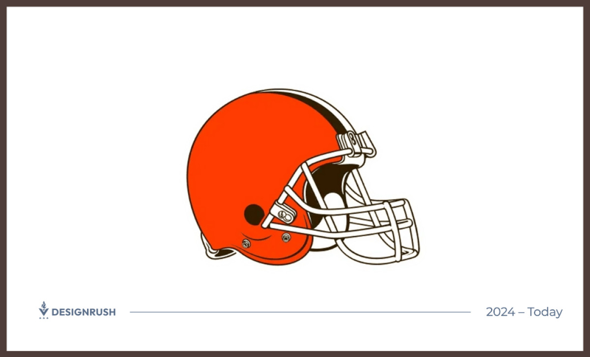
For the 2024 season, as part of a broader uniform refresh, the Browns switched the facemask to white, offering cleaner contrast against the orange shell and returning to the look that defined the franchise from 1975 through 1995.
The change refreshed the helmet's appearance while maintaining the team's traditional orange identity. It is the smallest possible adjustment that still registers visually, and it reflects a brand that knows exactly which elements are worth protecting and which can be updated without consequence.
The Wrap Up: Bold Minimalism Builds Billion-Dollar Equity
The Cleveland Browns identity demonstrates how a simple visual system can endure for decades. By focusing on recognizable color and a consistent helmet design, the franchise has built one of the NFL's most distinctive brand identities.
The team is valued at over $5 billion today, a figure built on performance, history, and a visual system that never needed to say much to be understood.
Evolution, not revolution, is the design mantra for brands aiming for longevity. The Browns' journey from the Brownie Elf to the plain matte orange helmet shows that knowing what to keep is just as important as knowing what to change.
Great logos do not just survive change. They guide it.
Final Notes:
- Design for Longevity: Each update respected history and fan sentiment while incorporating modern design elements.
- Listen to Your Audience: Gradual adjustments like facemask color shifts reflect a real understanding of fan expectations.
- Maximize Impact of Small Changes: Minor design tweaks, especially those aligned with uniform or apparel updates, can deliver outsized results in brand perception.