
Oversimplified logos strip away unnecessary details and focus on the core elements that represent the brand. They are simple, minimalist designs that increase brand recall and impact.
From the sleek Apple silhouette to the iconic Golden Arches of McDonald's, these logos demonstrate simplicity's effectiveness in creating a solid and memorable brand identity.
Why do the most impactful brands of our time prefer oversimplified logos? Let’s see the pros and cons of simple design, as well as some tips and tricks on creating one for your business!
What Is an Oversimplified Logo?
An oversimplified logo is a type of logo design where the company reduces the complexity of its branding or logo by eliminating or simplifying graphic elements and text. This design style is often used to create a more modern, clean, and stylish look that can be seen as less cluttered than a traditional logo design.
Oversimplified logos first became popular in the early 2000s, when digital technology and web design were undergoing rapid development. As companies began exploring how they could use digital platforms to promote their brands, oversimplified logos emerged to capture attention quickly while also helping to represent the brand in a minimalistic manner.
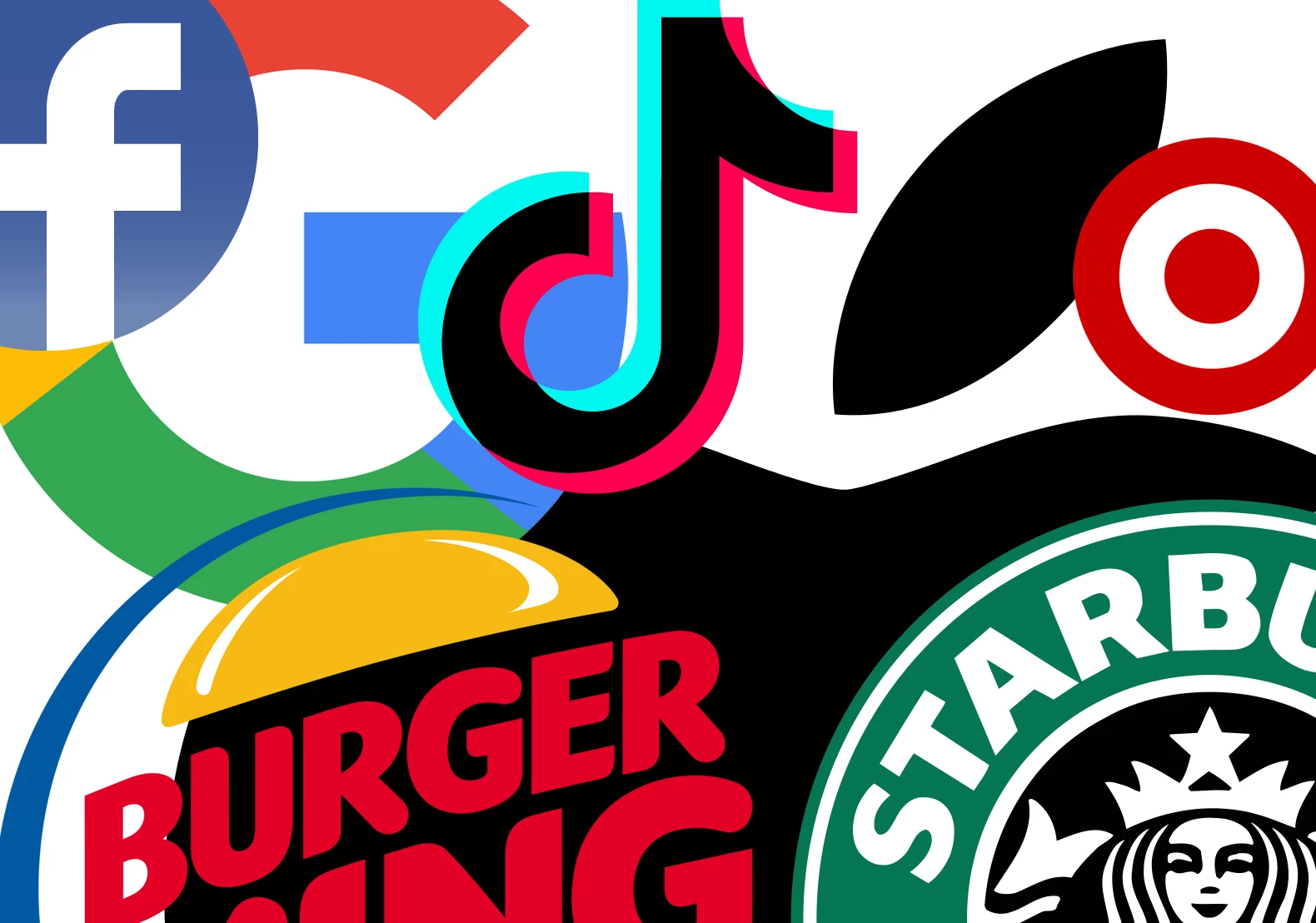
Today, oversimplified logos are some of the most popular designs for large and small companies. Notable brands that have oversimplified their logos include Apple, as we mentioned, but also Airbnb, Nike, and Starbucks. These iconic brands have successfully rebranded using simplified versions of their original logo designs, resulting in a more modernized image that appeals to today’s consumers.
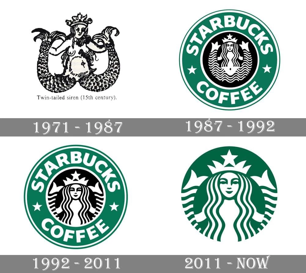
Overall, oversimplified logos offer numerous benefits for companies who choose this route when rebranding or designing a new logo for their business. When done correctly, an oversimplified logo can help create an instant connection with customers while also providing flexibility for different uses across various platforms without sacrificing too much on visual impact or clarity of message.
Why Is Logo Oversimplification a Trend?
In today's fast-paced world, logo oversimplification has become all the rage. This design trend brings a sleek, minimalistic look that often makes more of an impact than complex designs. In fact, the best brand logo designs usually rely on simplicity.
The shift towards this approach aligns with broader aesthetic design trends, which favor clean, uncluttered visuals. As digital interfaces and small-screen devices become more prevalent, more straightforward logos ensure clarity and recognizability even at reduced sizes.
For designers, oversimplification streamlines the workflow, making revisions and iterations more manageable. One of the primary advantages is the versatility and adaptability of minimalistic logos. These logos are easily scalable, ensuring they retain clarity and impact whether displayed on a small business card or a large billboard.
Another driving force behind this trend is the need for quick and strong brand recognition. Oversimplified logos are easily memorable, which increases their chance to stand out in peoples' minds and be perceived as timeless. Additionally, their straightforward appeal exudes trust and familiarity, helping businesses reach their target markets and ultimately generate income and establish strong brand recognition.
Moreover, global brands have influenced this trend by setting examples with their own logo simplifications. World-known companies have successfully rebranded with simpler logos, demonstrating the effectiveness and appeal of minimalism.
Oversimplified Logo Examples
To further explain the trend of oversimplification, let's look at some high-profile examples that encourage other businesses to follow, reinforcing this design tendency.
McDonald's
McDonald's iconic Golden Arches logo is one of the most popular and recognizable examples of oversimplified logos. Initially part of the restaurant architecture, the arches were incorporated into the logo to create a distinctive and cohesive brand identity. The arches soon became synonymous with the brand itself. As McDonald's expanded globally, the logo's simplicity proved effective.
By stripping away extraneous details and focusing on a straightforward, bold design, McDonald’s demonstrated that a simple logo can effectively capture the attention of potential customers. This presentation also ensures that the logo is effectively and easily applied across various mediums, from packaging and signage to digital platforms.
Apple
Apple's logo, a minimalist silhouette of a bitten apple, epitomizes simplicity and elegance. Its clean lines and monochromatic color scheme align with Apple's philosophy of intuitive technology and have successfully communicated the brand's identity for decades.
Initially, the company's logo was a detailed illustration of Isaac Newton sitting under an apple tree. However, as Apple's product line and market presence grew, a simpler design became necessary to maintain versatility and instant recognition across various mediums. Its simplified logo reinforces a cohesive brand image that emphasizes innovation and quality.
Sprite
Over the years, Sprite's logo has undergone multiple refinements to maintain its core elements while adapting to contemporary design trends. As the brand gained recognition, lemon and splash elements were erased from the logo leaving only a brand name in bold, italicized font in green.
Sprite keeps the design simple to ensure that its message of refreshment and fun is always highlighted. The logo exudes freshness and vitality through its vibrant green color, mirroring the beverage's appeal as a crisp, clear soda. This reductive approach guarantees that the brand stands out on store shelves and in advertisements.
Nike
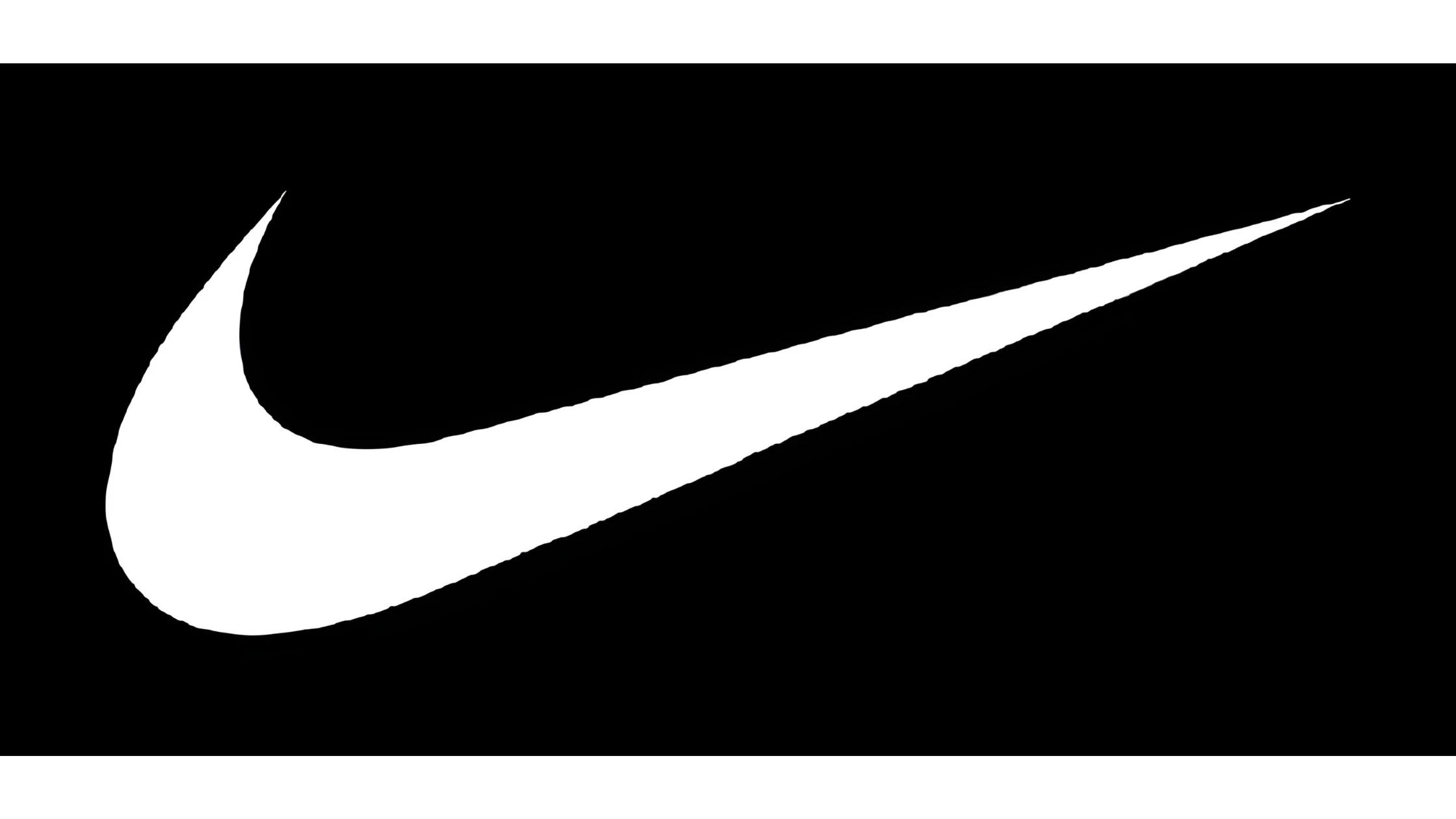
In 1995, the Nike Swoosh had become so universally recognized that the company could use it without the wordmark. Transitioning to a symbol-only logo, kept to this day, Nike transcended linguistic barriers, making it a globally recognizable emblem of excellence, innovation, and athletic performance.
The enduring success of Nike's logo lies in its ability to encapsulate the brand's ethos of determination and empowerment with minimalistic design. This straightforward design approach allows for consistent and cohesive branding across global markets, reinforcing Nike's position as a leader in athletic wear and a globally-recognized inspiration for athletic brand logos.
Windows
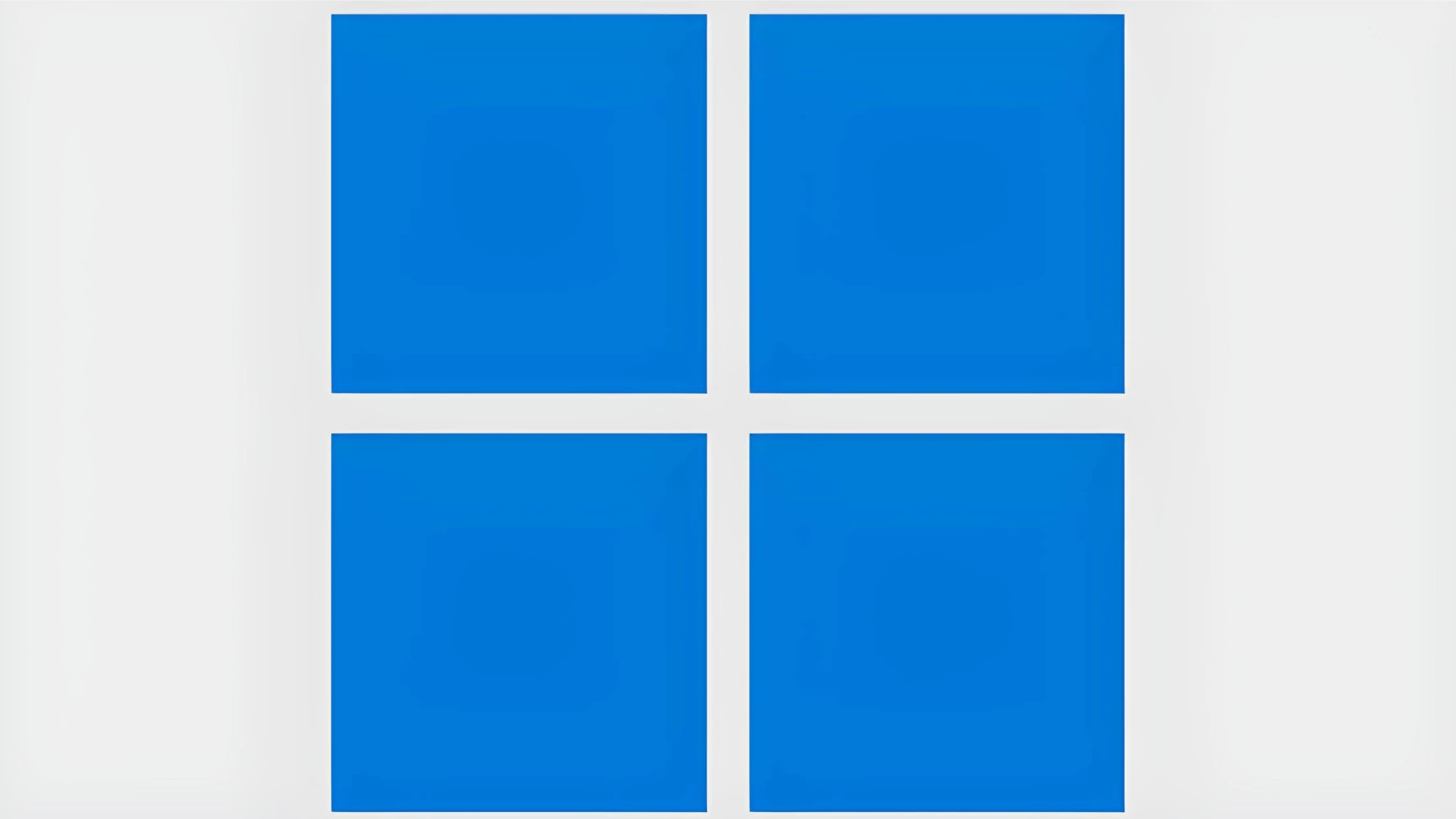
Windows’ logo has evolved from a colorful, flag-like design to a streamlined, monochromatic version, reflecting Microsoft's shift towards a modern, sleek aesthetic. The logo's clean lines and geometric shapes evoke a sense of clarity and order, which aligns with the software's user-friendly interface.
This oversimplified logo design enhances the logo's versatility and recognizability. The Windows logo remains consistent and clear whether displayed on a computer screen, tablet, or smartphone. Using basic shapes and a limited color palette ensures that the logo is easy to reproduce and stands out amidst the clutter of digital interfaces.
Burger King
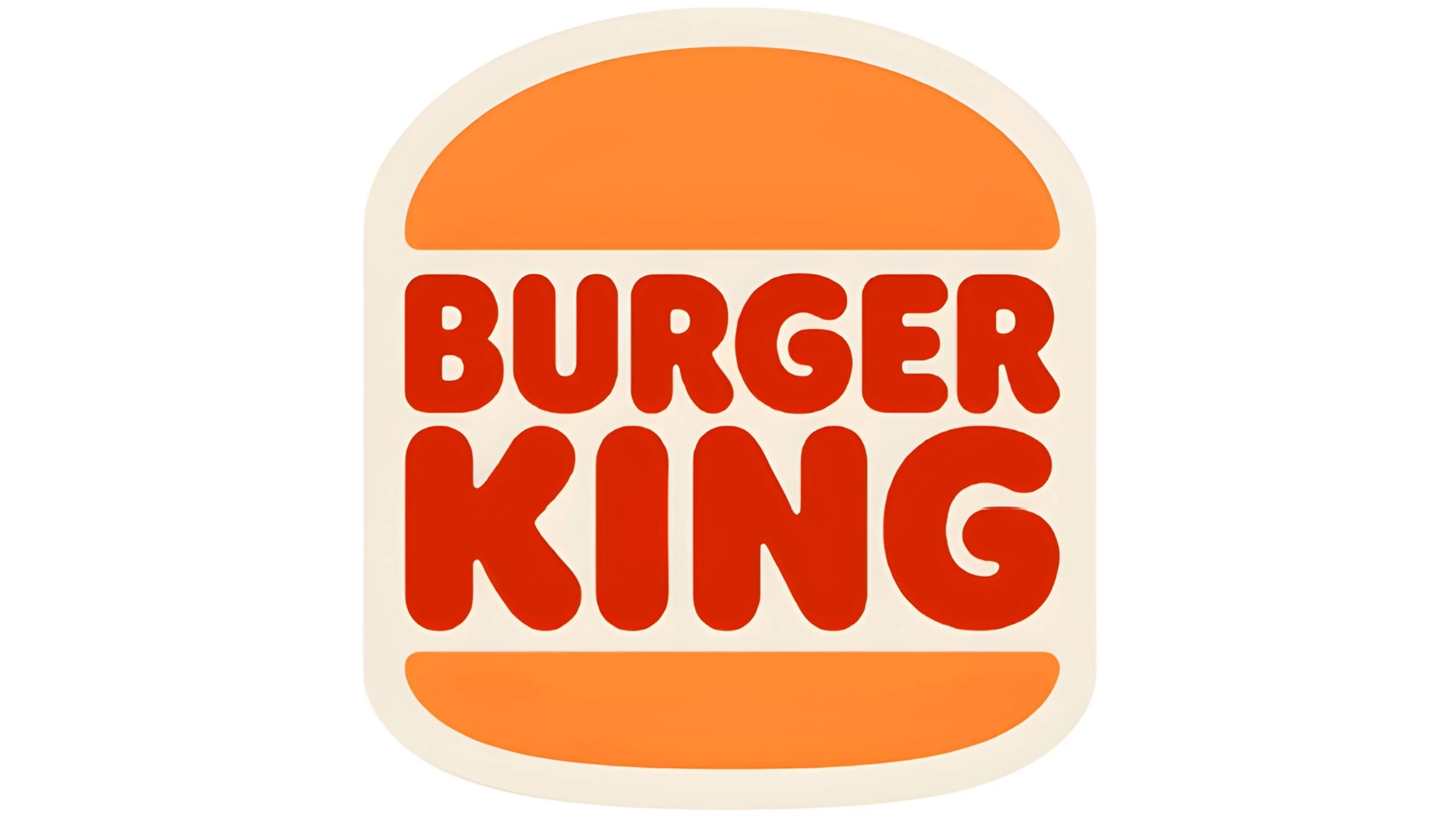
Burger King's logo, featuring a simple, bold typeface nestled between two bun-like shapes, effectively conveys the brand's identity as a fast-food giant. By stripping away extraneous details, the brand ensures its logo remains versatile and impactful across various mediums, from packaging to digital platforms.
This oversimplified approach enhances brand recognition and underscores Burger King's focus on delivering a consistent and enjoyable dining experience. Also, this current oversimplified version of logo design evokes nostalgia in older customers since a similar version was used from 1969 to 1999.
Volkswagen
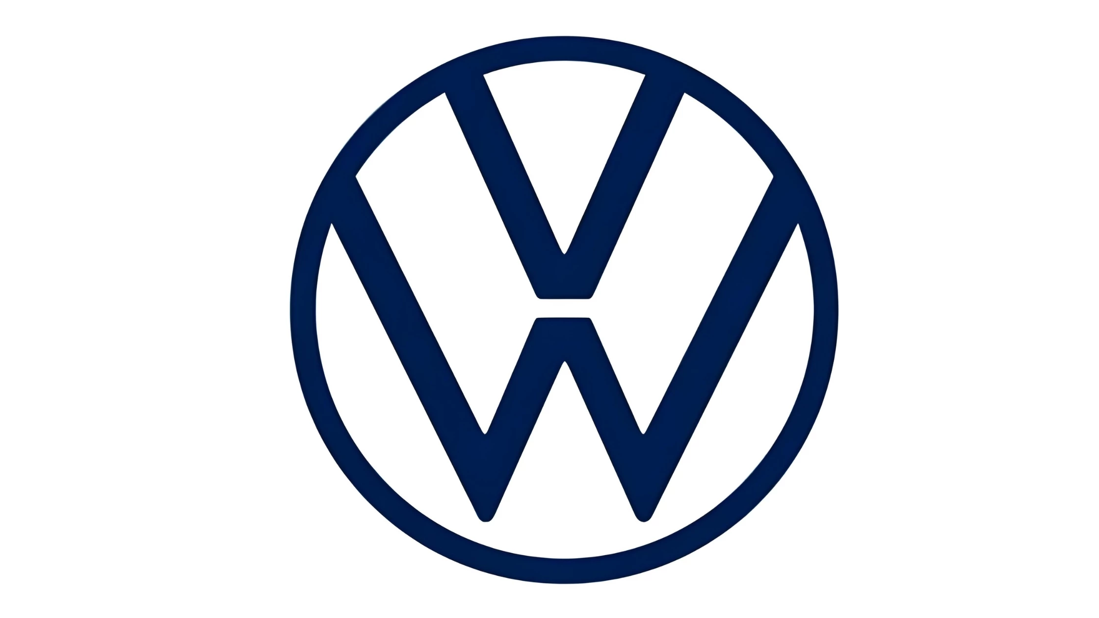
Volkswagen's logo, a simple, circular emblem featuring the interlocking letters "V" and "W," is one of the prime examples of oversimplified logos. Using reduction as its main approach, Volkswagen removed the 3D effect, the blue badge, and other subtle decorative elements such as shadows and double border lines to celebrate the brand's launch of electro cars.
The current futuristic, simple, and sophisticated two-dimensional display reflects Volkswagen's commitment to delivering innovative, high-quality, dependable vehicles. Consequently, straightforward form and monochromatic color scheme ensure that it is easily integrated across products, websites, and promotional materials.
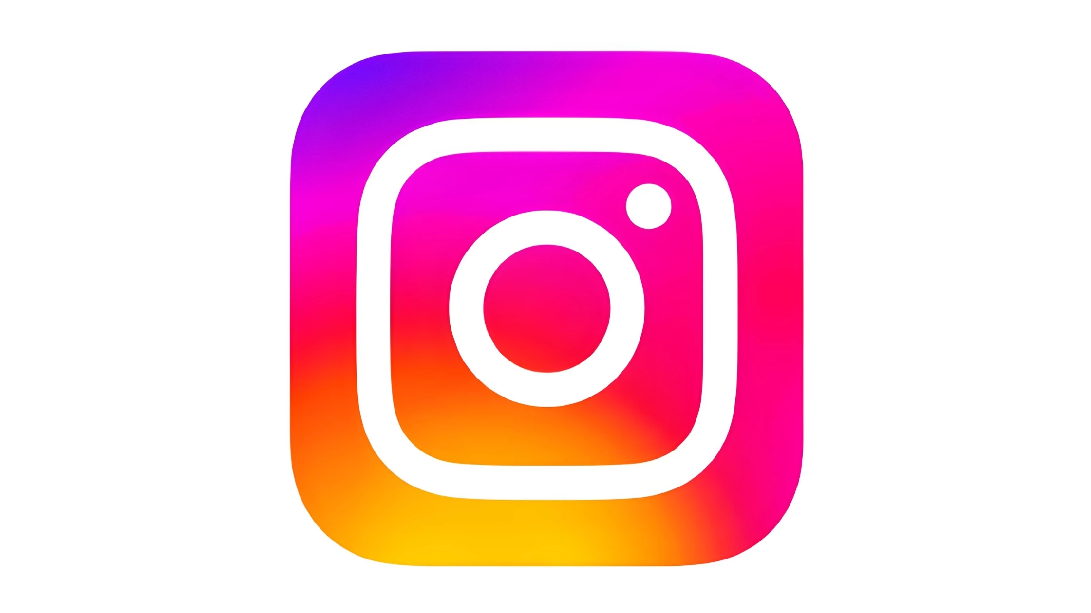
The evolution of Instagram's logo towards a more minimalistic design reflects the platform's growth and its focus on visual content. Initially, the logo featured a more detailed, retro-style camera, simplified to better suit the app's dynamic and visually driven nature.
The current logo's clean lines and bright gradient rainbow create a modern, vibrant atmosphere that appeals to the platform's creative and youthful user base. The straightforward camera icon effectively communicates the app's purpose, making it easy for users to identify and engage with the brand.
Benefits of Logo Simplification
- Oversimplified logos can help reduce clutter on websites and create a crisp and uncluttered look for business cards and other marketing material.
- They require fewer graphics resources which can help reduce overall costs associated with branding projects.
- Oversimplified logos tend to be easier to remember due to their simple yet iconic designs, making them highly recognizable by consumers.
- Oversimplified logos are more modern and stylish.
Disadvantages of Simplification of Logos
- Oversimplified logos may lack personality or character, and new brands using them may find it hard to stand out from other competitors.
- Companies need to pay extra close attention when creating an oversimplified logo so that it still reflects the essence of their brand accurately while also possessing enough uniqueness compared with other players in their industry sector.
Tips and Tricks for Creating Simplified Logos
Are you looking for help creating an eye-catching logo, but just aren't sure where to start? Logo design isn't as hard as it looks. In fact, creating a memorable and simplified logo that is both aesthetically pleasing and easy to recognize can be easy if you know what to do. Here are some top tips and tricks from experts on how to create a memorable logo with simplicity at its core.
1. Keep it simple
The simpler the logo, the easier it is for customers to remember and recognize. This means eliminating any unnecessary elements and making sure that your logo is easy to understand and remember.
Remove unnecessary elements while still keeping the core message intact. This makes it easier for customers to understand what your company is about without being overwhelmed by too many different design elements competing for attention.
2. Use basic shapes and lines
When designing a simplified logo, it's best to stick to basic shapes and lines. This will make it easier for customers to understand what your logo represents without being overwhelmed by intricate details or too much color.
3. Use a limited color palette
Using a limited color palette can also help simplify your logo design while still retaining its visual appeal. It's important to choose colors that are complementary so that your logo pops against whatever background it's placed on.
4. Make sure your logo is versatile
One of the benefits of simplified logos is that they're more versatile; they can be used across all mediums without losing any impact on their aesthetic value or integrity.
Use versatile designs that can be used across all mediums without losing any impact on their aesthetic value or integrity.
5. Keep typography simple
Just like with shapes and colors, when choosing typography for your simplified logo, it's best to stick with fonts that are easily legible and recognizable.
6. Think about the message you want to convey
Your logo should be an extension of your brand's identity, so take some time to think about what kind of message you want it to convey. This will help you create a logo that resonates with customers and positions your business in the best possible way.
Oversimplified Logos: Streamlined not Dumbed Down
In conclusion, oversimplified logos can be a great option for businesses looking to update their branding efforts without making drastic changes or alienating existing customers. By following the tips and tricks outlined above, you can create a logo that is aesthetically pleasing and memorable for all the right reasons!


-preview-webp.webp)