Team Behind the Agency
As a consultancy specializing in tailored financial solutions, David Kilpatrick Financial needed a brand that reflected its credibility and disciplined approach.
Tinova Agency redesigned the identity with a minimal, structured monogram and elevated typographic system that strengthens perception of reliability and expertise.
Logo Design Analysis
Financial logo designs work best when they show precision and reliability in a single glance.
Tinova’s mark does that through controlled geometry, thoughtful spacing, and typography that feels stable while staying approachable.
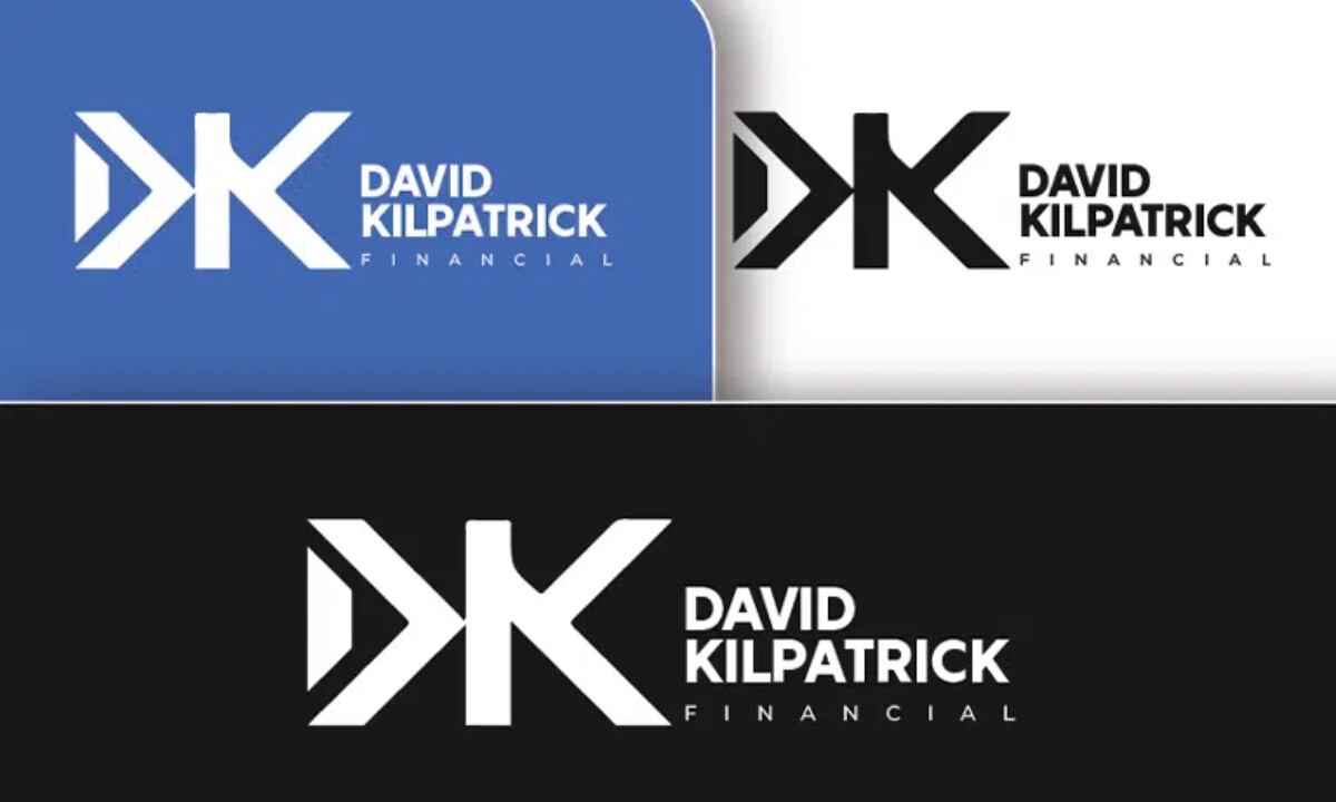
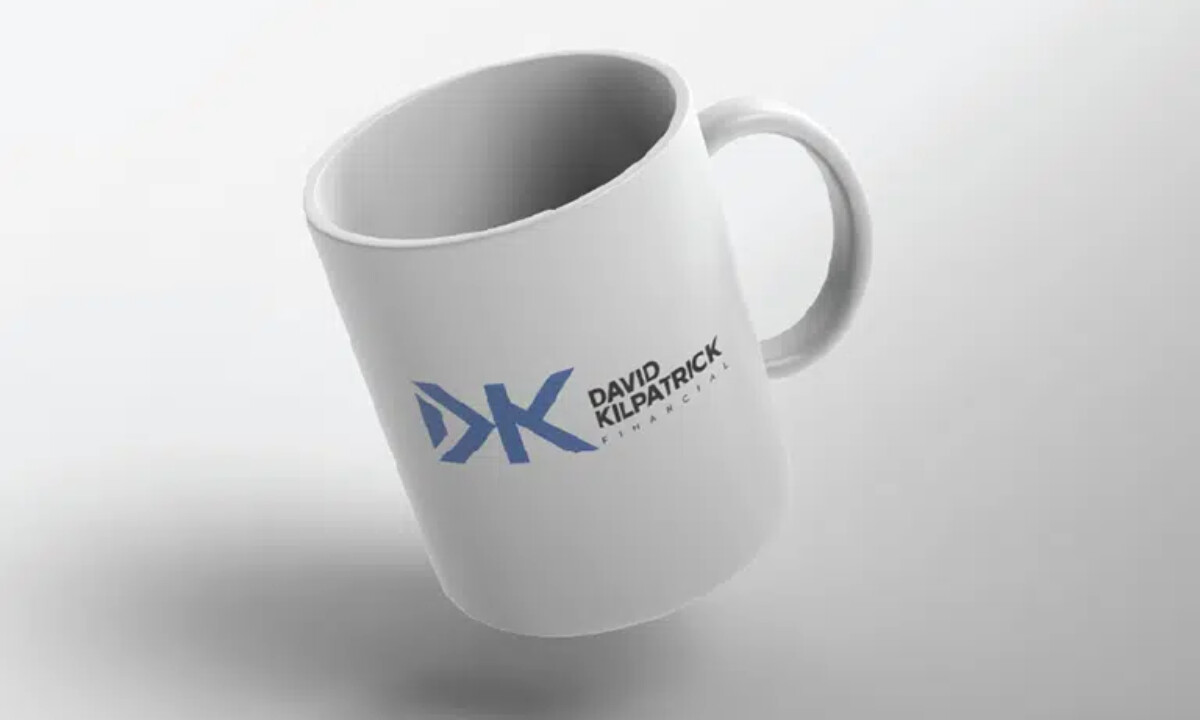
- Branding & Symbolism: The geometric DK monogram uses clean angles and well-shaped negative space to lock both letters into one clear symbol. I like how this creates a sense of unity and structure, which aligns with what most financial clients look for in a mark.
- Visual Design & Construction: The angled cuts give the monogram a quiet sense of movement without feeling exaggerated. Paired with a steady corporate-blue palette, the identity feels modern while still fitting the expectations of the financial field.
- Typography & Wordmark: The bold sans-serif used for “DAVID KILPATRICK” works well with the lighter, wide-set “FINANCIAL” line underneath. I like how this weight contrast builds a clear hierarchy and keeps the wordmark clean across both print and digital formats.
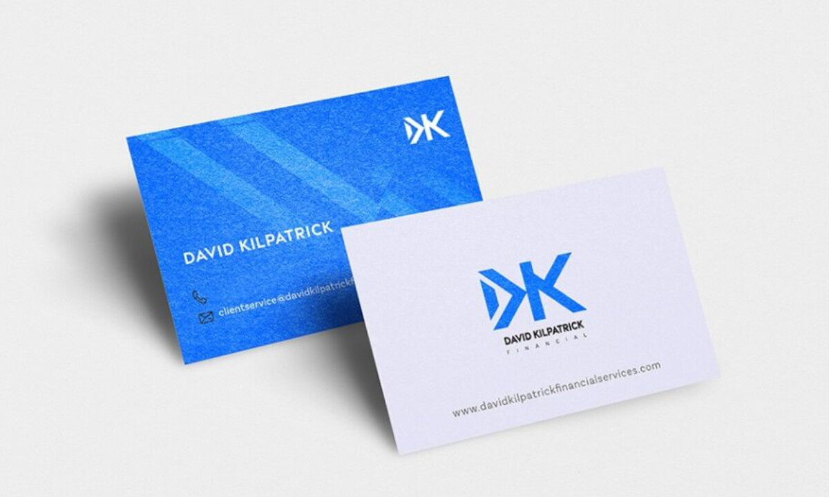
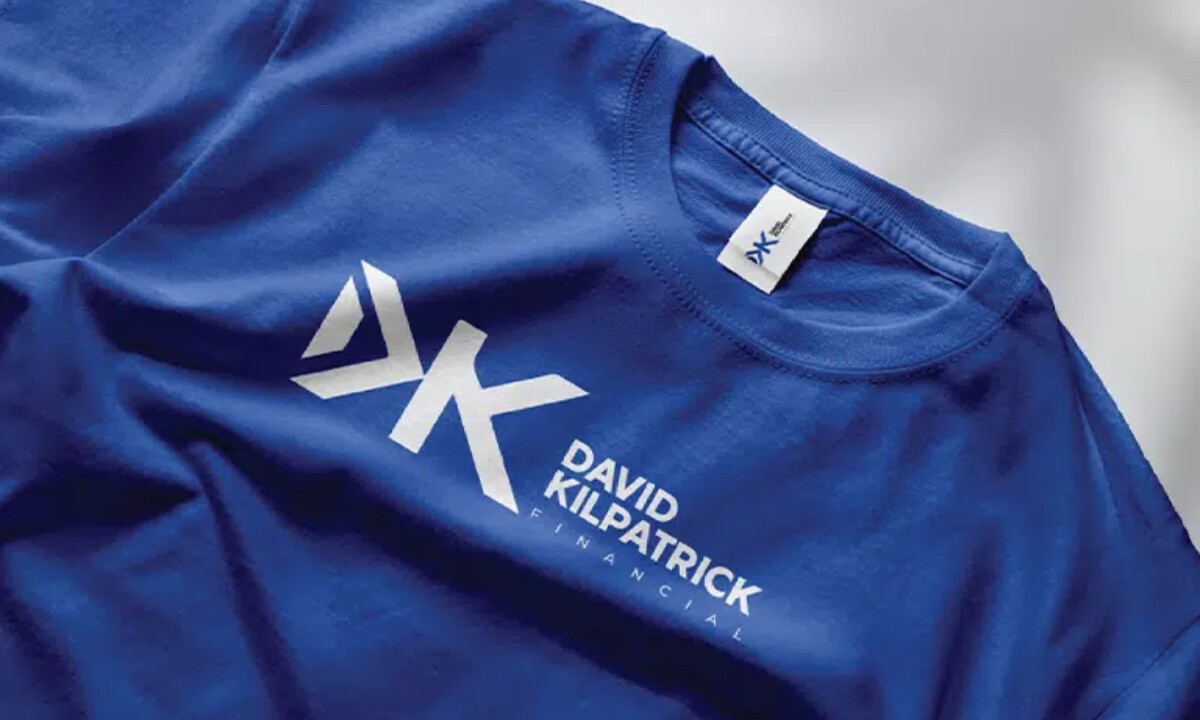
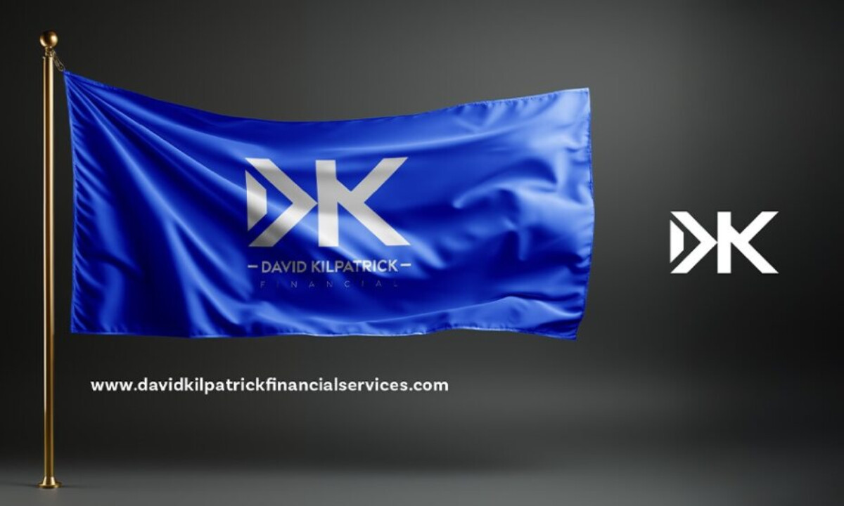
- Scalability & Usage: The monogram keeps its shape at every size — whether it’s on a business card, embroidered on apparel, or printed on flags and promotional pieces. I appreciate how well it holds up in small applications, since financial brands often rely on compact, detail-sensitive collateral.
What Brands & Agencies Can Learn from David Kilpatrick Financial
This identity shows how financial brands can use minimal geometry and clear structure to communicate maturity and stability without slipping into anything dated or overly formal.
1. Precision Geometry Signals Professional Strength
Sharp angles and intentional negative space create a sense of order and clarity. For financial brands, this visual discipline helps build trust quickly.
2. Dual-Weight Typography Creates Quiet Sophistication
Pairing a bold primary wordmark with a lighter secondary line sets hierarchy in a clean, understated way. It’s a simple approach that adds polish without extra ornamentation.
3. Scalability Must Guide the Entire System
Financial identities often appear on small-format items, so the monogram needs to stay crisp at reduced sizes. Designing with this in mind ensures long-term usability and consistent recognition.
About DesignRush Featured Designs
At DesignRush, we evaluate hundreds of projects each month. Featured selections stand out for clarity, craftsmanship, conceptual depth, and execution across digital and brand experiences.
The strongest examples move on to our Monthly Design Awards, highlighting best-in-class creative work.
Check out more standout work across categories:
- Best Logo Designs
- Best Website Designs
- Best App Designs
- Best Print Designs
- Best Packaging Designs
- Best Video Designs
For a full list of design agencies and related services, see our Agency Directory.


