Before Grand Theft Auto VI tells you anything — before a single line of dialogue, before a mission briefing, before the opening cinematic plays — the logo already tells you where you are.
A palm tree lives inside the "VI." Not beside it, not beneath it, but inside it, growing out of the counter space between the letters like it belongs there.
That's world-building through typography, and it's one of the quieter branding decisions in recent gaming history.
The GTA 6 logo works as a Roman numeral, a two-letter abbreviation, and a graphic container for a location signifier all at once: three layers, two characters, one mark.
For a franchise arriving after the longest gap in series history, that's a lot of weight carried gracefully.
With November 19, 2026 now confirmed for PS5 and Xbox Series X|S and Rockstar's full marketing push set for this summer, the logo is about to be inescapable, so understanding what it's actually doing is worth your time now, before familiarity makes it invisible.
Layer One: The Roman Numeral System
Rockstar established the Roman numeral convention with GTA III in 2001, the first numbered entry in the series and the game that locked in the franchise's modern visual identity.
Using "III" instead of "3" was a small but consequential typographic choice. Roman numerals carry an implicit sense of legacy; they reference classical architecture, championship titles, and cinematic sequels.
They signal that a franchise takes itself seriously without tipping into self-importance.
That convention has held through every numbered entry since.
The GTA franchise logo has evolved continuously across nearly three decades, but the Roman numeral system has remained the one constant thread connecting each game's otherwise distinct visual identity to the larger franchise.
By the time you reach the sixth entry, that history travels with the notation automatically. Anyone who's played a GTA game reads "VI" and understands it immediately, no explanation needed.
That's what a well-maintained visual system buys you: franchise positioning that works without asking anything of the audience.
Layer Two: The Abbreviation
Here's where it gets clever. "VI" doesn't just read as the Roman numeral for six. It also reads as an abbreviation.
V for Vice, I for... well, it doesn't complete the word, but the visual association snaps into place immediately for anyone familiar with the franchise's history.
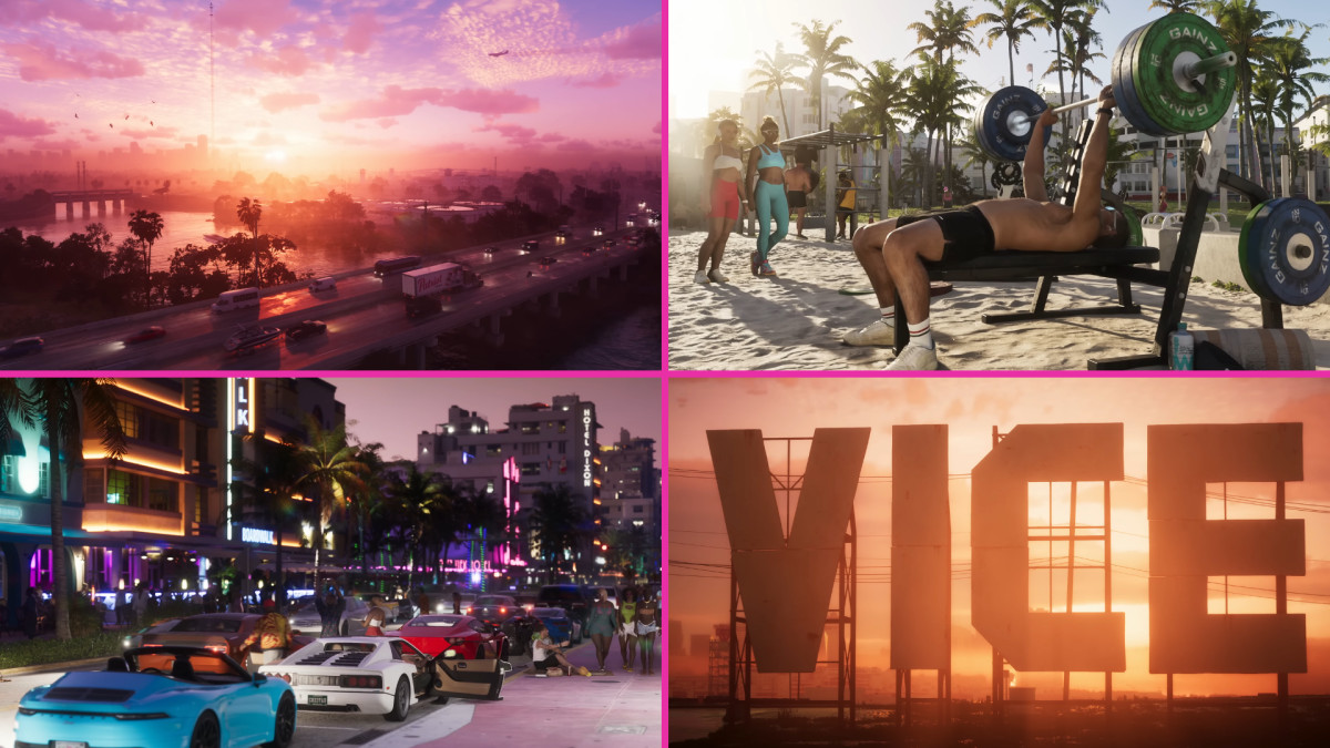
Vice City. The setting of one of the most beloved GTA games ever made, released in 2002 and set in a neon-soaked fictional Miami.
"VI" visually rhymes with "VC" in a way that lands somewhere between a numeral and an initialism, and given how carefully Rockstar's design team works, that ambiguity reads as a feature. The overlap is almost certainly not accidental.
The color palette reinforces this reading.
The logo runs a gradient from deep cobalt blue at the top through magenta and hot pink into burnt orange at the bottom — which is the specific palette of Vice City, pulled directly from the neon pastels and warm evening light of 1980s Miami.
Those colors would locate you in Vice City before you even parsed the letterforms. Paired with a Roman numeral that doubles as a location reference, you're receiving the same message from two directions at once.
Layer Three: The Palm Tree

This is the layer most people notice first, and the one doing the most specific geographic work.
The palm tree silhouettes are integrated directly into the negative space of the "VI" — inside the letterforms, growing out of them, not floating nearby.
That distinction matters more than it might seem. A palm tree placed beside the "VI" would be an illustration accompanying a logo.
Integrated into the letterform structure, it becomes part of the logo's grammar, the difference between a caption and a sentence.
The palm tree is doing specific location work. GTA 6 is set in Leonida, a fictional Florida analog, with Vice City as its Miami.
Florida's global visual shorthand is the palm tree: tropical heat, coastal geography, a particular strain of American excess, all communicated in a single silhouette.
No caption required, and that's the point.
The logo was refined in late 2025, and the revision made the palm tree considerably more legible, better defined, its branching form reading more cleanly inside the letterforms.
The earlier version was rougher, the palm less distinct. It was essentially a readability fix for a graphic element carrying significant conceptual weight, because if the palm tree doesn't read, the location signaling doesn't land.
A fan-made GTA 6 logo generator launched in May 2026, built by Felix (@Hubfex on X), lets users type any text in the VI font and generate custom versions mimicking the logo's design language.
It went viral fast, with fan accounts sharing thousands of variations.
That kind of engagement tells you something specific: the community isn't just excited about the game, it's excited about the design language itself.
A mark that people want to replicate and inhabit has done something most logos never manage.
Rockstar's Broader Design Philosophy: The Fictional Brand Universe
The VI logo doesn't exist in isolation. It's the apex of a design philosophy running through every pixel of GTA 6's world-building.
In the trailers, a convenience store door is covered in fake credit card acceptance stickers, four fictitious payment brands each with its own designed logo.
Beside them, a GTA-universe tap-to-pay symbol. An ad for Redwood Cigarettes, a Marlboro/Winston parody present in GTA games since San Andreas, runs on the wall.
The trailer's two minutes and 46 seconds are packed with fictional marina t-shirts, fridge magnets, bumper stickers and luxury brand logos — ephemera that most players will clock for half a second, if that.
PC Gamer described the feeling as somewhere between "delighted and scandalized", because the level of design investment in throwaway details is almost unreasonable.
Somebody designed those credit card logos. Somebody approved them.
Each one represents a conscious decision about what a fictional Florida gas station door should communicate, and that's before you get to the bigger stuff.
Take-Two CEO Strauss Zelnick confirmed in 2026 that GTA 6 will contain no real-world product placement, with all brands remaining fictional.
The reasoning is as much design-philosophical as commercial: a real Coca-Cola can sitting next to Rockstar's satire of consumer culture would puncture the world-building instantly.
Returning fictional brands include iFruit, eCola, Redwood Cigarettes, Weazel News and Pisswasser, each a crafted parody rather than a licensed shortcut.
This matters for understanding the VI logo because it establishes what kind of design house Rockstar is.
They are not a studio that stamps a logo on a game and moves on. They are a studio that designs fictional credit card logos for doors that appear on screen for two seconds.
The VI lettermark is the product of that same design culture — the same obsessiveness, the same layering of meaning, the same refusal to treat anything as purely decorative.
What the GTA 6 Logo Gets Right
A logo brief for a franchise entry might reasonably ask for five things: franchise continuity, title identification, setting communication, tonal positioning, and scalability. The GTA 6 logo delivers all five at once.
Franchise continuity comes through the Pricedown font family, the lowercase "grand theft auto" wordmark, and the Roman numeral system established in 2001.
Title identification is the "VI" itself. Setting communication is the palm tree integration.
Tonal positioning is the Vice City gradient, warm and tropical with a slightly dangerous glamour to it. And scalability? The mark reads from a phone screen to a Times Square billboard, exactly as the GTA V logo did for over a decade.
One Reddit user observed that fan-made GTA 6 logos consistently fail the same way: they're "beautiful but unreadable," loading the letterforms with so much detail that the hierarchy collapses.
Rockstar's version avoids this by keeping the palm tree readable but restrained, a silhouette rather than an illustration.
The gradient does the tonal work. The letterform system does the franchise work. The palm tree does the location work.
Each element has a distinct job and doesn't try to do anyone else's.
The Bigger Picture
The GTA 6 logo won't surprise anyone who follows Rockstar closely. But it's worth pausing on what a logo can actually do when it's built with this kind of intentionality.
Before you know the characters' names, before you've seen a single mission, before you've heard a note of the soundtrack, you already know you're in a hot coastal city, you know it's a numbered franchise entry, and you know it's tied to Vice City.
The letter "V" contains a palm tree. The letter "I" contains another.
That's location, lineage, and genre compressed into a square inch of screen real estate.
World-building through typography. Two letters at a time.

Our team ranks agencies worldwide to help you find a qualified partner. Visit our Agency Directory for the Top Logo Design Companies as well as: