
Open a phone in Lagos, Mumbai, Berlin, or Bogotá and you'll likely find the same icon.
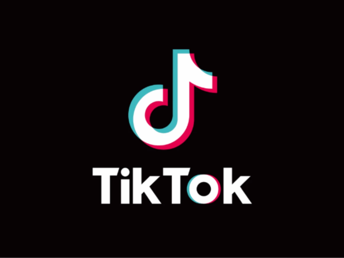
The TikTok logo sits on roughly two billion devices worldwide, making it one of the most distributed visual marks of the last decade.
What almost none of those users realize is that the mark was never meant for them.
It was drawn in 2016 for a Chinese app called Douyin, with a Chinese audience in mind.
When ByteDance went global a year later, the company kept the mark unchanged — no localization, no softening, no concession to Western branding orthodoxy. And it worked.
For anyone building a brand for cross-cultural markets, this is the most underreported case study in modern logo design.
The TikTok Logo: What You're Actually Looking At
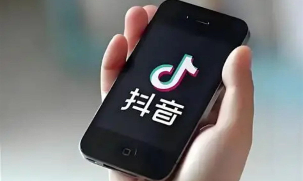
The shape is not a musical note that happens to resemble a "d." The "d" came first.
It stands for Douyin (抖音), TikTok's Chinese name, and it's the foundational design decision that the rest of the logo is built around.
Douyin launched in September 2016 as "A.me" before ByteDance renamed it three months later. A letterform doubling as a musical note was already in the brief, anchoring the app's identity to both its name and its category, which was short-form music video.
Shopify's design teardown confirms the dual reading. The musical note shape represents "Douyin" (which means "shaking sound" or "shaking music" in Chinese) and doubles as a lowercase "d" to reference the English spelling.
For Chinese users in 2016, this read instantly. For Western users in 2024, almost nobody reads it that way. And that's the point.
The Tremolo Argument: A Logo That Is Literally Its Name
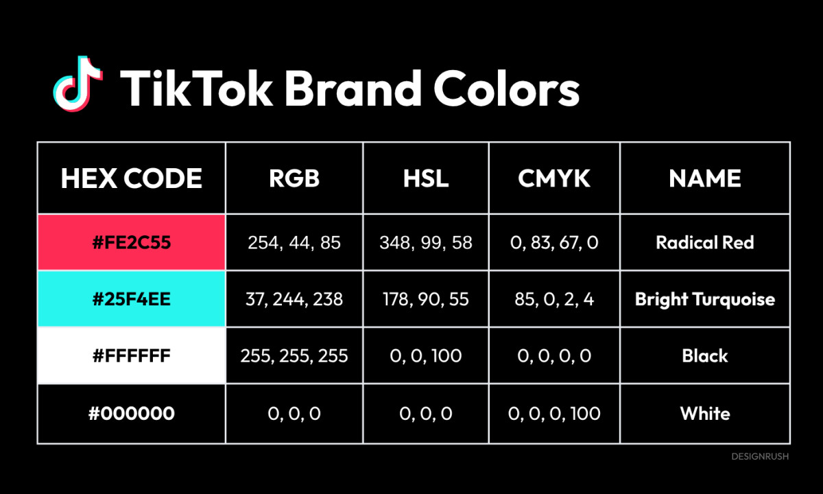
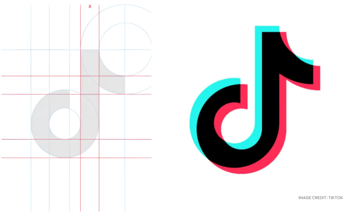
The cyan-and-fuchsia offset is the part most Western designers misread completely. It's not a VHS reference. It's not lo-fi nostalgia. It's not anaglyph 3D for its own sake.
It's a depiction of tremolo — the physical trembling of a sustained or repeated musical note.
Douyin translates to "trembling sound," or more poetically, "trembling music." The offset on the logo is that trembling, made visible.
As one design history of the mark puts it, "Douyin" means "trembling sound" or "trembling music," and the tremolo effect shows up directly in the logo.
This is the logo equivalent of onomatopoeia. The name describes a feeling, and the mark performs it.
Most Western audiences see concert energy: vibration against a dark stage, neon that spills in two directions.
That reading captures the surface, though something stranger sits beneath it. The logo is a literal visual translation of a Chinese word.
The cyan and fuchsia choice has a separate practical justification too.
Design platform Looka notes the high-contrast palette of cyan, magenta, and white on black was inspired by live concert lighting — the look of bright stage lights cutting through a dark venue.
So the mark works on two levels at once: semantic for Chinese readers, atmospheric for everyone else.
An Unnamed Designer, A Chinese Brief
There is no design lore here. No celebrity studio. No Pentagram case study.
The mark was created in-house and before TikTok even existed by a designer ByteDance has never publicly named.
Two things make this worth pausing on.
First, there was no global brief. No cross-cultural research mandate. No agency walking ByteDance through how this might land in São Paulo, Lagos, or Indianapolis.
The reference was a concert stage in a dark hall, drawn for Chinese teenagers in 2016.
Second, the logo that emerged from that narrow brief has outperformed almost every Western-market-tested mark of its generation.
Snap rebranded. Meta rebuilt. X torched its equity.
TikTok hasn't touched its logo since 2018. The platform's most recent visual identity update was a new typeface, TikTok Sans, introduced in 2023 with Swiss foundry Grilli Type, and even that left the mark itself alone.
For brand managers, the lesson sits uncomfortably. A logo built for one specific cultural audience often travels better than one engineered for "global appeal."
Specificity holds up. Consensus turns to mush.
Why ByteDance Didn't Localize When They Went Global
When ByteDance launched TikTok internationally in September 2017, they kept the Douyin logo. They didn't adapt it, soften it, or strip the cultural reference.
The mark crossed borders unchanged, even as the app became a distinct product from its Chinese counterpart.
Why though? Three plausible explanations, and they aren't mutually exclusive.
1. Confidence. ByteDance had watched the Douyin mark perform at extraordinary scale in China. They had data.The mark worked. Redesigning for Western markets would have meant betting against evidence
2. Efficiency. Localizing a visual identity for every market gets expensive, slow, and introduces coherence risks.
A single global mark, especially one as distinctive as the Douyin icon, is operationally simpler. Brand equity compounds faster when it isn't fragmented across variants.
3. The "d" bet. ByteDance may have calculated that nobody in Western markets would look closely enough to notice the Douyin reference.
A musical note is a musical note, and the underlying initial stays invisible without that context. The cultural specificity could travel as a non-feature, adding meaning for those who access it and nothing more than a clean logo for everyone else.
That symbol works across cultures and languages without much friction, so nothing stopped it from going global.
This is a sophisticated design outcome, whether by intention or by accident.
The mark carries a layer of meaning visible only to its origin audience, while showing a universally legible face to the rest of the world.
It isn't deceptive. It's economical. One mark, two readings, full coverage.
The Logo vs. the Platform — Eight Years Later
The mark was designed for a music app with 100 million users.
It now represents a 1.9-billion-user platform — by early 2026, monthly active users stood at 1.9 billion, placing it firmly among the world's top social platforms — that hosts news, congressional hearings, political organizing, kitchen-gadget commerce, and a geopolitical fight between Washington and Beijing that its original designer almost certainly never modeled.
The musical note is still there. The "d" for Douyin is still there. The trembling is still there.
Does it still fit? Honestly, barely. A musical note is a strange mark for a platform where most content has nothing to do with music anymore.
But changing it now would cost more than it's worth.
The mark has accumulated nearly a decade of recognition equity in markets where almost no other Chinese tech brand has built consumer trust at scale. ByteDance knows what they have.
The 2023 typeface refresh was the tell. When the platform finally felt brand pressure, they updated the type and left the symbol alone. The symbol is load-bearing.
What This Means for Anyone Building a Brand
Three takeaways for design and brand teams working across markets:
- Cultural specificity isn't a barrier to global legibility. It's often the source of it. A mark designed for one audience with conviction tends to travel further than a mark designed for everyone with caution.
- A logo can carry two readings at once, on purpose. TikTok's mark reads one way in Shanghai and another in São Paulo, and both readings hold. The design didn't pick a winner. It built the ambiguity in.
- Don't touch what's working. The platform has changed beyond recognition since 2018. The mark hasn't moved. That restraint is the most expensive design decision ByteDance has made, and the most valuable.
Our team ranks agencies worldwide to help you find a qualified partner. Visit our Agency Directory for the Top Logo Design Companies as well as: