Team Behind the Design
Logo Design Analysis
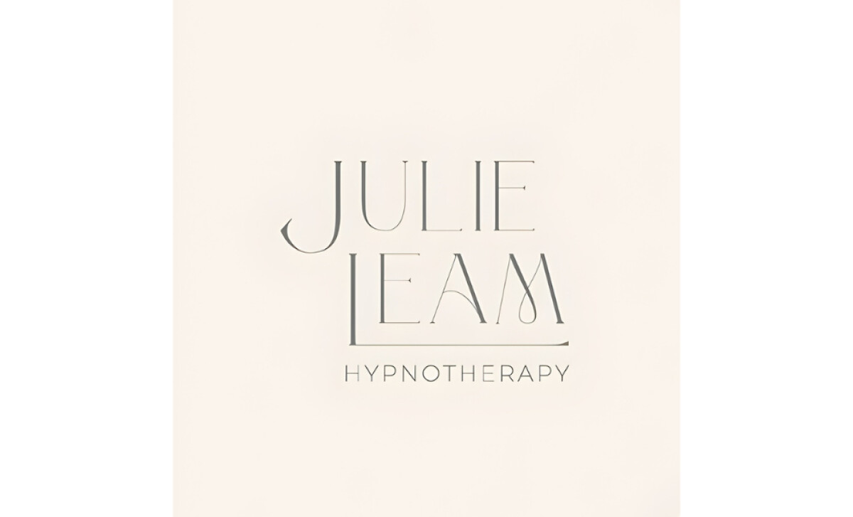
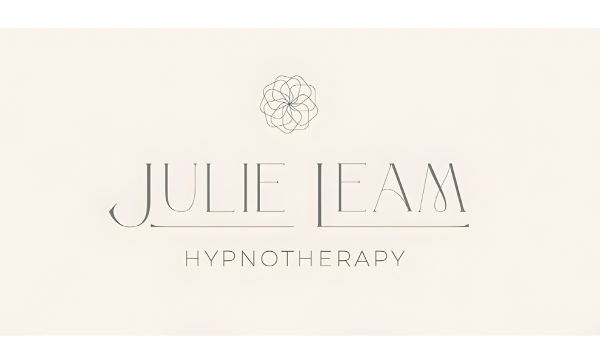
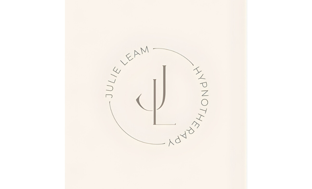
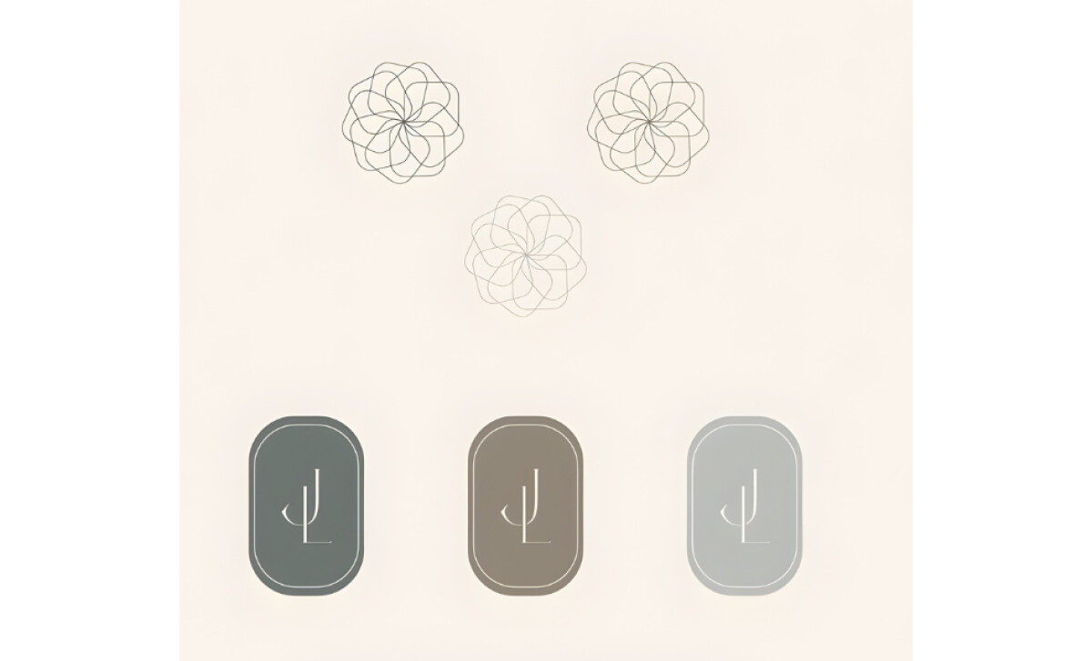
A strong wellness logo should convey calm, support, and clarity from the very first glance.
The Julie Leam Hypnotherapy identity does this through light, graceful strokes, soft geometry, and a visual structure that feels intentional and soothing.
- Concept: I see a monogram and wordmark built with long, thin letterforms that create a sense of emotional openness. The subtle curve supporting the EAM feels symbolic of guidance and care.
- Typography: The delicate serif type mirrors the sensitivity of the practice. Paired with a quiet sans-serif for “Hypnotherapy,” the contrast adds stability and reassurance.
- Scalability: The circular monogram adapts easily across formats. Even when minimized, the mark keeps its elegance without losing clarity.
- Applications: I like how the identity holds together through its soft palette and repeated floral-like motif. These details reinforce a calm, therapeutic atmosphere across all branded pieces.
What Brands & Agencies Can Learn from Julie Leam Hypnotherapy
The Brand Design Boutique shows how a therapeutic identity can feel gentle and trustworthy without losing structure. The design proves that emotional safety, clarity, and professionalism can coexist in a single refined mark.
1. Use Delicate Letterforms to Express Emotional Openness
The thin, elongated typography communicates softness and approachability. This demonstrates how subtle adjustments in type weight and curvature can shape the emotional tone of a wellness brand.
2. Let Symbolism Support the Practice’s Core Values
The curved form beneath the monogram introduces a visual cue of support and guidance. It’s a reminder that small symbolic gestures can carry significant meaning in therapeutic branding.
3. Build a Calming Atmosphere Through Palette and Motifs
The soft colors and floral-inspired details bring a sense of calm that aligns with hypnotherapy’s purpose. This shows how consistency in palette and shape language can strengthen trust across every touchpoint.
About DesignRush Featured Designs
At DesignRush, we review hundreds of agency projects each month. The featured designs stand out for creativity, relevance, and execution.
Many go on to be recognized as winners of our Monthly Design Awards.
Discover more examples here:
- Best Logo Designs
- Best Website Designs
- Best App Designs
- Best Print Designs
- Best Packaging Designs
- Best Video Designs
For a full list of design agencies and related services, see our Agency Directory.