Team Behind the Design
Logo Design Analysis
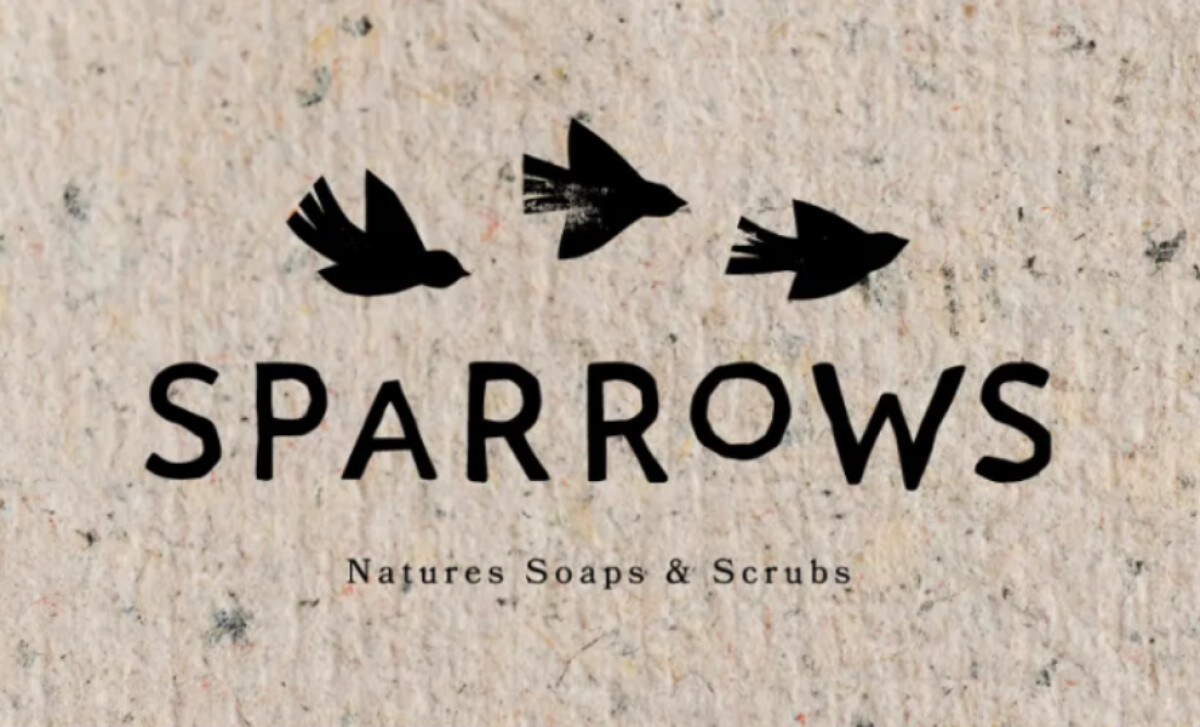
In fashion and beauty logo design, elegance often comes from authenticity, and Emma Hudson’s identity for Sparrows embodies that idea beautifully.
The logo feels refined and personal, expressing warmth and purity through simple forms and tactile restraint.
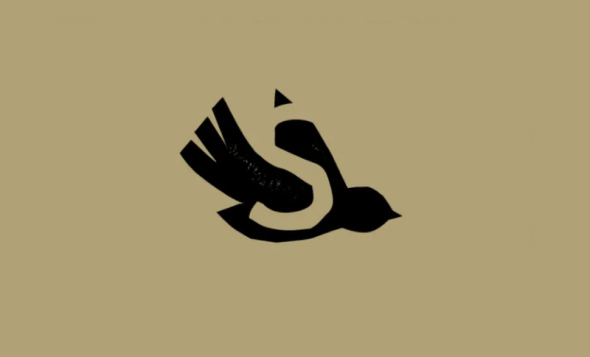
- Symbol: The stylized sparrow silhouette, drawn with uneven brush-like edges, captures the spontaneity of handmade craft. Its irregular lines feel alive, expressing freedom and motion while grounding the brand in its artisanal character.
- Typography: The wordmark “SPARROWS” uses a geometric sans serif softened by slight imperfections and paired with a fine serif tagline. I like how this particular type treatment balances between modern skincare and natural tradition.
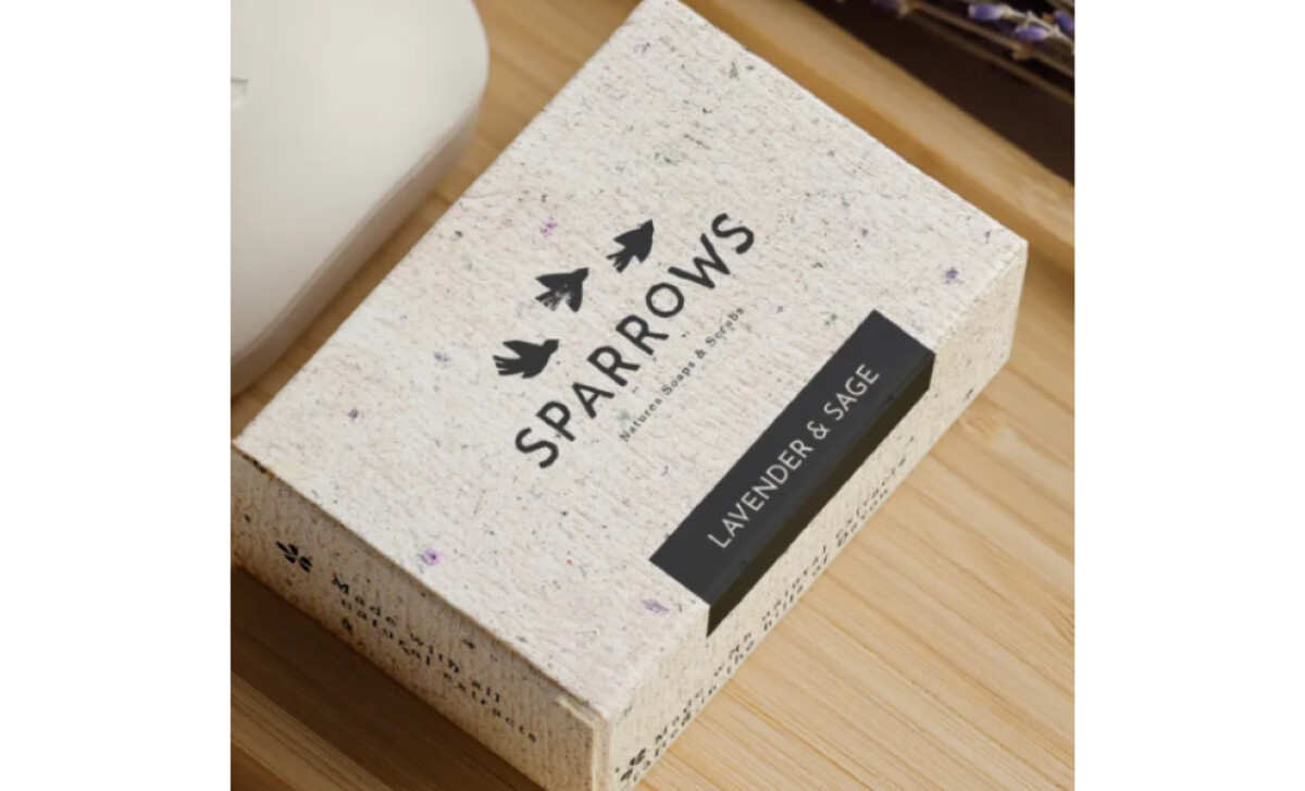
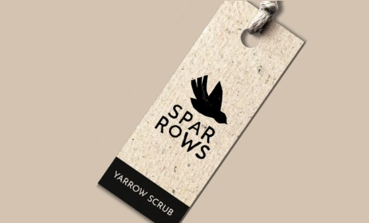
- Color and Material: Muted neutrals such as sand beige, off white, and matte black create gentle contrast and tactile depth. The paper-textured backdrop adds a sensory quality that highlights the brand’s honest, crafted nature.
- Adaptability: The sparrow motif functions both as an emblem and within the full logo system, maintaining coherence across print and digital. This modularity ensures brand consistency while allowing flexibility in packaging, tags, and marketing materials.
What Brands & Agencies Can Learn from Sparrows
Emma Hudson’s design for Sparrows demonstrates how thoughtful simplicity and material honesty can elevate a natural brand into an elegant visual identity.
1. Use Imperfection as a Design Strength
Organic irregularities can make a logo feel more authentic and human. By embracing texture and hand-rendered forms, designers can create visual warmth that connects emotionally with consumers.
2. Balance Natural Texture with Modern Typography
Combining handcrafted visuals with structured typefaces provides clarity without losing character. This approach helps natural or artisanal brands maintain professionalism while preserving authenticity.
3. Design for Sensory Connection
The look and feel of materials — paper grain, ink texture, muted tones — can be as powerful as the visuals themselves. Incorporating tactile qualities helps transform a logo from a visual mark into an experience.
About DesignRush Featured Designs
At DesignRush, we spotlight agency projects that push creative boundaries. The designs we feature reflect expert execution and highlight the trends shaping branding today.
Some of these standout projects later earn recognition in the Monthly Design Awards.
Check out more standout work across categories:
- Best Logo Designs
- Best Website Designs
- Best App Designs
- Best Print Designs
- Best Packaging Designs
- Best Video Designs
For a full list of design agencies and related services, see our Agency Directory.

