Lacoste's Quiet Redesign Is Louder Than It Looks
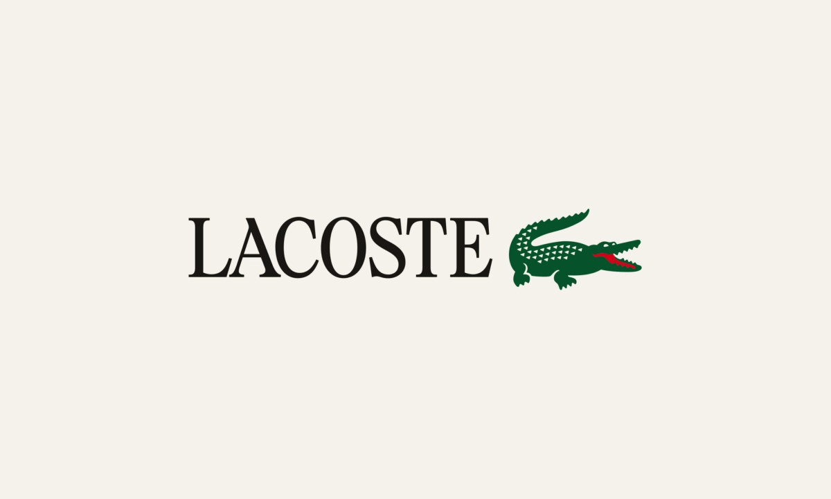
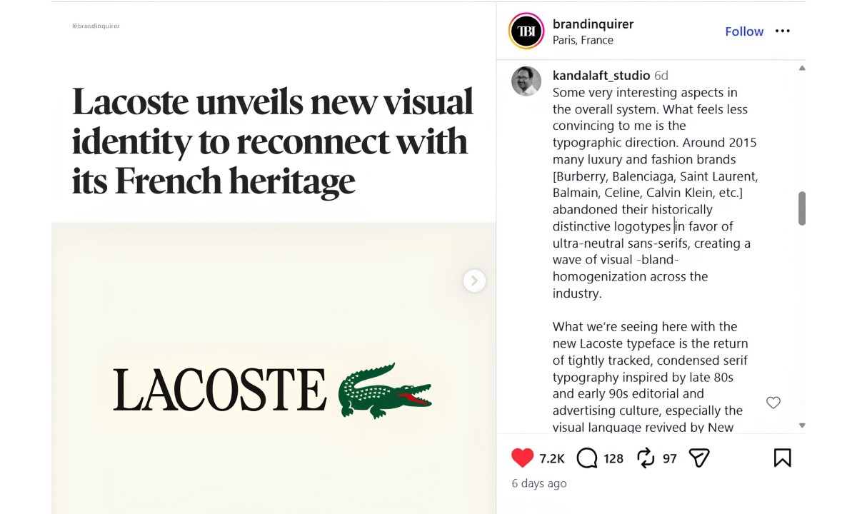
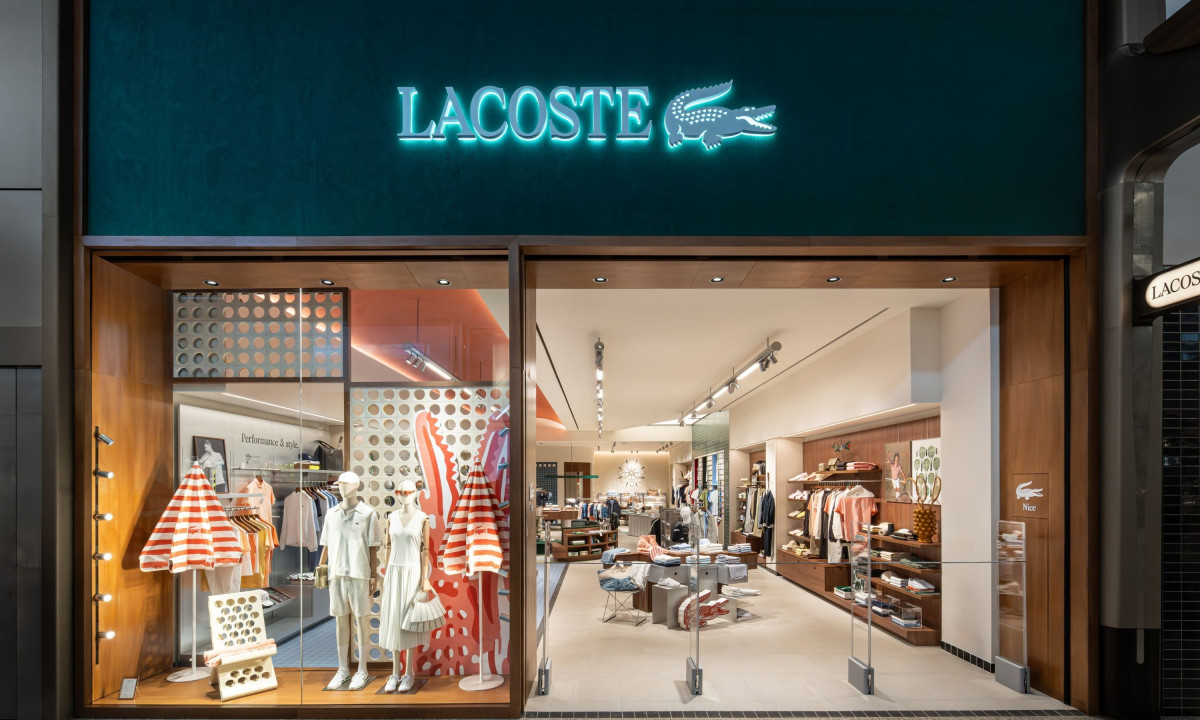
In April 2026, Lacoste quietly updated its logo. The crocodile stayed. The sans-serif wordmark it had carried for years did not, replaced by a bespoke condensed serif pulled from the brand's own archives.
New supporting colors, a more prominent standalone croc, René Lacoste's handwritten script introduced in select touchpoints — the full system, developed with London-based Commission Studio, rolled out gradually across retail, packaging and brand communications.
Lacoste called it a "visual identity evolution," and the careful word choice tells you everything about how the brand wants this read. No dramatic reinvention, no agency press tour, just a measured step backward toward its own origins. The design community noticed anyway, and the argument it sparked is more interesting than the redesign itself.
How the New System Reads
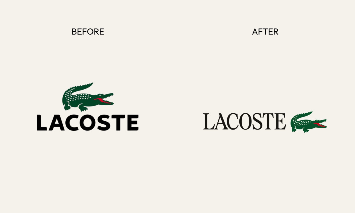
Start with the wordmark, because that's where most of the argument lives. The new condensed serif is tightly tracked, with proportions Lacoste describes as "distinguished by the precision of its proportions, rhythms and spacing" — brand-speak, but accurate brand-speak.
The letterforms read as editorial, slightly formal and older than the logo they replaced. Placed next to the crocodile, the combination looks less like a sportswear brand and more like a French house that happens to make polos.
The crocodile's shape is unchanged, but its role in the system has shifted. Lacoste now deploys the mark on its own more often, the croc without the wordmark, placed prominently on packaging and in-store signage.
The red tongue, always present in Robert George's original 1933 illustration, gets more visibility across executions. It's a detail only Lacoste owns — one that any imitator would have to copy outright to replicate, making the mark harder to approximate without looking like a knockoff.
The color story works the same way. The signature green returns to its original, more saturated shade. Two new supporting colors join it: clay, pulled from the tennis court surfaces René Lacoste played on, and farine, an off-white named after the color of his first blazer. These aren't decorative choices. They're sourced from specific biographical moments that competitors can reference but can't authentically claim.
René Lacoste's handwritten script also appears in select expressions, most notably within the Café Lacoste logotype. Together, these details build a visual system that is genuinely difficult to clone — not because it's complex, but because the provenance behind each element belongs exclusively to this brand.
The Rationale: Archives as Strategy
Lacoste frames the redesign as a return to its roots, drawing on its archives "from the earliest creations of René Lacoste to the foundational work of Robert George." That framing positions it less as a reaction to market pressure and more as an act of rediscovery.
Read between the lines, though, and there's a specific business argument. Lacoste has spent years fighting a positioning war, stretching from premium lifestyle into streetwear and back again.
The old sans-serif wordmark read as sporty, accessible, contemporary. The new serif reads as heritage, craft, premium. The brand is quietly moving upmarket without changing a single price tag or product line, by adjusting the register of every touchpoint a customer sees.
Lacoste hired Commission Studio for their methodology, not their portfolio. Commission's reputation for archivally grounded work with fashion and cultural clients made them the right partner for a brief fundamentally about recovery rather than invention. That's a strategic investment in getting the brief right before a single letterform gets drawn, and it shows in the result.
The Public Took Notice
The redesign landed quietly but spread fast among designers and brand observers online. Reaction split, not along lines of taste exactly, but along lines of principle.
The redesign landed quietly but spread fast among designers and brand observers online.
The most substantive critique came from @kandalaft_studio, a designer whose comment circulated widely in the days after the announcement. He placed the serif shift within a broader typographic cycle, noting that after a decade of fashion brands racing toward ultra-neutral sans-serifs (Burberry, Balenciaga, Saint Laurent, Celine, Calvin Klein), the industry is swinging back toward condensed, tracked serifs drawn from late-1980s and early-1990s editorial culture.
New Balance's archival campaigns helped revive this visual language and made it broadly legible as a movement. @kandalaft_studio's conclusion was blunt: "For a brand as iconic as Lacoste, I feel the challenge should be to resist these cycles entirely and develop a typographic voice that feels autonomous, timeless and unmistakably its own rather than aesthetically aligned with an already established movement."
That criticism is worth sitting with rather than dismissing.
What Agencies and Designers Can Learn
A few things worth pulling from the Lacoste episode, beyond the aesthetic debate.
- Archive access is a strategic asset. Lacoste didn't have to invent anything. The serif forms, the color palette, the crocodile's red tongue were all sitting in its own history. Brands with genuine archival depth can use that history as a moat, and agencies should press clients to actually excavate it, not just nod at it in brand guidelines.
- The quiet rebrand is a legitimate format. Lacoste made no big announcement — no campaign drop, no rebrand film, no creative director interview. The work went out and let people find it. That restraint generated organic conversation, including the critical kind, which is often more valuable than praise.
- Typography is the argument. The typographic switch carries the real weight here, repositioning the brand in consumer perception without touching the product. A font change at this scale is a positioning statement, and that's a meaningful lesson in how much semantic weight letterforms carry.
Looking for a partner who builds from the brand up? Browse DesignRush's Best Logo Design Companies.
DesignRush's Take: The Right Move. But Not Without Risk.
Our honest read: Lacoste made the correct call.
The old sans-serif had aged into genericness. In a retail environment full of athletic brands running similar geometry, Lacoste's previous wordmark did less to distinguish the brand than it once did. The new serif, bespoke, archivally grounded, a little severe, immediately reads differently.
It creates distance from the sportswear category and pulls the brand closer to the premium French fashion houses it arguably belongs alongside.
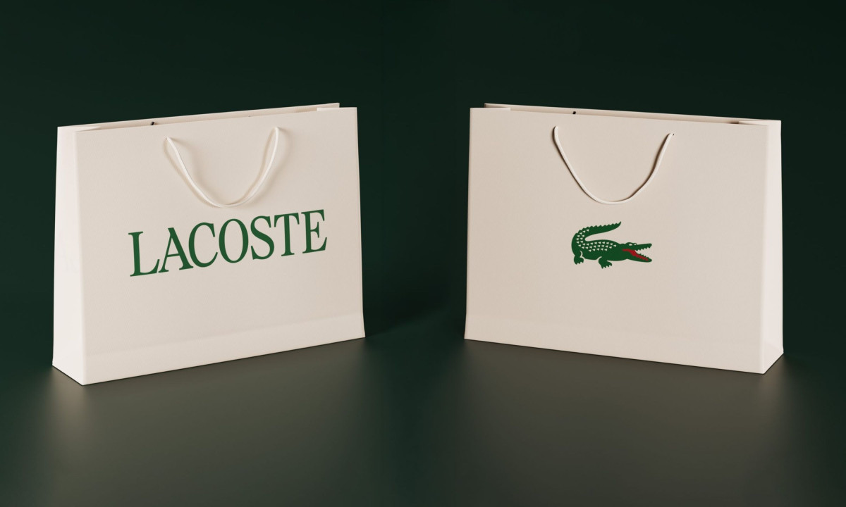
The shopping bags tell the story cleanly. One side carries "LACOSTE" in the new serif, large and confident in heritage green. The other carries just the crocodile. That two-sided split is a system built for a brand that trusts both elements to work independently, and the execution backs that confidence up.
@kandalaft_studio's critique deserves a real answer, though. He's right that the tightly tracked condensed serif is now a recognizable trend dialect, and being legible as a trend is a risk for a brand with Lacoste's longevity.
The distinction Lacoste needs to maintain is between referencing its own archive and following someone else's aesthetic cycle. The bespoke type, developed specifically for the brand rather than licensed from a foundry, is the insurance policy. Whether it reads as autonomous or trend-adjacent will depend on how consistently and creatively Lacoste deploys it over the next several years.
The legacy is intact. The crocodile is still the crocodile. But the letters it stands beside are now doing more of the same work.