Studiothathari’s logo design for Nuska Beach Restaurant & Bar evokes the quiet elegance of coastal luxury. Crafted for a high-end beachfront dining experience, it achieves a delicate balance between serenity and strength.
Key Insights for Brands:
- Use symbolic motifs that convey brand identity
- Craft custom letterforms to reflect sophistication and subtlety
- Pair light and dark colors for contrast and harmony
A Stylized Sun Motif Anchors the Brand in Coastal Serenity

Without relying on the obvious, Nuska’s logo tells you everything you need to know. At the center sits a stylized sun: minimal, radiant, and quietly powerful. It draws from geometry, not ornamentation, to illustrate sunlight without cliché. You feel the morning calm, the glint on still water, the rhythm of tide and time.
Studiothathari designed the motif with subtlety in mind, creating a symbol that doesn’t demand attention but quietly earns it. It’s memorable yet restrained, leaving space for interpretation while nodding to the coastal experience.
Not only does it look beautiful, it functions beautifully, too! Scaled across formats from signage to digital, the mark remains recognizable, elegant, and versatile.
This balance of form and feeling strengthens the identity — it invites without overpowering.
Custom Letterforms Set the Tone for Elevated Sophistication

Typography often carries the soul of a brand, and in Nuska’s case, it whispers rather than shouts.
The logotype uses a refined, high-contrast type that’s both sharp and fluid. Look closely, and you’ll see deliberate decisions like the subtle dip of the “K” or how the "S" curls with a softness that feels like a sea breeze.
This isn't off-the-shelf lettering. It’s crafted with intent. It tells us this place is elevated but not stiff. It's comfortable without being casual. More importantly, it avoids the trap of over-styling. There's no gratuitous flourish, no overly ornamental serif. The elegance lies in its control.
A Contrasting Color Palette Balances Depth and Lightness
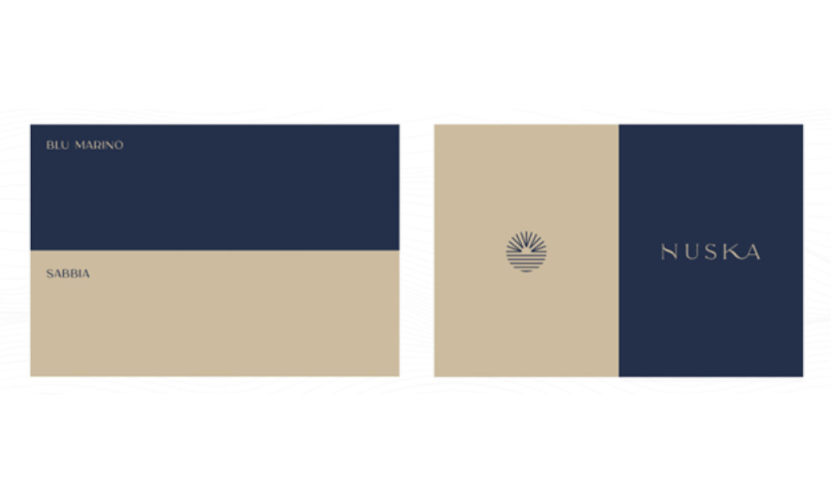
Color strategies in exceptional logo designs are always deliberate and meaningful. Here, the Blu Marino and Sabbia colors are not simply navy and beige. They are drawn directly from the landscape: one dark and cool like the ocean at dusk, the other soft and warm like sunbaked sand. It’s a subtle yet powerful contrast that reflects both place and purpose.
Together, they create a push-and-pull, balancing depth with lightness. The dark blue lends formality and gravity, while the sandy beige brings softness and approachability.
This palette also fits well in the application. Blu Marino on signage feels formal and refined. Sabbia in menus or uniforms feels grounded and tactile. The consistency across both tones allows the brand to live seamlessly in digital and physical spaces.
Learn how to choose colors for your brand.
Nuska’s Cohesive Identity is Built to Live Across Materials and Platforms

Great brand systems don’t stop at a screen. They live in the real world. Nuska’s identity was built with this in mind, and it shows. Whether rendered in brushed metal on wood paneling or printed in ink on textured stock, the brand retains its character, clarity, and composure.
This is where the expertise of professional logo designers comes through. The logomark and wordmark hold their own in both dimensional materials and flat graphic treatments.
On architectural surfaces, they feel embedded as though they were always part of the space. On printed collaterals, they feel intentional and tactile, never forced. These all contribute to a consistent visual presence that strengthens brand recognition across every touchpoint.
Some logos are designed to catch the eye. Others are crafted to stand the test of time, like Nuska. From its elegant motifs to creative letterforms and impactful colors, this logo design is rooted in place, steeped in meaning, and crafted to last — deserving of the Design Awards.
-preview.jpg)