
The Minecraft logo did something almost no logo does. It built itself. In early Alpha, stone blocks fell down the menu screen and stacked into the game's name against a wall of dirt. The logo ran on the game's own physics. Then Mojang deleted it, and the mark has been getting quieter ever since.
What To Know
- The Minecraft logo is a blocky stone wordmark drawn to match the game's own materials rather than designed as a separate brand mark.
- Markus "Notch" Persson released Minecraft in 2009, and the first public logos used the game's cobblestone texture directly.
- The creeper face inside the letter A first appeared in Beta 1.4 in 2011 and has stayed in the mark ever since.
- Mojang split the identity on August 31, 2021, using a flat logo for the franchise and keeping the detailed stone logo for the game.
- The through line is legibility, because almost every revision since 2009 has traded a little detail for the ability to work at a smaller size.
The Minecraft logo has changed constantly and barely changed at all.
Almost every revision since 2009 has done the same job, which is to make the stone read better as it gets smaller.
A texture built for one menu screen had to survive becoming a console tile, a classroom product, a merchandise tag, and a film logo. The real story is a wordmark giving up detail, one pass at a time, to stay legible everywhere it landed.
What Is The Current Minecraft Logo?
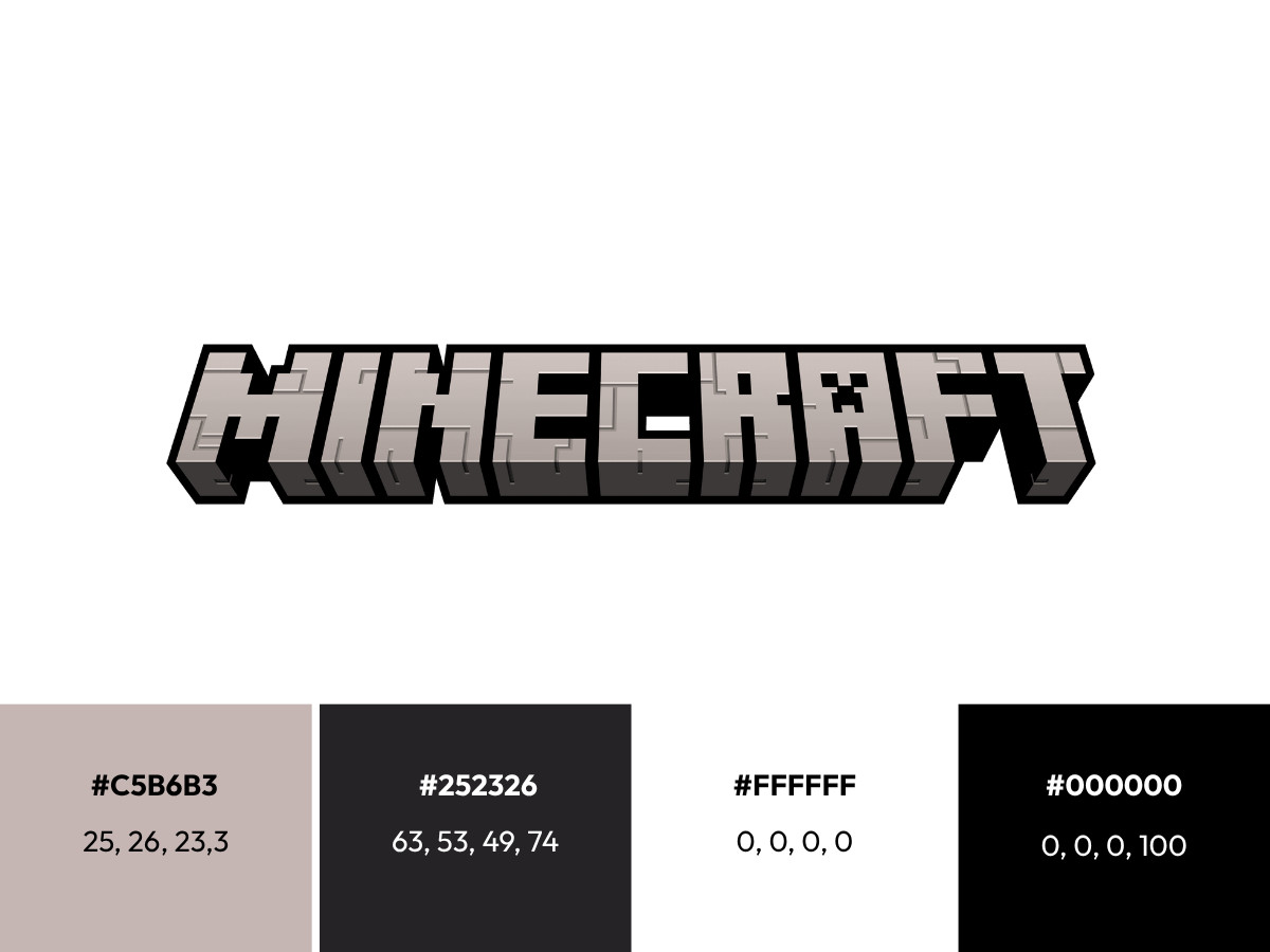
The current game logo is 3D capital lettering that spells MINECRAFT, tilted slightly upward as if you are looking up at it.
The letters carry a cracked stone texture inside a heavy black outline, and the second "A" holds a creeper face as a cut-out rather than a drawn-on detail. The face is negative space, so the background shows through the hole where the mouth and eyes sit.
A separate flat version handles the franchise. It keeps the same letter shapes and the same creeper cut-out, drops the reflections, and thickens the outline so the word holds up as a small icon.
The palette stays in stone grays against a near-black keyline, with the green of the creeper reading only where the game art sits behind it. The colors shift slightly by surface, which is why no single swatch matches every version you will find online.
For how much it says with so little, it belongs among the best gaming logos working today.
What Font Is The Minecraft Logo?
The Minecraft logo is not set in a font you can download. The stone lettering is custom, drawn by hand for the mark rather than typed out of any typeface, which is why the letters sit at slightly different angles and each one cracks in its own way.
The font people usually mean is Mojangles, also called Minecraft Seven, the pixelated typeface used for text inside the game. It is a proprietary Mojang asset and not the logo lettering.
The "Minecraft" fonts on free download sites, such as MineCrafter and Minecraftia, are fan recreations built to look close to the mark, so none of them is the real thing.
The stone palette holds steadier than the lettering does. The values most designers reference put the light gray at #C5B6B3 (CMYK 25, 26, 23, 3), the highlights at pure white, #FFFFFF (CMYK 0, 0, 0, 0), the dark gray at #252326 (CMYK 63, 53, 49, 74), and the outline at pure black, #000000 (CMYK 0, 0, 0, 100).
Mojang does not publish an official color guide, so treat these as close approximations rather than exact specs.
2009: The Logo That Never Shipped
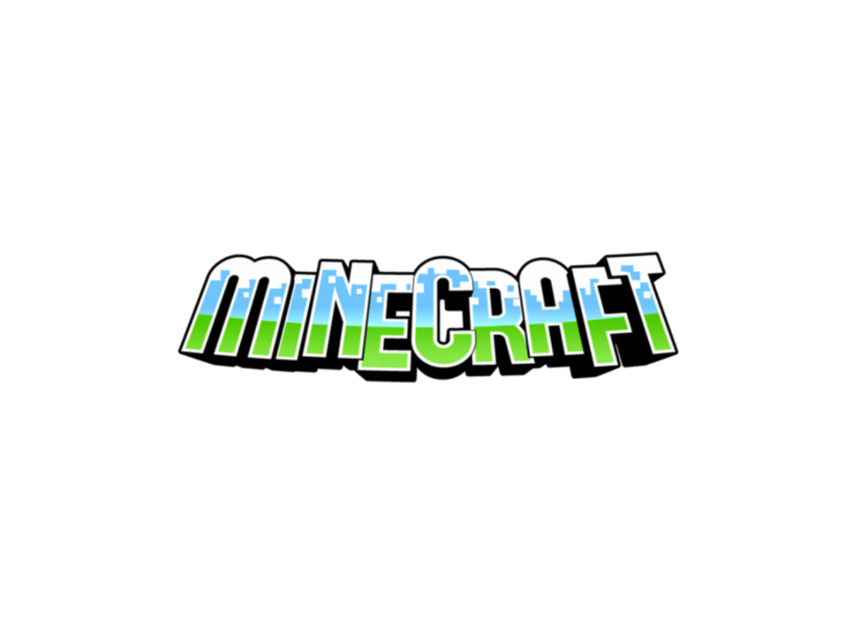
The mark that several logo sites credit as the first Minecraft logo is the one that never got used.
Designer Hayden "Dock" Scott-Baron drew a bold blue-and-green wordmark that year, with sky above the letters and grass below them. Mojang never officially adopted it, and the record files it as an unused concept.
That correction matters more than it looks. Calling Dock's wordmark the first logo suggests Minecraft's identity began as a flat graphic on a designer's screen.
The identity that shipped began as a texture pulled straight out of the game, which is the opposite starting point and the reason the brand looks the way it does today.
2009 To 2010: Cobblestone
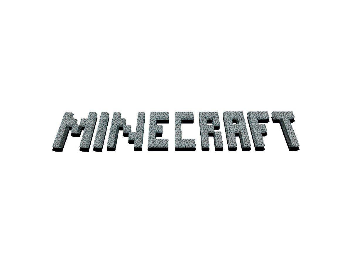
The first logo that actually appeared spelled MINECRAFT in gray cobblestone blocks. Notch posted it on his personal blog on May 17, 2009. A brighter version with an added shadow appeared on the game's homepage within days and entered the game on January 31, 2010 during the Indev phase, where it sat on the menu against a wall of dirt.
Alpha v1.0.4 swapped the cobblestone for smoother stone and added the falling-block animation from the open of this piece.
The point here is plain. The logo was built from the same blocks players placed and broke, so the brand and the product were made of one material from the start.
2011: The Creeper Arrives
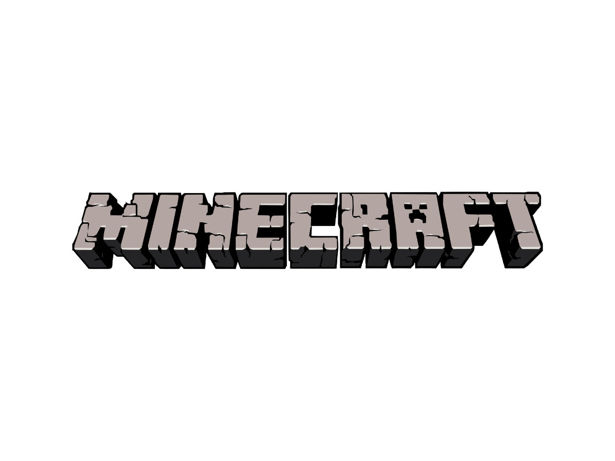
Beta 1.4 gave Minecraft the logo most people picture.
Mojang replaced the pixel-block lettering with hand-drawn stone letters and cut a creeper face into the A. The falling-block animation left in the same update, so the logo stopped moving and started sitting still like a proper wordmark.
Beta 1.8 softened the reflections on the letters, and that quieter Beta 1.8 version carried the full release on November 18, 2011. The cut-out did the heavy lifting.
A plain stone wordmark is hard to tell apart from any other stone graphic, but the creeper hole turns it into a mark you can name from a thumbnail and ties it to a specific enemy instead of a generic texture.
One date to get right, because sources disagree on it: the creeper did not appear in 2009 or 2010. The version record puts it in Beta 1.4 in 2011, and that is the date to trust over the earlier ones floating around.
2011 To 2015: Two Logos At Once
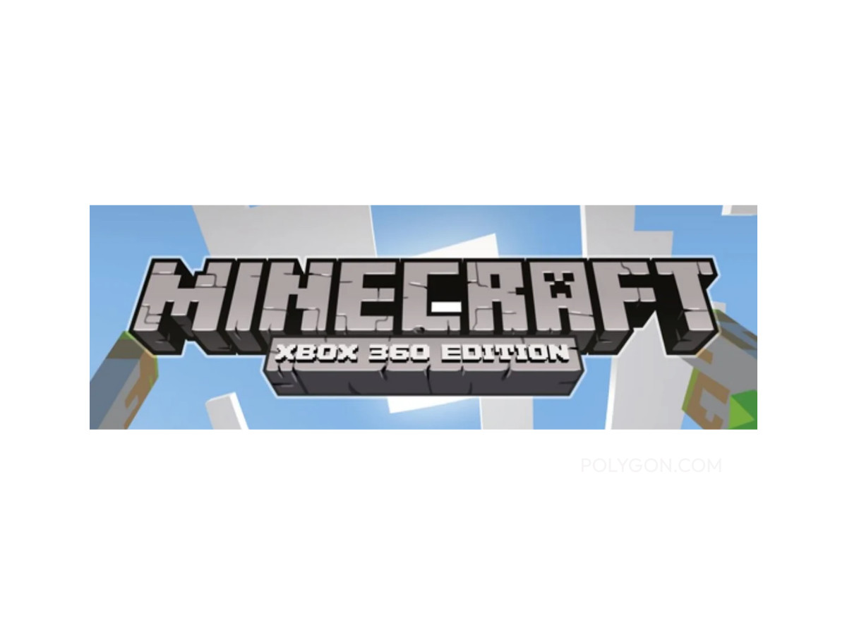
While the stone mark ran the PC game, a cleaner website variant ran next to it.
That second version turned up across Pocket Edition and the Xbox 360 Edition as Minecraft reached phones in 2011 and the Xbox 360 in 2012, the same jump across hardware that the PlayStation mark made over its own console generations.
This is the first time Minecraft carried more than one logo at once, and the reason is mechanical. One detailed stone wordmark could not sit cleanly on a phone icon, a console tile, and a web header all at the same time.
That single problem is what the 2021 redesign eventually answers.
2015 To 2021: The Microsoft Polish
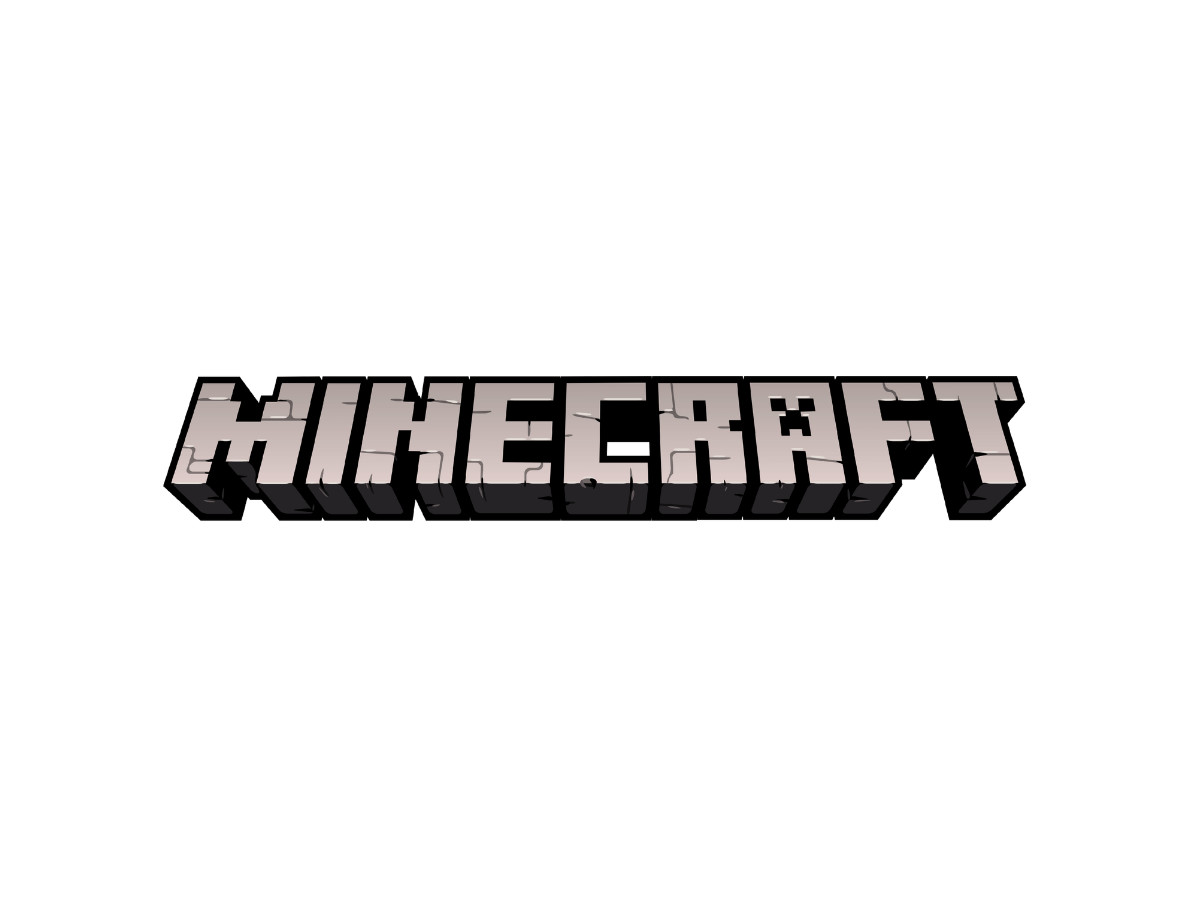
After Microsoft bought Mojang for 2.5 billion dollars in 2014, a cleaner franchise mark became the default from 2015 on. Minecraft Live in 2020 and 2021 used a lighter gray cut of the logo, and version 1.16 in 2020 lightened the gray further and added a thick outline. The Caves & Cliffs update pushed harder, with squarer letters, a heavier keyline, and more angular cracks in the stone.
The thicker outline was doing a real job, not adding shine. On a bright store page or a small tile, a thin stone edge disappears into the background, and a heavy black keyline keeps the word readable at any size.
That kind of steady tidying under one owner shows up across current logo design trends, and you can see the same restraint in NVIDIA's near-frozen wordmark.
Worth noting for accuracy: Java Edition kept its older in-game logo until the studio refreshed it in 2023 with version 1.20, so the brand ran years ahead of the game it represented.
2021 To Now: The Split
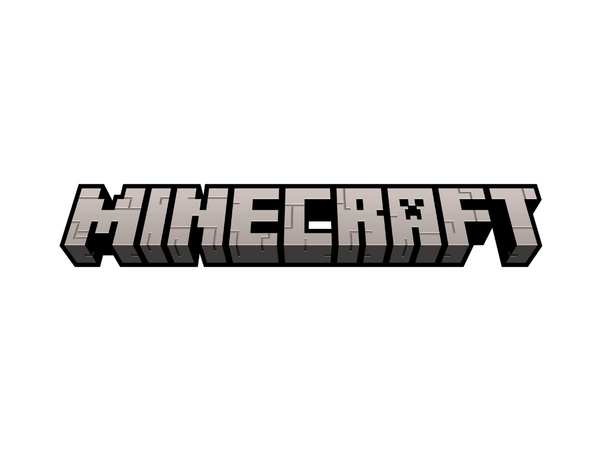
On August 31, 2021, Mojang split the mark in two. A flat logo would represent the franchise, and the detailed stone logo would stay on the game itself. The flat mark thickened the outline again, removed the reflections in the letters, and reshaped the creeper face in the A.
What Does It Mean When A Brand Keeps Two Versions Of The Same Logo On Purpose?
It means Mojang stopped asking one mark to do every job. The flat vector scales down to a favicon and prints on a shirt without muddy shadows, which suits the same screenshot-friendly identity you see across Discord and Roblox.
The textured stone mark still greets you on the title screen, where atmosphere counts for more than a clean edge. Mojang later added the "Shape Your World" slogan for the game's 15th anniversary in 2024, without touching the logo underneath it.
A Minecraft Movie arrived in April 2025 and broke the opening-weekend record for a video game adaptation, pulling in about 163 million dollars at home and clearing more than 300 million dollars worldwide in three days. The film got a promotional logo of its own, and the game and franchise marks did not change to match it.
The Verdict
Is Seventeen Years Of Shaving Detail Off One Wordmark Discipline Or Slow Erosion?
Call it discipline. Every version answered a real constraint, whether a new screen, a new platform, a smaller icon, or a movie poster. Mojang never chased a passing trend or scrapped the concept, which is rare for a brand this size and this loved, and it ranks among the more disciplined redraws in notable logo designs. The stone still cracks, and the creeper still hides in the A.
A logo that began as a block you could break has spent years learning to survive everywhere those blocks now sell.

Our team ranks agencies worldwide to help you find a qualified partner. Visit our Agency Directory for the Top Logo Design Companies as well as: