Last Updated: 07/03/2024
Have you ever found yourself mesmerized by the iconic Caterpillar logo emblazoned on heavy machinery and wondered about the story behind it? Its bold uppercase lettering in a modern sans-serif font, and a bright yellow triangle, immediately capture your attention but you always question how this machinery-producing company chose that design as its trademark.
Allow us to demystify this logo’s elements as we discuss its long and colorful history, meaning, and the reasons why it is so effective and memorable.
Caterpillar's Iconic Logo Origins
The very first Caterpillar logo, created in 1924, was a distinctive wavy wordmark, mimicking the silhouette of a caterpillar, with split ends representing the animal’s legs. This design was innovative and though it stayed with the company for a short period, it was a crucial first step in establishing the brand's identity.
In 1931, Caterpillar's logo underwent its first redesign. The wave-like logotype was replaced with a more traditional and structured design. The new red title case inscription was crafted in a stylish serif typeface giving the logo a more conventional look.

The color of the Caterpillar logotype was changed to black in 1932, shifting towards a more professional image. Between 1939 and 1957, the company experimented with about three different versions of the inscription, all in monochrome.
The 1957 redesign marked a significant transformation for Caterpillar's logo. The new black inscription, now in all capitals, was written in an extra-bold sans-serif typeface. This commanding design reflected the company's growing authority and expertise in the industry.
In 1967, Caterpillar introduced an emblem alongside its wordmark for the first time. The new logo featured a square with a white circle, intersected by lines to form a stylized "C." This redesign represented a period of prosperity and growth, with the emblem adding a visual dimension to the brand's identity.
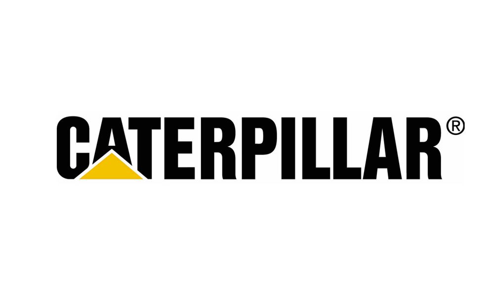
The modern Caterpillar logo, introduced in 1989, blends tradition and contemporary design. The all-caps inscription is executed in a bold sans-serif typeface. A distinctive wide yellow triangle covers the bottom parts of the first three letters, creating a unique and recognizable accent.

Caterpillar’s Logo Design is a Simple and Energetic Symbol of the Company’s Effectiveness
Caterpillar Inc designs, develops, engineers, and manufactures heavy-duty construction and mining machinery and diesel-electric locomotives.
The Caterpillar logo features the name in black color with an eye-alluring yellow triangle eliminating the negative space in the “A” letter. The yellow hue exudes energy and enthusiasm, brightening the logo and attracting more attention. This tells the consumer that the company has the spirit and drive to accomplish its goals.

On the other hand, black lettering in modified Helvetica font represents excellence, strength, and elegance. we can see a modified form of the Helvetica font. The letter “A” nestles on top of the yellow triangle much like a CAT bulldozer moving over a dirt mound at a construction site. This element subconsciously reminds the consumer that they still see CAT machines anywhere that construction takes place.
CAT is utilizing this simplicity and sets a high standard for effective logo designs. CAT generates abundant additional revenue from licensing the Caterpillar and CAT trademarks and logos. They merchandize their iconic logo on everything from clothing to construction tools. Wherever you put it, it looks cool and rugged. And like CAT machinery — it gets the job done.

-preview.jpg)