Team Behind the Design
Logo Design Analysis
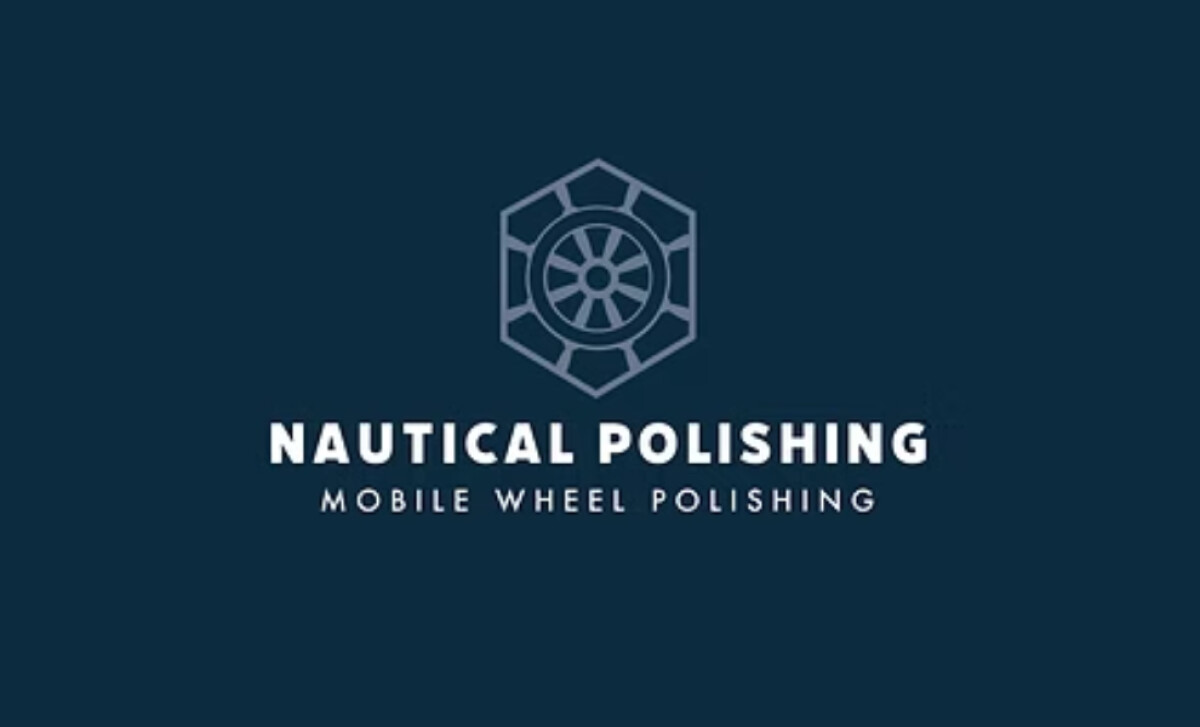
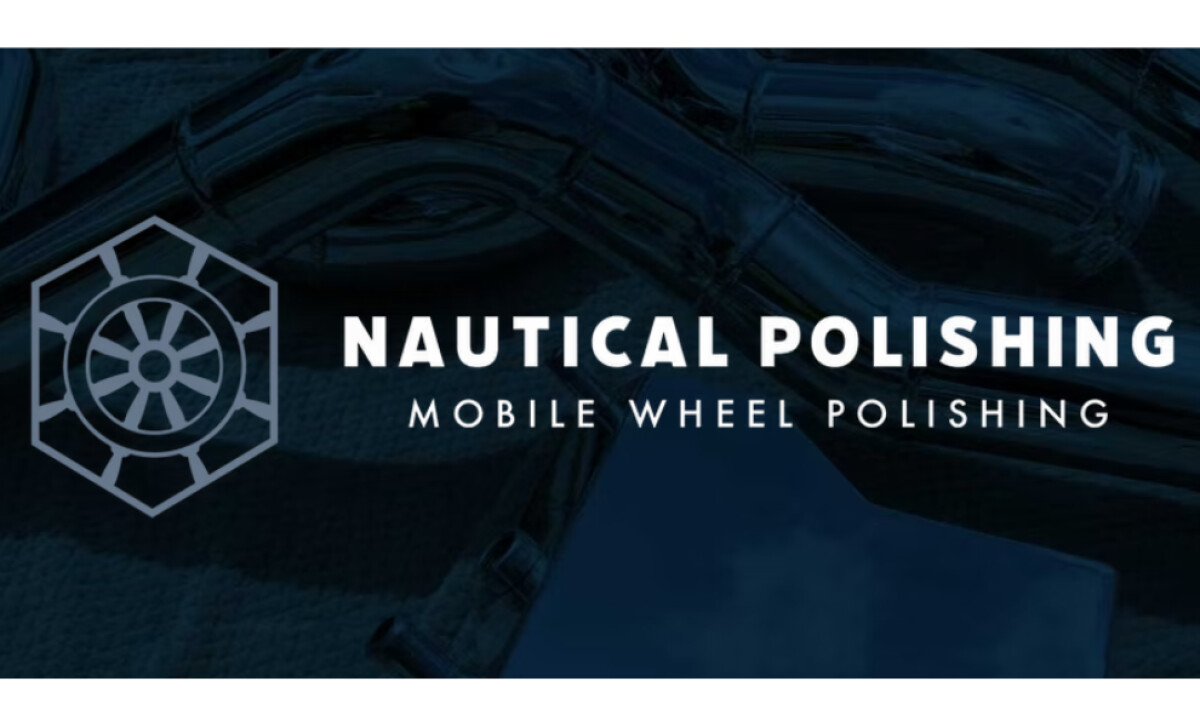
A strong automotive logo design should communicate precision and reliability from the very first glance.
The Nautical Polishing logo does this through engineered geometry, clean stroke work, and a visual structure that feels disciplined and highly professional.
- Concept: I appreciate how the hexagon-framed wheel emblem creates an immediate association with precision and craftsmanship. The geometry feels mechanical without becoming overly complex, which suits a wheel-polishing service grounded in accuracy.
- Typography: The bold, all-caps wordmark reinforces authority, while the lighter secondary line introduces a refined balance. This pairing supports readability on apparel and printed materials while still projecting strength.
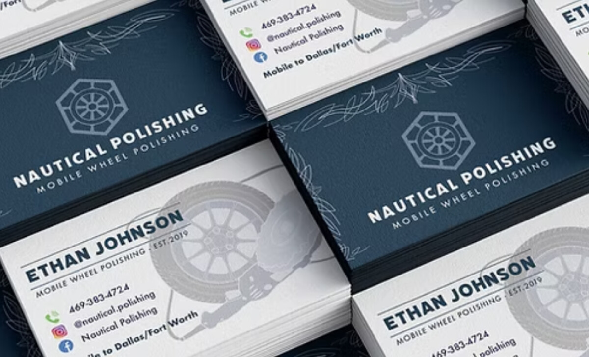
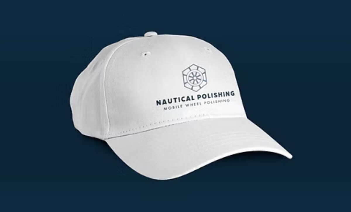
- Scalability: The consistent line weight and clear geometry maintain legibility across real-world applications. The emblem retains its clarity even on surfaces that tend to soften or distort detail, like business cards and hats.
- Applications: The deep navy palette adds a sense of professionalism and trust. Against both dark and light fabrics, the contrast feels crisp, helping the mark present as polished and reliable across branded apparel and print collateral.
What Agencies Can Learn from Nautical Polishing

This project shows how geometric discipline and clean typography can elevate a technical trade into a more premium, trustworthy brand.
1. Use Geometry to Anchor the Identity
The hexagon-and-wheel emblem demonstrates how a single, well-constructed geometric form can instantly communicate industry, precision, and service specialty.
2. Set the Tone Through Type
The firm sans-serif wordmark gives a mobile wheel-polishing service the presence of a focused provider, showing how type choice can shift how people read the brand.
3. Design for Everyday Brand Use
By planning for embroidery, print, and apparel from the start, the logo performs reliably across real surfaces, not just digital mockups.
About DesignRush Featured Designs
At DesignRush, we evaluate hundreds of projects each month. Featured selections stand out for clarity, craftsmanship, conceptual depth, and execution across digital and brand experiences.
The strongest examples move on to our Monthly Design Awards, highlighting best-in-class creative work.
Check out more standout work across categories:
- Best Logo Designs
- Best Website Designs
- Best App Designs
- Best Print Designs
- Best Packaging Designs
- Best Video Designs
For a full list of design agencies and related services, see our Agency Directory.