Last Updated: 07/24/2024
Mercedes-Benz's Clean Logo Design Is A Symbol For The Future
Mercedes-Benz is a world-renowned automobile brand known for its innovative and cutting-edge vehicles. Headquartered in Stuttgart, Baden-Württemberg, Mercedes-Benz is part of a larger company called Daimler AG that has been making cars since 1926.
Ever since hitting the scene, these vehicles have been true leaders in the automotive industry. They’re known for their power and innovative qualities, which is also what this brand as a whole is widely known for.
However, this legacy and history extend farther back than the 1920s.
The origins of the Mercedes-Benz brand date back to 1886, when Karl Benz created the first petrol-powered car, the Benz Patent Motorwagen. The first Mercedes car hit the market in 1901.
Mercedes was founded in 1902 after entrepreneur Emil Jellinek created the trademark, naming the car after his daughter. But over the years, companies merged, and more minds entered the picture. There wasn’t just one entrepreneur leading the charge—no, several insightful and innovative minds (along with some of the era's best graphic designers) worked to shape this brand into what it became known as and what it’s known for today.
On 28 June 1926, Mercedes-Benz was formed after the merging of Karl Benz and Gottlieb Daimler's two companies.
It was this merger that gave birth to the car brand that we know today, and to the logo that represents such quality, strength and ingenuity — the three-pointed star.
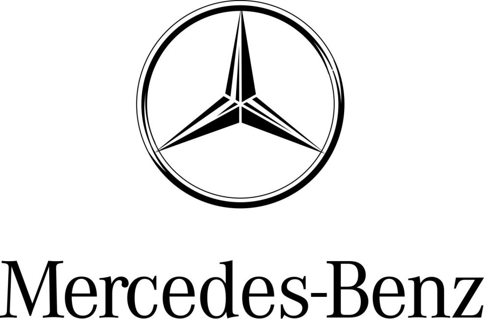
The three-pointed star logo came into existence in 1909, but it wasn’t until this merger that it came in with the Mercedes-Benz logo. This three-pointed star represents the domination of land, air and sea — very fitting for a company that, at the time, was revolutionizing the automotive industry.

The Mercedes-Benz Logo Is Modern, Sleek And Revolutionary
Over the years, this logo has seen many iterations and variations. But the main theme behind this symbol has remained the same. It has always stood tall and proud — with three points dictating its power and resilience in the automotive industry.
Today, this logo looks much like it did in years past — though it has ditched the badge and shield-like quality it once held in its formative years. It still holds that regalness and honor, but now in a more modern, luxurious and minimal way.
This design is made up of a circle, with a three-pointed star sitting inside of it. These points are equidistant from one another, with one point shooting up and the other two falling equally to either side.
As the leading branding companies working in the automotive industry dictate, this simple design is modern, powerful and effective. It represents heritage and resilience. It represents strength and determination. It, quite literally, depicts the brand's domination over all forms of transportation — whether that be in the air, on land or across oceans. Their branding strategy effectively reinforces their global presence and authority in the industry. For more detailed insight, explore out list of the top branding agencies at the moment.
Could this logo also be a symbol of complete domination across the world? Maybe. But it sure is exciting to look at
This logo design is often seen in a bright, bold silver color. It is seen on car hoods in this bright and eye-catching color and on many other mediums. It’s raw. It’s innovative. It’s a callback to its raw and unfiltered routes — before cars were painted in a variety of colors, they were a simple silver-like untouched metal.
The Mercedes-Benz logo is one of the most iconic logos in history. It’s instantly recognizable, simple, and modern. It’s ahead of its time, and it tells the story of a three-manned company and a goal to achieve and succeed.

Mercedes-Benz Makes A Strong Statement With Its Designs & Products
The Mercedes-Benz logo has stood the test of time. It is an image and design that exudes authority, values and sophistication. It’s instantly recognizable as a symbol of power, strength and resilience.
You know this logo means business. You know this brand means business. You have trust in this brand through the use of history and honor it imparts onto its products and into its designs.
This three-pointed star is said to be a symbol of complete domination — of land, air and sea. This is a company of innovators and dreamers. They have high hopes and expectations that they are constantly working towards.
This simple logo design is a powerful symbol of that dedication, passion and commitment to doing better and being better — creating products that amaze, enlighten and excite. They’ve been true to this statement from the beginning and will continue to be true to it far into the future.
This logo design has a weight to it that comes from its modern and simple design elements, as well as the brand’s history as a whole. It’s a testament to true craftsmanship — and it’s here to stay.
If you're a fan of cars and want to learn more about the most recognizable car brand logos, our article "10 Best Car Company Logos of 2023" is the perfect place to start. From the iconic Mercedes-Benz logo to other well-known car logos, you're sure to find some of your favorites on this list.


