Standout Features:
- Dynamic logotype layout
- Bright and vibrant color pairings
- Modernized logo redesign
After two decades in the accounting industry, NewCont needed to refresh its aesthetic and introduce a new yet familiar visual identity to a new age of consumers. So, they paired up with Ave Design for a massive visual overhaul.
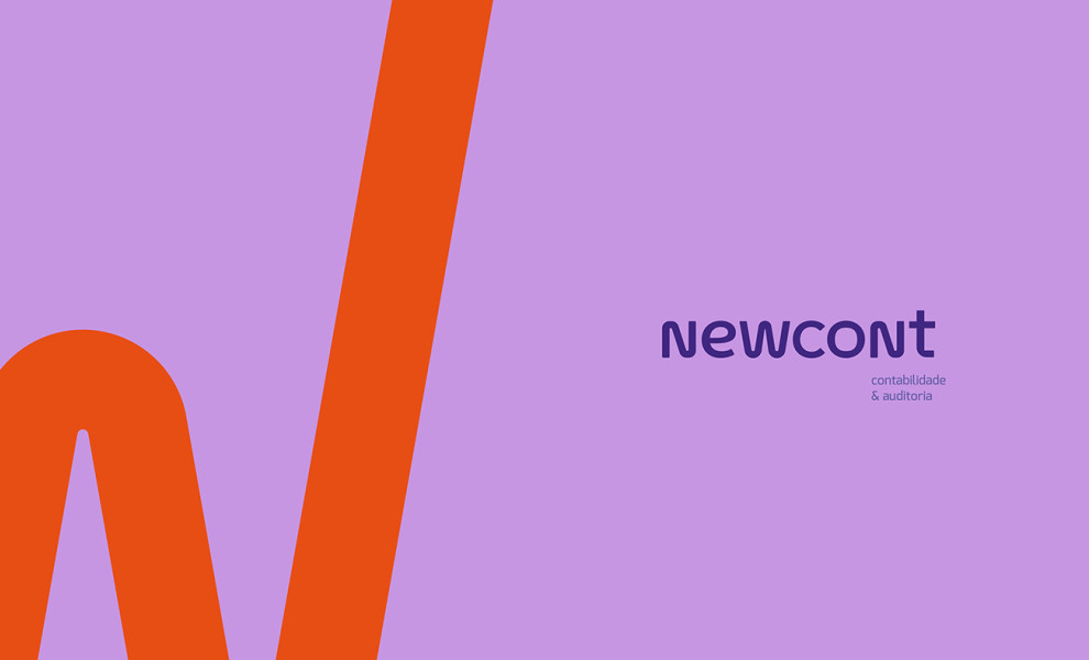
And we must say, the best thing to come out of this project is this logo design that is bright and youthful, yet professional and straightforward simultaneously (Read on how experts develop good logos for business). In other words, the perfect brand character for a modern business!
The logo features a singular illustration – the brand name and nothing else. What used to be a symbol and text ensemble has now been updated to a singular NewCont logotype that’s clean, fresh and instantly recognizable.
But what’s an excellent logotype without a touch of style? To keep up with the youthful vibe, the designers mixed lowercase and uppercase letters, a design move that can quickly look messy and unprofessional. However, they streamlined the layout by keeping all the characters aligned, uniform and cohesive in font style.