Team Behind the Design
Logo Design Analysis
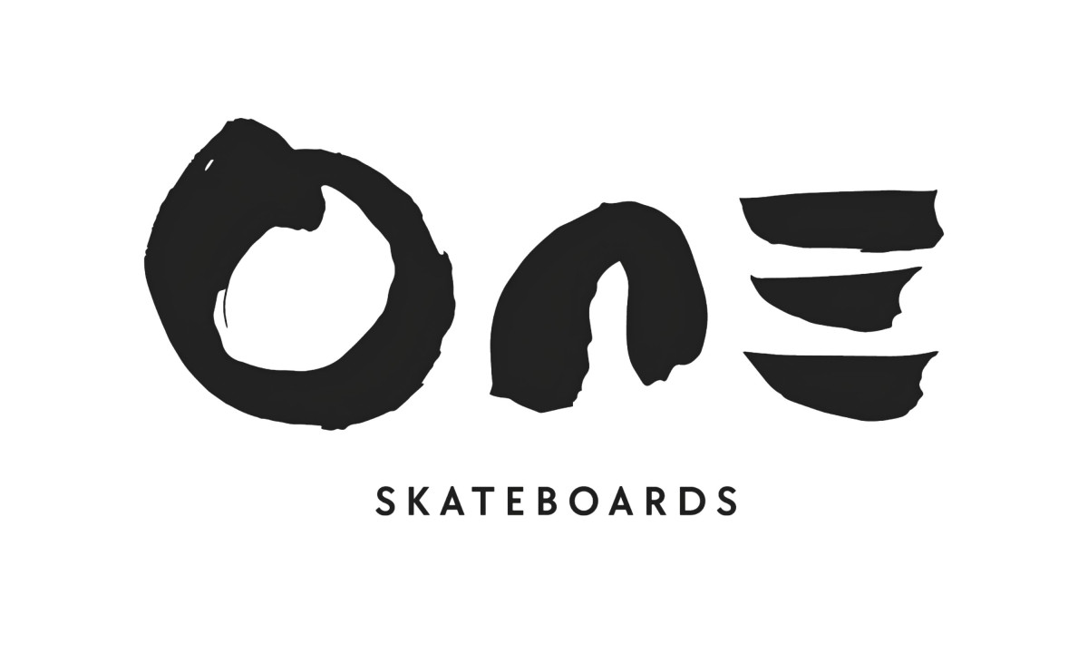
A great sports logo design captures a brand’s spirit in its simplest form. That’s exactly what WillMWCreative achieved with One Skateboards.
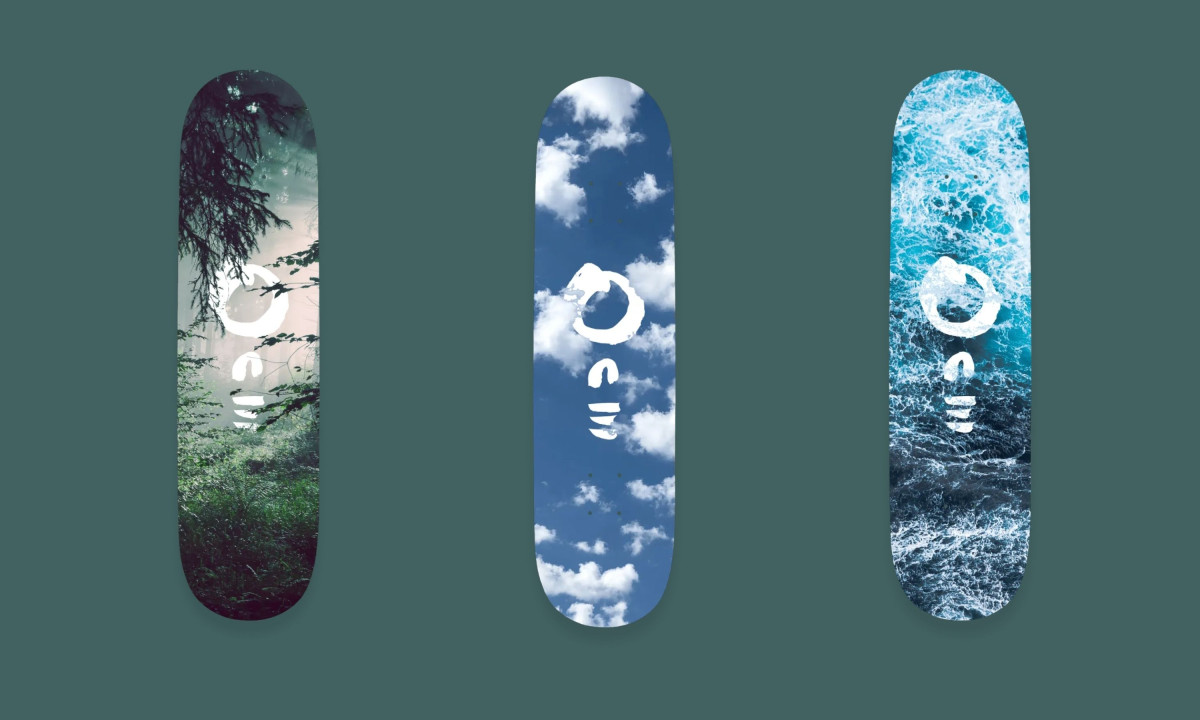
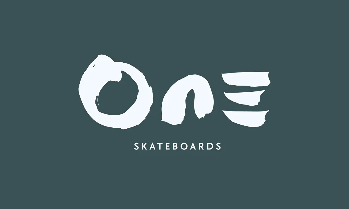
- Concept: The “One” logotype uses expressive brushstrokes that suggest motion and balance. Its circular “O” echoes the Zen enso, symbolizing unity and flow. The fragmented “N” and “E” hint at terrain and momentum, reflecting the rhythm of skateboarding.
- Symbolism: Each stroke feels deliberate, shaped by nature’s imperfect symmetry. The design captures skateboarding as both art and meditation, a movement that connects body and environment in one continuous rhythm.
- Typography: I love how the minimalist sans serif tagline “Ride With Nature” adds structure and clarity beneath the expressive mark. This restraint grounds the logo’s energy and lets the hand painted quality stand out.
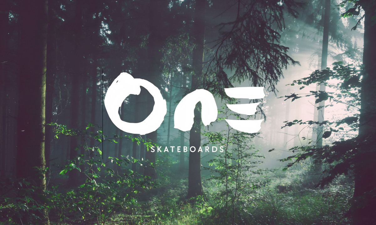
- Adaptability: The logo holds its character across materials and formats. Whether embossed on decks, printed on clothing, or used online, it stays distinct and balanced. Its contrast against textures like water, forest, or sky gives it a sense of quiet strength.
What Brands and Agencies Can Learn from One Skateboards
WillMWCreative’s identity for One Skateboards shows how minimal design can hold deep meaning through material, philosophy, and flow.
1. Build Meaning Through Simplicity
Minimalism works when it carries emotional depth. Using handcrafted brushstrokes and organic shapes turns the logo into a metaphor for balance and unity that reaches beyond the product itself.
2. Let Environment Inform Identity
Blending natural textures and real settings gives the brand an honest presence. When design connects with its surroundings, it feels alive and part of something larger, not detached from the world it represents.
3. Design for Versatility and Storytelling
A strong identity system adapts easily across mediums while staying conceptually clear. The One Skateboards logo does this well, looking equally compelling on decks, apparel, and digital spaces. The story of “Ride With Nature” stays steady wherever it appears.
About DesignRush Featured Designs
At DesignRush, we review hundreds of branding and digital design projects each month. The featured works stand out for their creativity, precision, and relevance to modern industry needs.
The most compelling projects advance to our Monthly Design Awards, recognizing excellence and innovation across creative categories.
Check out more standout work across categories:
- Best Logo Designs
- Best Website Designs
- Best App Designs
- Best Print Designs
- Best Packaging Designs
- Best Video Designs
For a full list of design agencies and related services, see our Agency Directory.