Why does the badge of one of the world's most successful football teams look almost nothing like any of its earliest crests?
The answer isn't a rebrand brief. It's 100 years of German history.
The German national football team crest, known formally as the Deutscher Fussball-Bund (DFB) logo, has been redesigned at least 15 times since the team played its first official match in 1908.
But unlike most sporting rebrands, the changes weren't driven by marketing committees or kit manufacturers.
They were driven by revolution, fascism, world war, national partition, reunification, and a slow reclamation of national identity.
This is a piece about a logo.
But really, it's about what happens when a country's most visible sporting symbol has to survive the same catastrophes the country itself barely survived.
Era 1: The Eagle Takes the Pitch — 1908 to 1929
The German Football Association — the Deutscher Fussball-Bund, or DFB — was established in 1900.
Eight years later, the national team played its first official match, losing 5–3 to Switzerland.
With that debut came the need for an emblem, and the design team reached for the most obvious source available: the heraldic traditions of the Holy Roman Empire.
1908–1912: The Imperial Eagle
The first crest featured the eagle of the Holy Roman Emperor: a crowned, double-headed bird carrying the coat of arms on its chest, with a heraldic crown and ribbon above signaling both legacy and divine sanction.
This wasn't designed — it was inherited. Germany was still an imperial nation in 1908, ruled by Kaiser Wilhelm II, and the crest reflected the state it represented.
The coat of arms repeated on the eagle's chest was deliberate, emphasizing continuity between the ancient Roman Imperial tradition and the modern German state.
The football badge wasn't trying to be sporty. It was trying to be legitimate.
1912: Stripping Back for the Olympics
By the 1912 Stockholm Olympics, the shield surrounding the eagle was gone, bringing the bird into direct focus.
The simplification coincided with one of Germany's most emphatic early victories: a 16–0 demolition of Russia.
No decorative framing, no heraldic context. Just the eagle, on its own, which read as confidence enough.
1924: The Weimar Eagle
After World War I ended the German Empire and established the Weimar Republic, the crest changed with it.
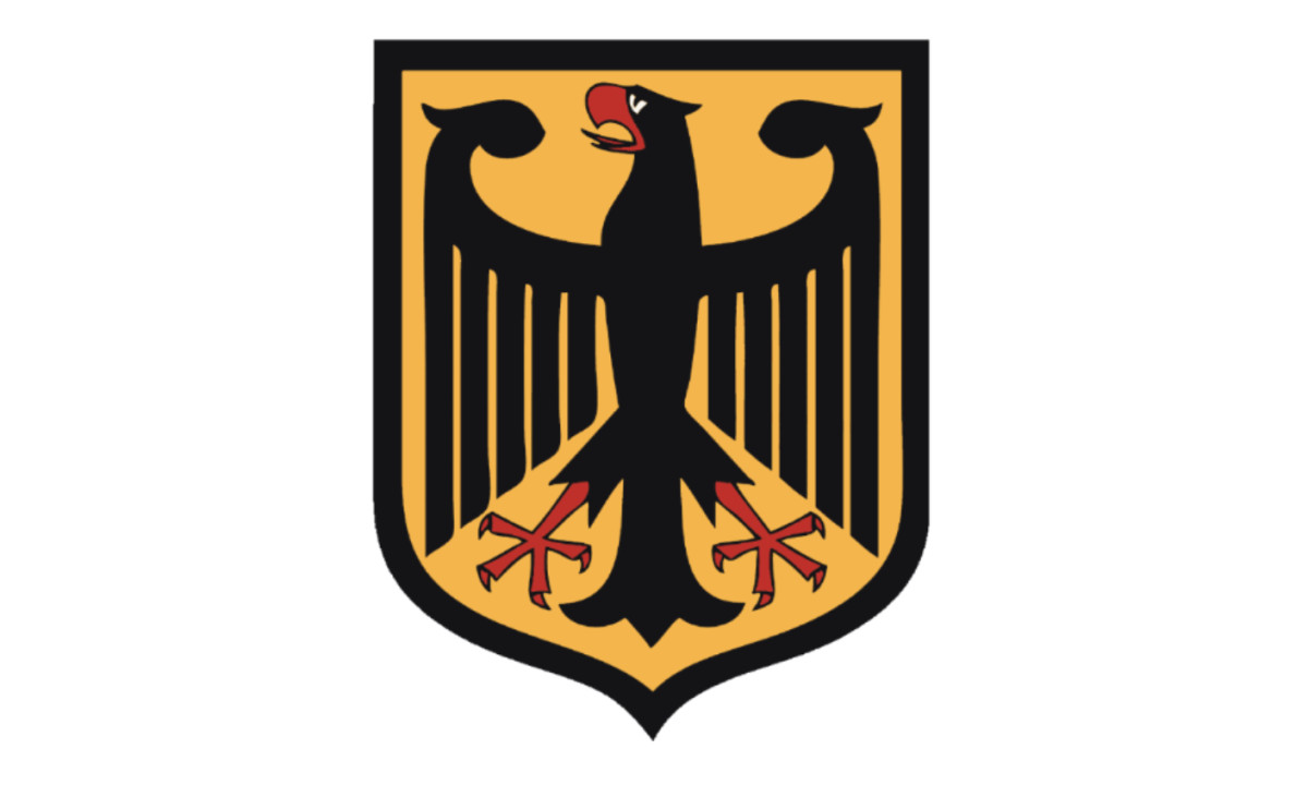
The 1924 logo swapped the imperial eagle for the coat of arms of the new republic: a black eagle on an orange shield with a red beak and claws, wings bent in what has been described as a boxer's stance.
Removing the royal crowns and dynastic imagery was a political act as much as a design one.
The new Germany was a republic, and its football badge was going to look like one.
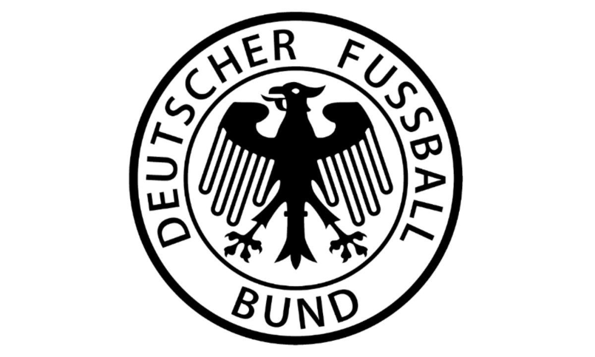
1926–1927: First Manager, New Circle
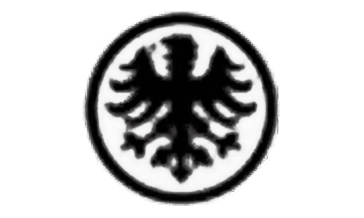
When Germany appointed its first national team manager in 1926, the eagle was placed inside a circle, the earliest sign of the circular format that would define the DFB logo for decades.
The bird returned to a more imperial styling with fuller spread feathers, a quiet nostalgia for pre-war strength even as the republic struggled economically and politically.
1927–1929: The Seal Takes Shape
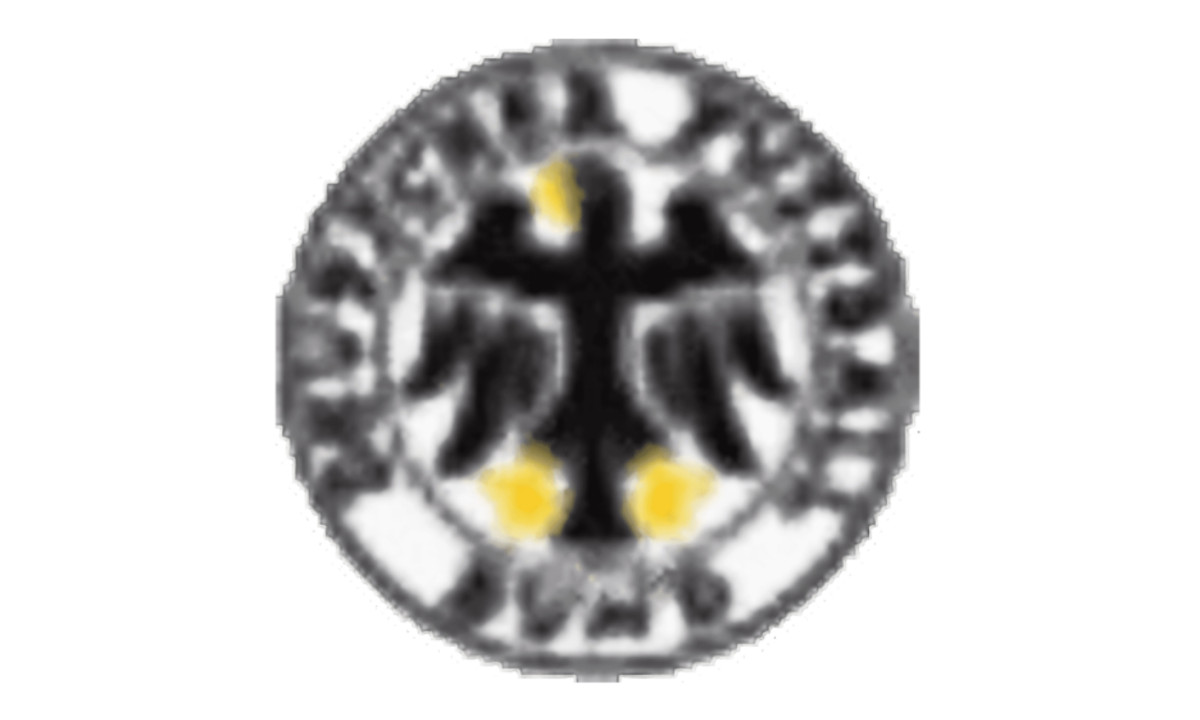
The circular border became a formal organizational seal, with the words Deutscher Fußball-Bund running around the perimeter and the eagle's beak and claws rendered in gold.
For the first time, the crest functioned as an institutional identity — not just a symbol of the state, but of the football federation itself.
This version, restrained and official-looking, marked the end of what you might call the innocent period of German football identity.
The Weimar Republic was crumbling. What came next was not a design evolution. It was a takeover.
Era 2: The Logo Under the Swastika — 1929 to 1945
No serious account of the DFB logo can look away from this era. Between 1929 and the end of World War II, the German football crest was progressively absorbed into the visual language of National Socialism.
These weren't subtle design updates. They were acts of political branding under a totalitarian state.
1929–1934: The Transition Mark
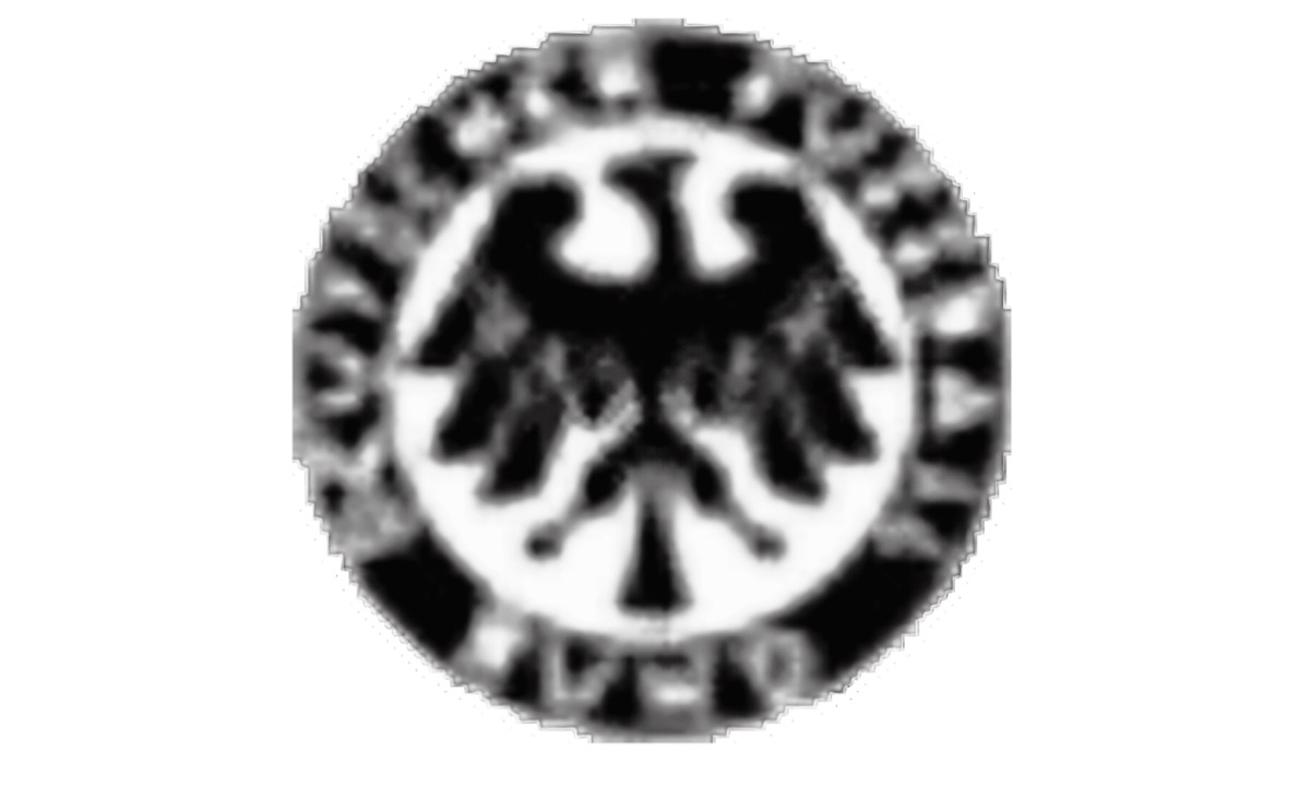
The 1929 logo moved into stark black-and-white: a heavy circular seal with thick borders and bold lettering that some have described as resembling an antique coin.
The design coincided with the dying years of the Weimar Republic and projected severity and institutional permanence at a moment when the political situation was anything but stable.
Adolf Hitler became Chancellor in January 1933. The next crest change would reflect that directly.
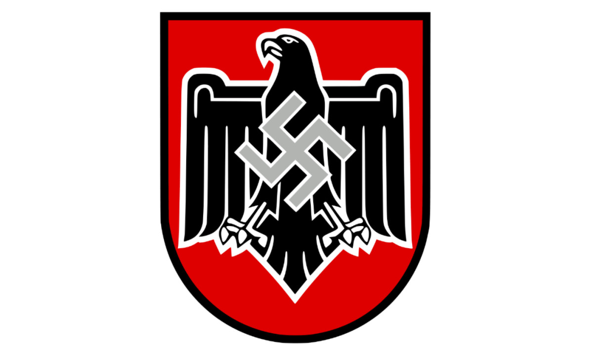
1934–1938: The Swastika Appears
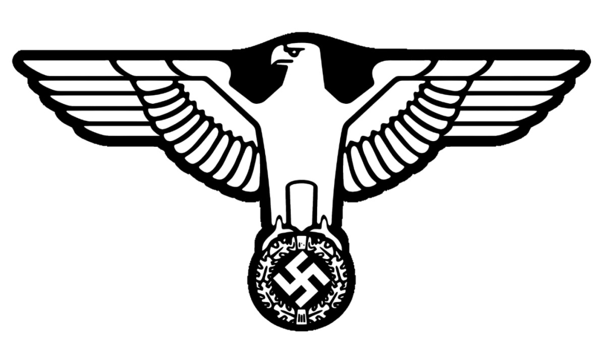
By 1934, the crest had been fully redesigned to incorporate Nazi Germany's official visual identity.
The eagle, now rendered in the aggressive forward-facing "Parteiadler" style used across Nazi state institutions, perched with outstretched wings above an oak wreath encircling a swastika.
This was the Reichsadler, the imperial eagle of the Third Reich, applied to a football badge.
Germany made its World Cup debut in 1934, finishing third, playing under this badge and under a state that used sport as propaganda.
The 1936 Berlin Olympics, held under this same emblem, remains the most documented example of sport weaponized for ideological spectacle in the 20th century.
1938–1942: After Anschluss
Following the annexation of Austria in 1938, the German and Austrian football federations were merged, and the crest updated accordingly: a black eagle on a red shield, red being the dominant color of the Austrian flag, with a swastika on the eagle's chest.
This badge represented a forcibly expanded Germany, and it carried that history into every match played under it.
By 1942, there was no German national football team in any meaningful sense. There was only war.
Era 3: Rebuilding the Badge — 1950 to 1970
When the guns stopped, Germany ceased to exist as a unified country. The post-war occupation zones crystallized into two separate states: the Federal Republic of Germany in the west and the German Democratic Republic in the east.
Each eventually fielded its own national football team, and each faced the same question: how do you rebuild national identity in sport when the last version of that identity was a criminal regime?
West Germany's answer was deliberate restraint.
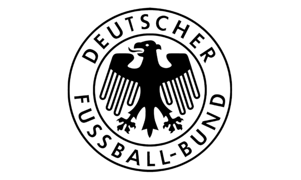
1950–1962: Returning to the Circle
When Germany was readmitted to FIFA and UEFA, the DFB returned to the pre-Nazi circular badge: the black eagle in a circular seal with Deutscher Fussball Bund around the perimeter.
No color, no aggression. A design that said we were here before all of that, and we are here again.
The restraint was the message. There was no question of keeping any element of the Nazi-era crests, but the designers also avoided anything that looked like trying too hard to reinvent themselves.
And it was under this quiet, almost anonymous badge that West Germany achieved the result that gave the nation back its soul.
On July 4, 1954, at the Wankdorf Stadium in Bern, West Germany faced the Hungarian side widely considered the greatest international team in the world, a team that had beaten Germany 8–3 in the group stage of the same tournament.
Germany won the final 3–2, Helmut Rahn scoring the decisive goal in the 84th minute.
The victory became known as the Wunder von Bern.
For a country still under Allied occupation, still processing the magnitude of what the Nazi regime had done, it was more than a football result.
It was the first moment of collective German pride that felt clean. Untainted. Earned on a pitch rather than imposed by force.
The badge on the shirts that day was barely visible. That, in retrospect, seems exactly right.
1966–1970: Shrinking the Eagle
The 1966 crest made one significant adjustment: the eagle was reduced in scale, shifting emphasis more firmly to the institutional lettering of the DFB.
The timing coincided with West Germany's run to the World Cup final, where they lost 4–2 to England at Wembley in one of the most debated matches in football history.
In the context of a country still carefully managing how much national symbolism it projected, keeping the eagle understated was a considered choice.
Era 4: The Circle Holds, Slowly Evolving — 1970 to 2008
This is the longest era in the DFB badge's history, nearly four decades of relative visual stability punctuated by incremental refinements.
The circular format held through all of it. The eagle held through all of it.
What changed, gradually, was confidence.
1970–1974: Bolder Lines
The 1970 update returned to the basic 1950 structure but with noticeably bolder stroke weights on the eagle, the circle, and the lettering.
The effect was a badge that projected more authority — apt timing, given what was coming on the pitch.
West Germany under Franz Beckenbauer won the 1972 European Championship and the 1974 World Cup, defeating the Netherlands 2–1 in the final.
The team of that era, Beckenbauer, Gerd Müller, Sepp Maier, Paul Breitner, is considered one of the greatest in the history of the sport.
1974–1978: The World Champions' Badge
Following the 1974 triumph, the crest was refined again with subtle adjustments to proportions and line weights, but nothing dramatic.
West Germany had just become world champions on home soil. The badge didn't need to shout.
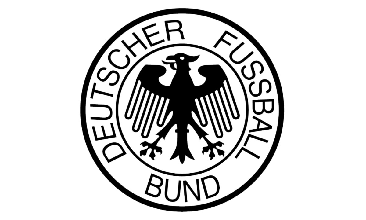
1978–2003: Twenty-Five Years Unchanged
This is the version most people who grew up watching German football in the 1980s and 1990s will recognize.
The circular eagle seal held essentially unchanged through twenty-five years that included some of the most consequential moments in both German football and German history.
West Germany won the 1990 World Cup in Italy, a 1–0 victory over Argentina settled by Andreas Brehme's penalty.
That same year, reunification brought the East and West German states back together after 45 years of division.
The East German football federation was absorbed into the DFB, and the reunified Germany inherited West Germany's football history, records, and badge.
That was a significant editorial decision — East Germany had its own history, its own legends, its own identity, and in the reunification of German football, it was the western institution that survived.
In 1996, the reunified Germany won the European Championship in England on Oliver Bierhoff's golden goal against the Czech Republic.
One badge, one country, one identity finally pieced back together.
2003–2008: Adding Color
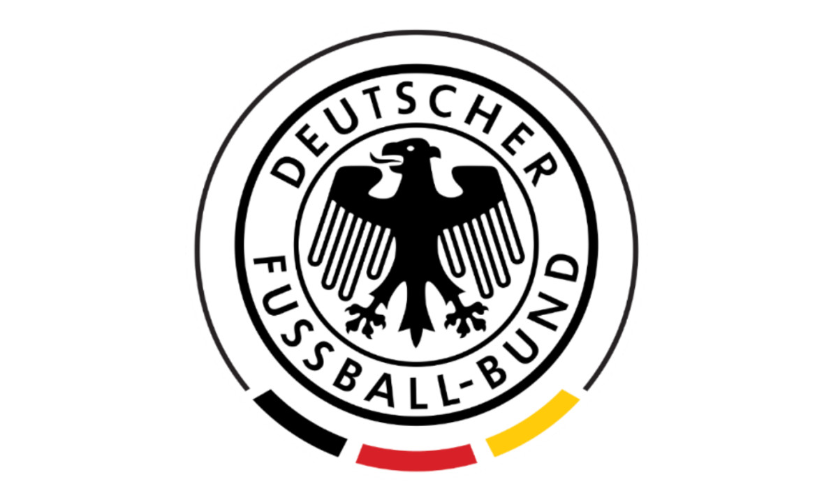
The first significant departure from the monochrome circular format came in 2003, when the DFB introduced black, red, and gold into the badge for the first time in the modern era.
The effect was warmer and more dynamic while preserving the foundational structure intact.
This version carried Germany through the 2006 World Cup on home soil, where the team finished third in a tournament widely credited with changing the German public's relationship with their national team.
Germany rediscovered football joy that summer. The Sommermärchen — the Summer Fairy Tale — it was called, and the colorful new badge was part of that softer, more celebratory presentation.
Era 5: Premium and Permanent — 2008 to Present
The last three iterations of the DFB crest represent something the earlier eras could never fully achieve: a badge carrying the weight of everything that came before it, rendered in a design language confident enough not to over-explain itself.
2008–2014: Streamlining for the Modern Era
The 2008 redesign brought the most significant structural change in decades. The circular seal format was retained, but the execution became markedly more refined: the eagle redrawn with cleaner geometry suited to digital reproduction, the black, red, and gold palette developed further, the perimeter lettering sharpened.
This was the badge Germany wore through the 2010 World Cup in South Africa, where they finished third, representing a team in transition — young, technically progressive, increasingly dominant in European qualification.
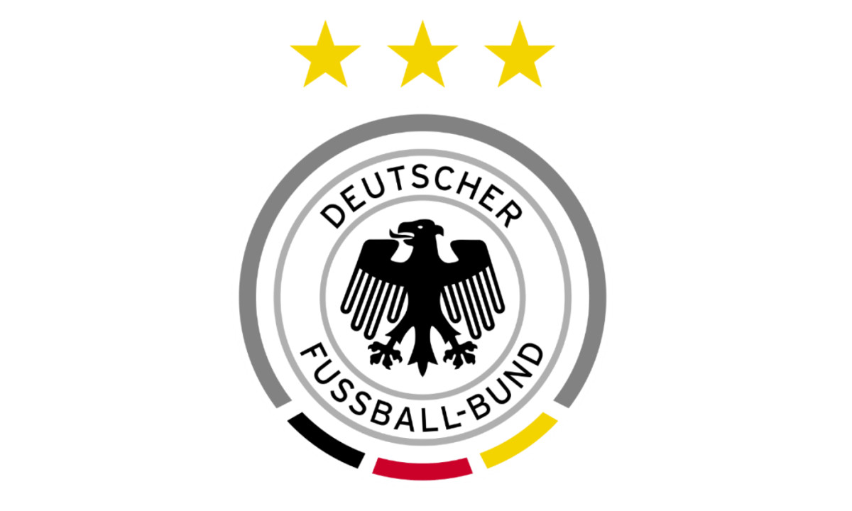
2014–2021: Four Stars
On July 13, 2014, Mario Götze scored in extra time to give Germany a 1–0 victory over Argentina in Rio de Janeiro, the fourth World Cup title and the first for a European nation on South American soil.
The tournament also produced the result that has entered football mythology: Germany 7, Brazil 1, in Belo Horizonte, in front of a stunned home crowd.
Four stars were added above the eagle after 2014, one for each World Cup triumph.
They transformed the crest's visual hierarchy — the eagle no longer stood alone at the top, the history now sitting above it.
A badge that once bore a swastika now bears four World Cup stars.
The same national symbol, the same eagle, separated by decades of catastrophe, recovery, and achievement.
If you need a single visual argument for why this logo's history matters, that's it.
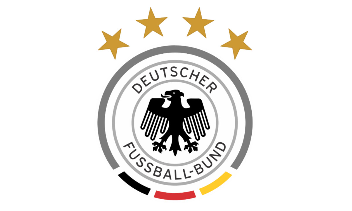
2021–Present: The Current Badge
The most recent refinement, introduced in 2021, brings further precision to the eagle's rendering and typographic details while leaving the fundamental structure intact: circular seal, heraldic eagle, black-red-gold palette, four stars above.
The DFB partnership with Adidas, one of the longest-running kit deals in international football, continues to shape how the badge appears on kits and commercial materials, the three stripes and the DFB crest now inseparable in the visual identity of Die Mannschaft.
The badge has arrived at itself.
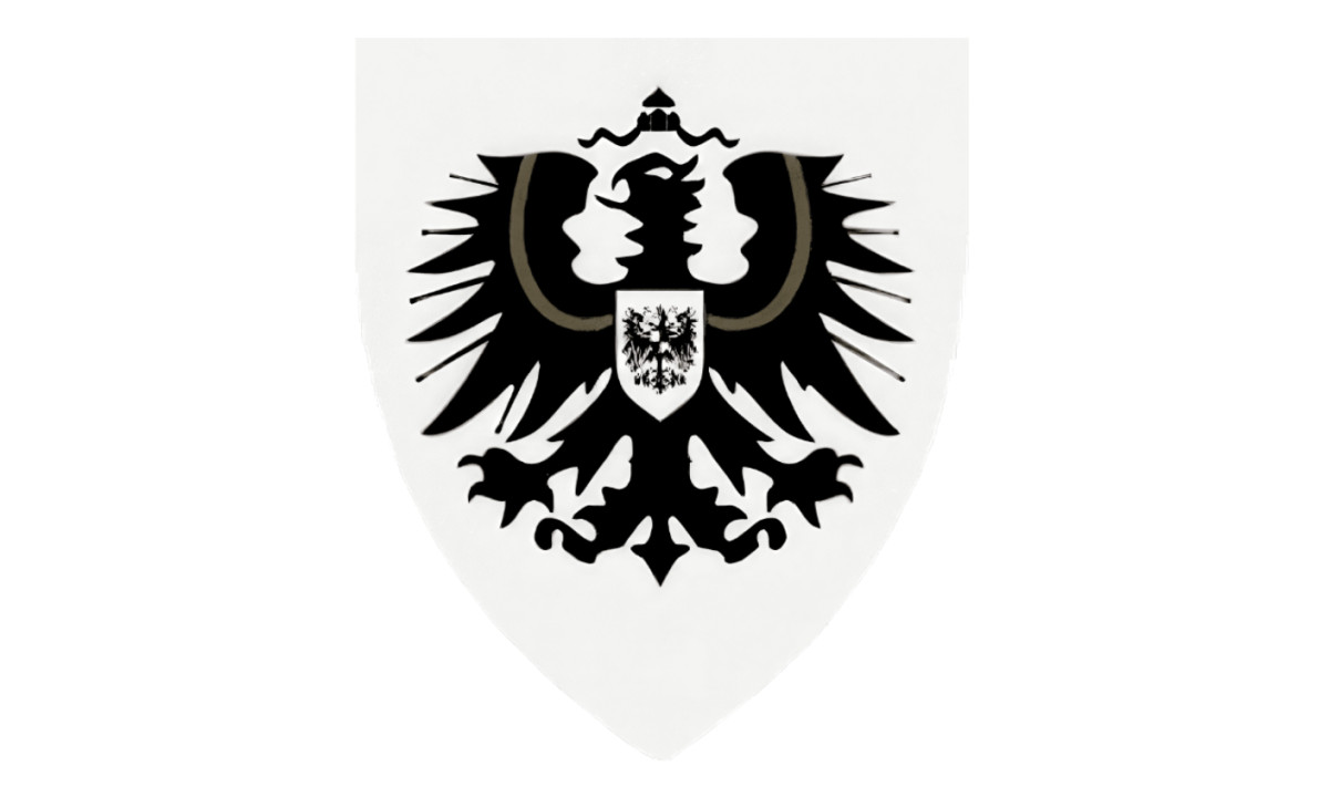
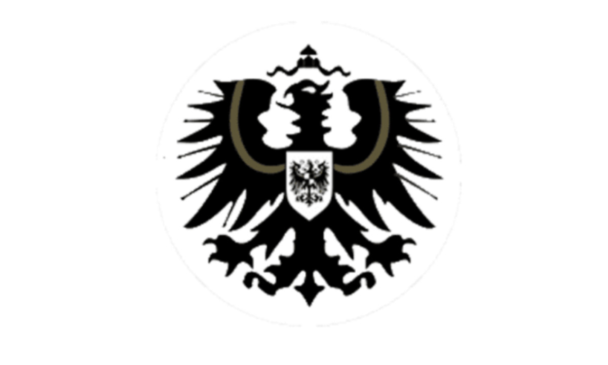
The Eagle's Symbolism: Why It Was Always Going to Be There
The black eagle on a gold or white field traces back to the Holy Roman Empire, specifically to the heraldic traditions established by medieval German rulers as a symbol of imperial authority.
It appears in the German national coat of arms today as the Bundesadler, or Federal Eagle, a direct descendant of the same symbol that appeared on the very first DFB badge in 1908.
The fact that the same bird, adapted, simplified, redrawn, weaponized, purged, and restored, has appeared on every German football badge for over a century reflects something about how national symbols survive their worst moments.
The eagle didn't belong to the Nazi regime. The regime borrowed it, as it borrowed and corrupted so much else.
Restoring the eagle to the post-war badge was an act of reclamation: taking back a symbol that predated the regime and would outlast it.

Our team ranks agencies worldwide to help you find a qualified partner. Visit our Agency Directory for the Top Logo Design Companies as well as:
- Top Sports Marketing Agencies
- Top Design Agencies
- Top Branding Companies
- Top Graphic Design Companies