Team Behind the Design
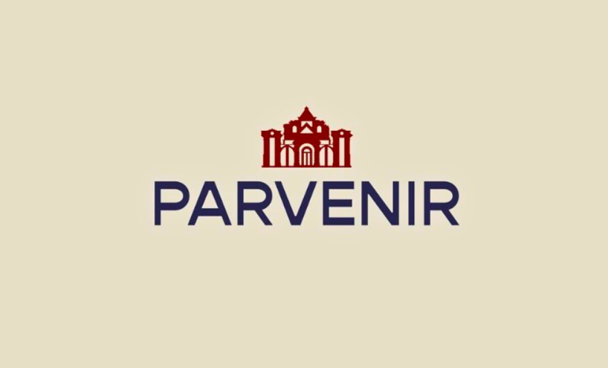
Project Brief: Create a logo conveying Parvenir’s identity with architectural heritage elements to align with its heritage restoration and maintenance services.
Logo Design Analysis
When I review logos, I often consider concept clarity, typographic balance, scalability, and brand application.
Parvenir’s rebrand by Keith Austin shows how a thoughtful mark can bridge heritage and modernity.
- Concept & Symbolism: The use of classical architectural motifs instantly connects the logo to heritage preservation, reinforcing Parvenir’s role in restoration and cultural projects.
- Typography Balance: I appreciate the choice of a clean sans-serif typeface. It adds modern contrast to the ornate symbol, keeping the identity approachable and versatile.
- Elegance in Simplicity: Minimalist execution helps the logo feel timeless. Strong forms and balanced proportions make it memorable without unnecessary detail.
- Scalability & Application: The mark holds up well in monochrome and color, allowing it to adapt across signage, print, and digital without losing character.
About DesignRush Featured Designs
At DesignRush, we review hundreds of agency projects every month. The featured designs stand out for their creativity, execution, and brand relevance.
The most compelling works often advance to the Monthly Design Awards, earning recognition among the best in the industry.
Discover more inspiration in hospitality logo designs:
- Best Logo Designs
- Best Website Designs
- Best App Designs
- Best Print Designs
- Best Packaging Designs
- Best Video Designs
For a full list of design agencies and related services, see our Agency Directory.