Houston Texans Logo Evolution: Key Points
- Brand Refresh Drives Significant Growth: The Houston Texans' 2024 logo redesign led to a 5.43% social media growth and an 5.43% increase in season-long followers, demonstrating the substantial ROI of a fan-centric visual overhaul.
- Consistency Builds Brand Equity: The Texans' consistent use of their iconic bull logo since 2000 contributed to their franchise's current value of $6.1 billion, highlighting how maintaining a steady brand identity strengthens both fan loyalty and financial performance.
- Secondary Marks Foster Local Connection: The introduction of a secondary "H" logo in 2024, reflecting Houston’s civic pride, showcases how secondary marks can diversify merchandise offerings while staying true to the core brand identity.
- Actionable Insights for Brand Managers: The Texans’ success underscores the importance of evolving branding with digital platforms in mind, offering actionable strategies for sports teams and businesses aiming to blend tradition with modern design for sustained growth.
The Houston Texans, one of the NFL’s youngest franchises, unveiled a bold rebrand and uniform overhaul in spring 2024 to reflect Houston’s vibrant spirit. The redesign fueled a social media spike post-launch and cemented a franchise value of $6.1 billion. These figures surrounding the Texans’ brand refresh demonstrate how design can elevate both fan loyalty and franchise equity.
The Modern Houston Texans Logo: Bold Contrast & Cultural Continuity
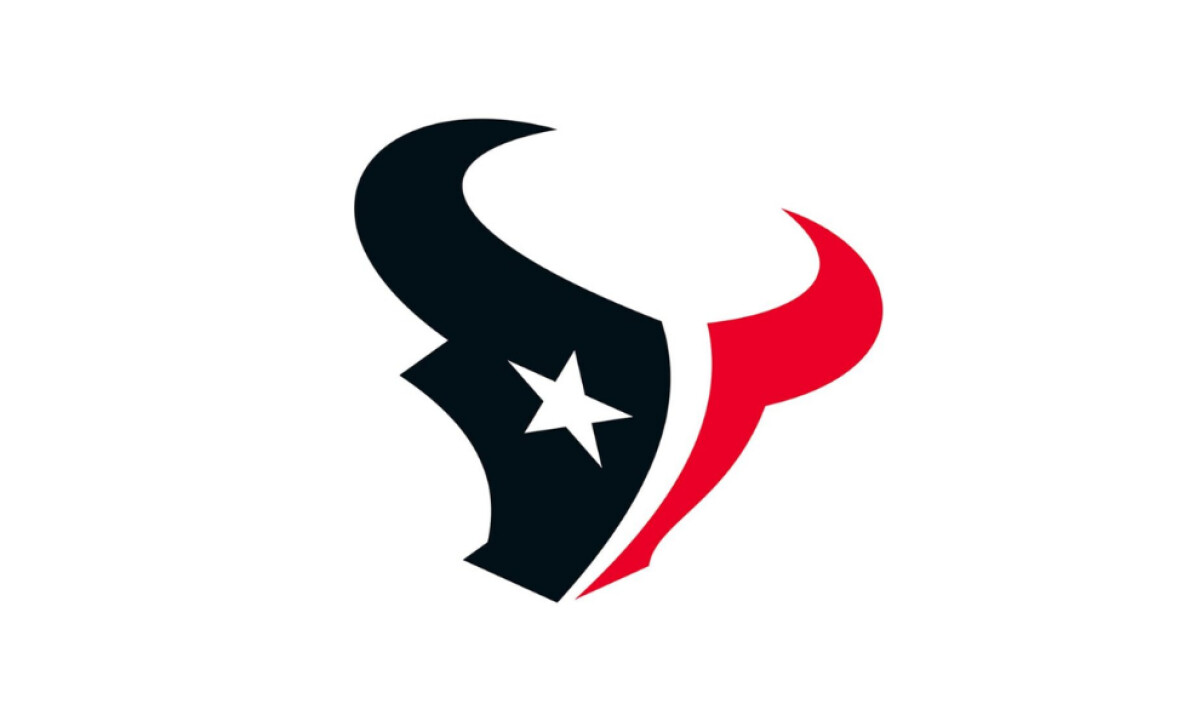
While the bull-head silhouette remains intact, new color values: a darker, near-black blue and a deeper crimson red deliver heightened visual punch across digital and physical mediums.
The updated palette ensures the logo maintains impact on LED screens, mobile devices, and uniform fabrics alike — part of a larger movement in modern sports branding.
Yet beneath the surface, the team’s identity remains deeply rooted in tradition. The five-pointed star still anchors the bull’s “eye,” symbolizing Texas pride, resilience, and independence.
The signature horn curve, echoing the Gulf Coast, has been preserved, ensuring the logo speaks to its geography and fan base. It’s a flawless evolution that connects past to present.
If you want to understand what makes a great logo, the Texans’ 2024 redesign perfectly showcases how subtle adjustments can refresh a legacy while maintaining core values.
Houston Texans Logo History
2000 - 2024: The Foundational Bull Logo
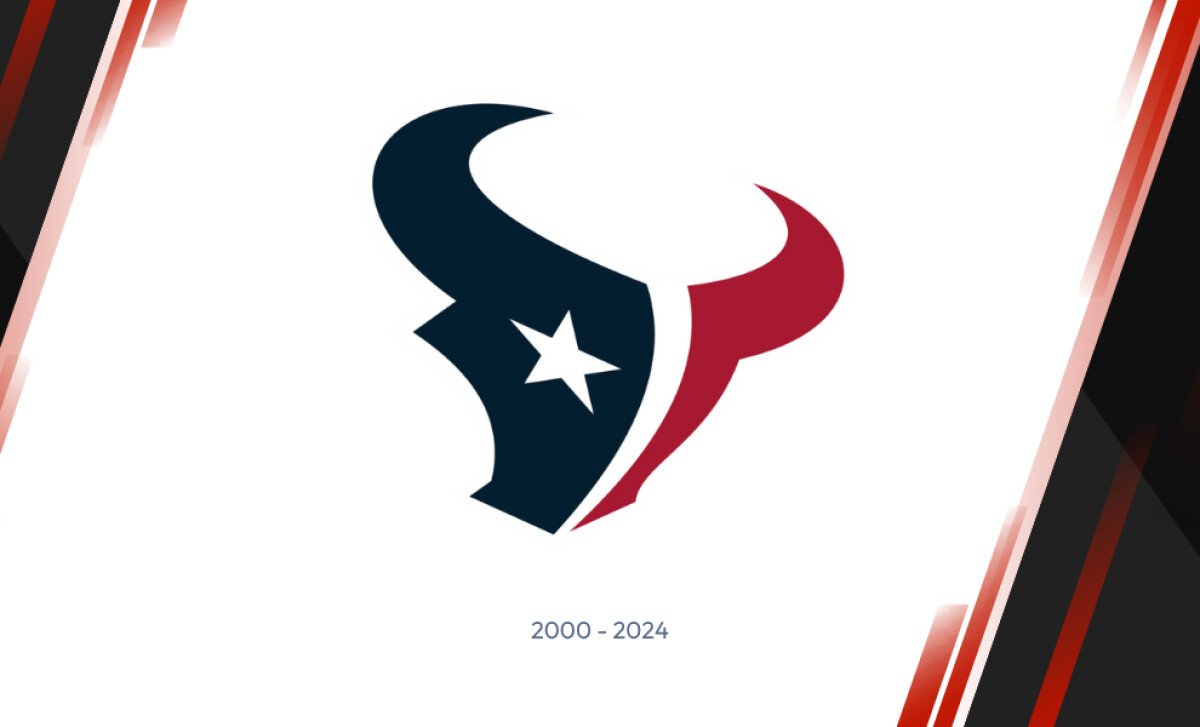
Before ever taking the field, the Texans unveiled a bold identity rooted in state pride.
Introduced in 2000, the original Houston Texans logo featured a stylized bull head split into deep steel blue and battle red, colors pulled directly from the Texas flag.
The bull’s eye, a white lone star, symbolized independence and valor, echoing the ethos of the team’s namesake. This emblem was a visual commitment to local culture and fierce competition.
Design Insight: A consistent visual identity fosters trust. Research from Lucidpress shows brands with consistent presentation are 3.5 times more likely to enjoy brand visibility.
2000 - 2024: Map of Texas Alternate Logo

The Houston Texans' alternate logo, used from 2000 to 2024, integrates the team's initials "HT" within the outline of Texas, creating a bold and dynamic visual identity.
The deep crimson and navy blue colors are consistent with the primary logo, ensuring brand cohesion, while the white star embedded in the design maintains the connection to Texas pride and independence.
This alternate logo offered flexibility for merchandise and fan gear, appearing on practice apparel and secondary items without altering the core brand.
It allowed the Texans to expand their visual presence and strengthen regional ties with fans.
The logo’s sharp, modern design and use of state symbols enhanced the team’s connection to Houston while keeping the franchise’s visual identity consistent.
Want to boost your brand’s recognition? Discover the latest logo and branding trends that are making waves in 2025
2024 - Present: Gothic "H" Emblem Celebrating Local Identity
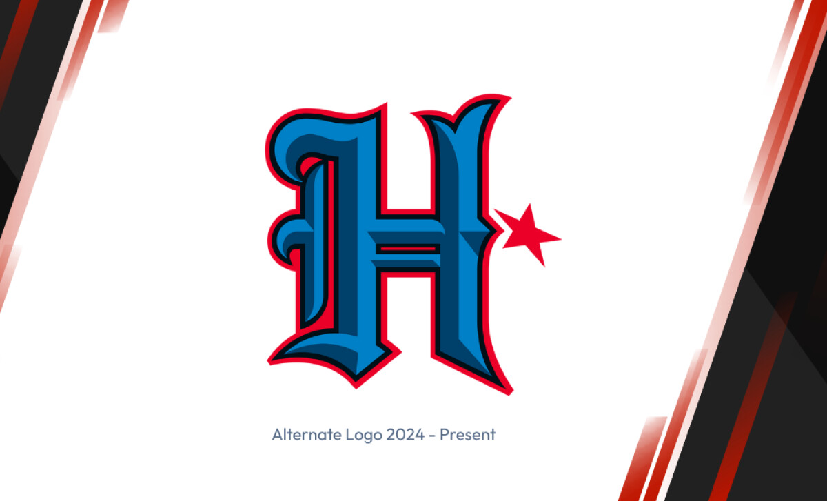
The Houston Texans' alternate logo introduced in 2024 features a bold, gothic-inspired "H" that reflects the team's strong local identity.
The intricate design incorporates rich blue and crimson hues, echoing the franchise’s primary color scheme while enhancing its visual impact.
The addition of the red five-pointed star subtly ties the logo to Texas' iconic symbolism, reinforcing the team's deep connection to its roots and pride in the state.
This new alternate logo serves as a fresh, modern representation of the Texans, striking a balance between heritage and contemporary aesthetics.
The ornate, Old English style of the "H" brings a touch of historic flair, appealing to both fans and the local community.
As a secondary logo, it offers the team versatility in merchandise and marketing, expanding their branding options without overshadowing the primary bull-head emblem.
Strategic Takeaway: Secondary marks allow teams to diversify merchandise lines and test new visual directions without altering legacy logos.
2024 - Present: A Bold, Award-Winning Brand Refresh
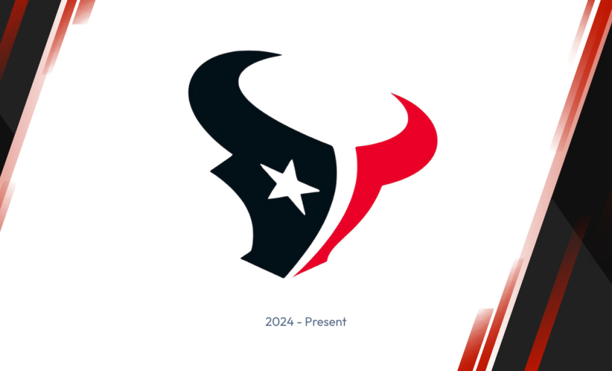
In spring 2024, the Texans launched their most significant visual update to date. In collaboration with creative agency Carmichael Lynch, the rebrand modernized the bull logo’s color palette: deep steel blue gave way to bold black, battle red deepened into a richer crimson, and white remained as a clean accent.
The redesign is not just a visual overhaul but a strategic move to better reflect Houston’s vibrant spirit, all while maintaining the recognizable identity that has defined the team for over two decades.
Carmichael Lynch’s work on the Texans’ brand refresh was widely praised for this very balance, modernizing the logo to align with contemporary design standards while honoring the legacy features that loyal fans have come to cherish.
The effort earned multiple awards in the industry, such as the 2024 Bronze Clio Awards and the bronze and silver awards for The One Club for Creativity ADC awards.
Following the public debut of their rebrand in May 2024, the Houston Texans saw:
- A 5.43% uptick in their total social media following across all platforms
- Unsurprisingly, the biggest gains came from their most visually engaging channels
- Instagram followers rose by 8.17%
- TikTok experienced a significant 31% surge through the end of the year
The Wrap-Up: Forge Tradition Through Refinement
What gives the Houston Texans logo its staying power isn’t reinvention; it’s their strategic refinement. Since the team’s inception, the Texans have stayed true to their core symbol: a fierce, lone-star-eyed bull.
Rather than chasing trend cycles, they’ve evolved deliberately, enhancing contrast and cultural relevance while protecting legacy.
Final Notes:
- Refinement Beats Reinvention: Minor adjustments, like updated color values and cleaner outlines, have delivered major returns. A 2024 redesign led to a 5.43% growth in social media followers, proving that modernization doesn’t require radical change.
- Alternate Marks Build Local Connection: The new Old English “H” alternate logo connects directly with Houston’s civic pride and cultural grit. Secondary marks like this create space for regional storytelling without compromising the core brand.
- Consistency Converts to Value: With a current franchise valuation of $6.1 billion, the Texans’ visual discipline is paying off, illustrating how long-term consistency strengthens brand equity in both fan engagement and financial performance.
Great sports logos don’t just mirror their city; they anchor identity across generations. For brands seeking staying power, the Texans’ evolution is proof that refinement, not replacement, is often the most powerful move.
The Houston Texans’ logo evolution proves that a blend of heritage and modern design can drive lasting brand value.
For sports teams and established brands, success lies in a design partner who balances tradition with innovation.
Ready to create a brand identity that evolves with your fanbase?
Our team ranks agencies worldwide to help you find the perfect creative partner. Visit our Agency Directory to discover top firms in:
You can also explore our Best Sports Logos Designs section to see more award-winning visual identities in sports.

-preview.jpg)