
The Gucci double G has survived a hostile takeover, four creative directors, a family murder, and a Lady Gaga biopic.
In 2027, it faces something it has never faced before: 1.5 billion people watching it travel at 300 kilometers per hour on the side of a Formula 1 car.
That test hasn't happened yet. But the history of what this mark has already survived makes a strong argument for how it will hold up when it does, and why the world's most counterfeited monogram has never once needed to change its geometry.
The Double G: A 100-Year Design History
To understand why the Gucci logo works on an F1 car, you have to understand why it works at all. And that story starts not with a monogram, but with a hand-lettered signature on a Florence leather goods tag.
1921: The Script
The first Gucci logo was a single word in flowing script: "Gucci" rendered in a calligraphic letterform with a dramatically looped capital G that dominates the composition.
The stroke contrast is high: thick downstrokes against hairline upstrokes, the way a steel-nib pen produces when moved with confidence.
It reads as a signature, which is exactly what it was — a craftsman's name as a quality mark, not a brand identity designed for reproduction at scale. Beautiful at one size. Difficult to stamp in metal hardware, embroider on canvas, or reduce to a button badge.
1929: G. Gucci
Six years later the logo added a capital G initial before the surname.
"G.Gucci" underlined, both elements in the same calligraphic script. A naming convention, not a design solution.
The initial and surname read as two elements rather than one unified form, and the underline holds them together by force rather than by structure.
The brand was still a single Florence shop. The problem of scale had not yet arrived.
1934: The Knight
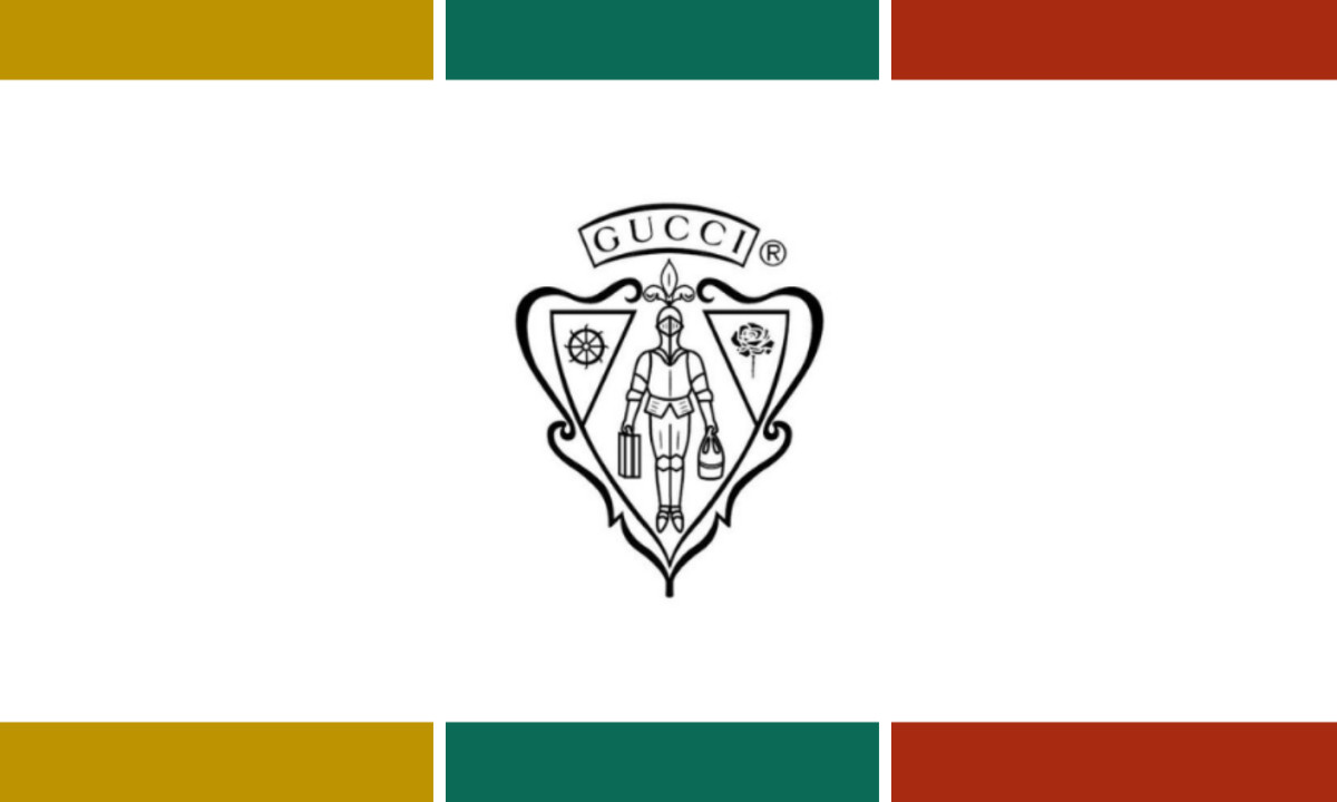
The 1934 mark is the outlier in Gucci's entire visual history.
A heraldic knight in full armor stands inside a pointed shield, carrying two suitcases, the porter elevated from hotel employee to medieval aristocracy.
Flanking the knight are a ship's wheel on the left and a rose on the right, symbolizing commercial judgment and aesthetic sense. A banner reads GUCCI in compact all-caps serif.
The mark is hand-illustrated, dense with detail, and communicates Florentine heritage convincingly at poster size. At the size of a shoe lining or belt clasp, the illustration collapses into visual noise.
It was a mark designed for one era of the brand: small, local, craft-focused. That would become a liability as Aldo Gucci began building an international empire.
1953-1958: Guccio Dies, Aldo Takes Over
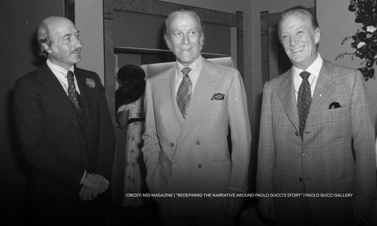
Aldo Gucci served as chairman from 1953, following his father's death.
He opened boutiques in New York in 1953, London in 1961, Paris shortly after.
Jackie Kennedy was photographed carrying Gucci bags. Grace Kelly wore Gucci loafers.
The brand was becoming American celebrity currency, and its visual identity needed to keep pace.
The knight crest stepped back. It was reduced, moved to a secondary position beside a clean, spaciously tracked sans-serif wordmark. G-U-C-C-I in open capitals, light and modern.
For the first time the name itself, as typography, was doing the primary identity work. The shift from illustration to letterform as the primary carrier of brand meaning is the most significant design decision Gucci made before the 1990s.
1960s: Aldo Designs the Double G
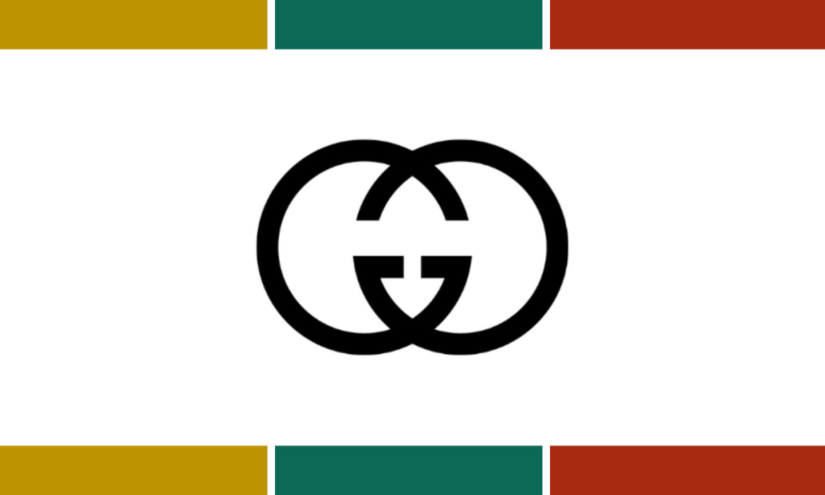
The 1960s saw the introduction of the double G logo.
Aldo Gucci designed the interlocking GG motif in honor of his father, intending it to represent the links of a bracelet.
Two capital Gs, mirrored, interlocked at the curved terminal of each letterform. It appeared first on leather hardware — embossed on metal closures, buckles, and clasps. Not yet a logo. A signature mark.
The double-G monogrammed canvas fabric arrived in 1969 in a diamond-pattern repeat of the interlocked monogram on coated cotton.
That move changed everything. The mark was no longer a hardware detail seen only on close inspection. It became the product surface itself.
Within years of its introduction, it was being counterfeited. The market had voted on which Gucci mark had value before the company had formally designated it as the primary identity.
1971: The Serif
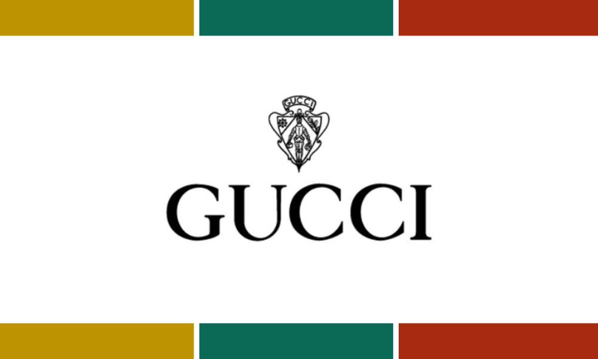
The sans-serif gave way to a serif wordmark in 1971, the knight crest repositioned above the logotype.
The letterforms are heavier and more traditionally proportioned. There's tighter tracking, stronger stroke contrast, explicit reference to Italian typographic heritage.
The identity system was coherent and clearly positioned in the heritage-luxury register. It was also still carrying a 1934 illustration that had been designed for a different era entirely.
1980-1986: The Family Destroys Itself
The logo held. The family did not.
In 1980, Aldo's son Paolo Gucci attempted to launch his own fashion line using the Gucci name.
Aldo disapproved and sued his own son. At one board meeting the tension turned physical: Aldo and Paolo came to blows, and when Maurizio tried to break up the fight, he was punched in the face.
Seeking revenge, Paolo tipped off the IRS about the family's tax schemes.
In 1986, Aldo was sentenced to a year in prison for evading more than $7 million in personal income taxes.
That same year, Maurizio fled to Switzerland to avoid separate prosecution after Aldo accused him of forging his father's signature to avoid inheritance taxes.
The man who designed the double G was in prison. His nephew was in exile. The brand's visual identity was stable. Its ownership was not.
1992-1995: The Mark Outlasts the Family
By 1993, Maurizio's mounting debts had forced him to sell his remaining shares to Investcorp.
For the first time in 72 years, no member of the Gucci family owned a piece of Gucci.
The year before, the interlocking GG had finally been formalized as the brand's primary logo, decades after Aldo designed it, and long after counterfeiters had already made the decision for them.
The 1992GG is bold and geometric: thick circular strokes, two letterforms interlocking at their openings, the negative space between them forming a third implied shape.
It solved every problem the knight crest and the script signature never could.
Two years later, Maurizio was shot dead outside his Milan office. His ex-wife had ordered the killing. She was convicted in 1997. It was the final severance. The family gone, the company in outside hands, the name belonging to no one who carried it by birth.
The brand survived because by then it didn't need them. The double G was already more recognizable than the people whose initials it was made from.
1998-2004: Ford Strips It Down
Tom Ford had been reshaping the brand since 1994, and his 1998 logo reflected a company that had survived murder, imprisonment, and a hostile takeover. His response was reduction.
The GG disappeared from the primary mark entirely, replaced by the wordmark alone: G-U-C-C-I in a refined, widely spaced serif, nothing above or alongside it.
Every trace of the family's turbulent history, cleared. Just the name. Ford's logic was that by 1998, the name was enough.
2015-2022: Alessandro Michele
When Ford and his CEO Domenico De Sole departed in 2004 following a dispute with Kering over creative control, Alessandro Michele eventually took the helm in 2015 and reversed course entirely.
Pattern, embroidery, flora, fauna, historical references — the GG returned, but now competed with everything placed alongside it.
In 2019 Michele introduced a second GG variant: both letters facing the same direction, overlapping rather than mirroring, rendered in solid fills.
The brand ran two monograms simultaneously. The GG survived the maximalism. It also survived being multiplied.
Where the Double G Goes Next
Fashion logos do not belong on race cars. That is the premise every luxury brand has accepted for decades, and it explains why, in 74 years of Formula 1 history, not one fashion house has ever held a title partner position.
The fear is legible: a mark built for boutique walls and shopping bags loses something when it gets placed on a carbon fiber sidepod doing 300 kilometers per hour.
It looks borrowed. It looks out of register. It looks like a logo that does not know where it is.
On May 27, 2026, Gucci decided the double G was strong enough to find out.
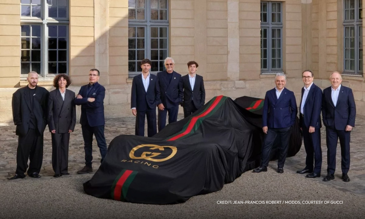
Alpine confirmed that Gucci will become its title sponsor from the 2027 F1 season.
The team races as the Gucci Racing Alpine Formula 1 Team — the first luxury fashion house title partnership in the sport's history.
The multi-year deal is estimated at $50-60 million per year, and from the first announcement imagery, it is clear this is not a sponsorship in the conventional sense.
The announcement imagery is unambiguous: black base, gold overlapping GG at sidepod scale, the red-and-green web stripe running the length of the car.
The complete Gucci identity system, not a simplified motorsport adaptation. Every element present. The web stripe is there. The gold-on-black hierarchy is there.
That is a brand confident its visual system can survive translation wholesale.
Why the Geometry Holds
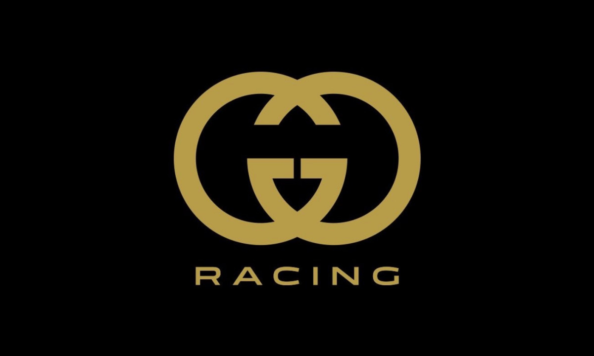
A century of creative directors, family collapse, and ownership changes raises an obvious question: what is it about this specific mark that holds? The answer is structural.
Two capital Gs face opposite directions and interlock at the curved terminal of each letterform.
At that junction, both letters share space without either subordinating the other. The result reads as a single unified form. Most monograms resolve the two-letter problem through superimposition or size hierarchy.
The GG resolves it by giving both letters equal territory and a shared contact zone. That is why it reads at belt-buckle scale, at storefront scale, and at 16 pixels on a browser tab without modification.
The form's identity lives in the negative space of the interlock, not in the details that miniaturization eliminates.
Fashion, racing, or wherever the brand goes next: the geometry does not change. That is the only thing about Gucci that never has.