UIDO’s Voka Logo Design Uses Minimalism And Geometry To Combine Custom With Contemporary
Voka is a contemporary takeaway coffee experience for the Indian market. The brand is available in the country’s major cities and builds its unique identity by serving quality brews at affordable prices.
Behind their logo and branding is UIDO, a product and graphic design agency with offices in Florida and Argentina.
UIDO’s approach to Voka logo design incorporates local tradition and contemporary coffee culture to form a unique market position for the brand.
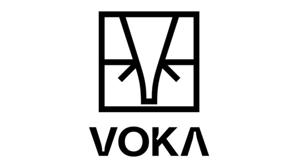
These three pillars of Voka’s brand are present in separate logo elements: the inner “V” shape which serves as the brand’s logotype, the geometric depiction of the elephant’s head as the cultural link to Voka’s origins and the square frame as the geometrical component that keeps it all grounded.
This intelligent amalgamation of different symbols doesn’t take away anything from the logo’s minimalist, typographic totality. It’s made from nothing but straight lines and sharp angles yet it represents the contrasting concepts of culture and modernism.
This shows that much thought was put into the development of this iconography, and how logo designers can skillfully blend contrasting elements to create a conceptually-rich logo.

The Entrepreneurial Spirit Of Voka Logo Is Aimed At Urban And Millennial Demographics
Voka’s coffee houses are generally found at the heart of metropolitan areas and business districts. The brand’s customers are mostly city-based millennials and office-going commuters.
India’s big cities are both cosmopolitan and heavily influenced by long-standing local customs. Therefore, Voka’s logo design needed to reflect this dualism in order to resonate with a culture that embraces modernity and tradition.
The outcome is an innovative and decidedly spirited brand identity whose logo speaks to the entrepreneurial mindset of Voka’s work-bound customers. People from India as well as anywhere else in the world can relate to it in equal measure.
The Voka Brand Identity Takes Cues From India’s Ample Tradition
Voka made sure their brand identity doesn’t end with the logo. To soften the logo’s sharp geometrical design, UIDO tapped into India’s rich tapestry of patterns. The country’s iconic paisley pattern is given a contemporary shine and is arranged in an orderly sequence on Voka’s cups and packaging.
The pattern’s curvatures in vibrant colors stand in stark contrast to the logo’s boxy and monochromatic appearance. The same design approach and discipline apply to packaging and marketing collaterals.
Rather than divert the consumer’s attention from the logo, this visual segment complements the Voka logo perfectly. Together, they make a whole that tells the story of the brand’s origins and points to its global future.

The Simplicity Of Voka Logo Design Easily Blends In While Also Standing Out
The major perk of a monogram-style logo is that it doesn’t require a specific setting or a platform to look at its best. Branding experts often use them because they are timeless, adaptable, and visually impactful across various platforms.
Voka logo design is a 2D, vector-based image that delivers just as well as a print on a T-shirt as it does on any digital platform.
The creator makes this very apparent by placing the Voka logo in a variety of media. From its original setting on coffee packaging to billboards, bus stop panels and mobile apps, the Voka logo looks as intended.
The fusion of different constituents makes Voka logo open to different interpretations: the elephant head can also be seen as a square with arrows, while the trunk is also the “V” in the brand’s name.
The original logo doesn’t come with any lettering, but the version with the brand name uses clean, sans-serif typography that is readable and simple to replicate on different platforms. The font’s only quirk is the incorporation of the elephant’s trunk in the “V’s” and “A’s” negative space.
UIDO’s Voka Logo Blends Custom and Contemporary, With An Affordable Cup Of Coffee
Voka logo design is a successful rendition of cultural meets global to appeal to modern-day coffee drinkers.
UIDO agency proves that Voka’s logo design and brand identity can be firmly rooted in the representation of India’s heritage while keeping up with design trends of the current market.
As Voka stands out for “its quality and affordability”, their logo had to deliver an even greater message – the three pillars that make this important backbone.
By combining geometry and modern minimalist design to create a profusion of symbolism, UIDO has succeeded in bringing a very local coffee takeaway brand closer to its target audience.
In doing so, Voka logo captivated the global market with a stunning example of a job well done – translating hundreds of years of history into a present-day brand whose name we’ll be seeing more of in the future.


