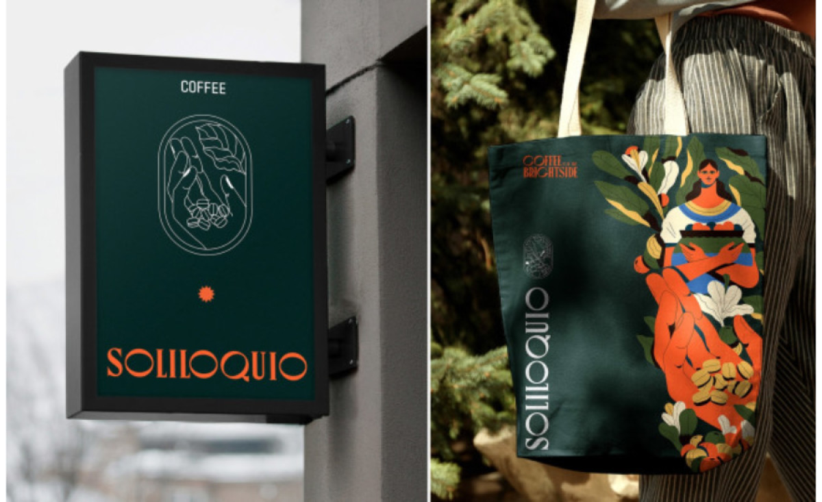
Standout Features:
- Striking color combination
- Classy typography
- Traditional illustrations
Soliloquio, a new Colombian coffee brand created in the heart of the country's coffee zone, was designed to conquer the European markets, starting from Berlin, Germany.
When designing the whole brand identity, Imigrante Estudio focused all their efforts on the so-called "The Brightside", or the hopeful light at the tunnel we now know as the "pandemic". The resulting brand is a reminder that what builds your reality is not what happens to you, but what you do with those things that happen, it's a constant invitation to actively seek new opportunities.
A Soliloquio is a discourse that a person keeps with oneself as if thinking aloud, fed by what is part of his daily routine. It's a complete mental wandering between problems, solutions, and daydreaming. The entire graphic proposal and the logo design, its crown jewel, were based on the visual representation of what could be the Soliloquio of a peasant who picks coffee in the middle of the Colombian mountains.
The lettermark, on the other hand, is less rooted in fantasy but keeps a robust auto-reflective note with its classy typography that unites both traditional and modern design trends.


