Monogram’s Logo Design Uses Minimalism To Communicate Class And Exclusivity
As a company that creates and sells exclusive kitchen appliances, Monogram boasts a tasteful and contemporary-looking logo that reflects the brand’s visual identity, position and values.
With a tagline of “Redefining the world of luxury appliances,” the look and feel of Monogram products are supported by three main pillars of construction: materials, performance and ownership.
Monogram’s logo design serves as the first point of contact with prospective consumers. As the company targets a high-end market segment, its logo oozes exclusivity and elegance, resembling the design of some fashion brand logos.

Monogram Logo’s Golden Hue Design Can Shift To Monochrome Without Losing Value
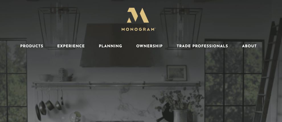
The primary color of Monogram’s logotype is a delicate golden shade, as used on the company’s slick website.
The gold color signifies grandeur, triumph, prosperity and glamour – something that’s out of the ordinary, not an everyday experience.
In the context of Monogram’s logo, the color is meant to reflect not only the products’ up-market aspirations, but also the quality of craftsmanship.
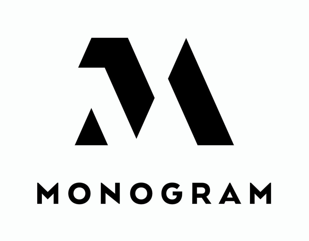
Having a monochrome version of a logo is almost obligatory in the corporate world and Monogram’s logotype doesn’t lose any of its meaning or substance in its black and white version.
Devoid of golden hues, the logo’s simple lines really come to the forefront and demonstrate the effectiveness of its shape.
The “M” consists of thee geometrical forms and the empty space is integrated in such a way that the “M” is evident at a first glance, despite the slightly abstract nature of the image.
The sharp edges of the logo indicate a technology-oriented brand, although this use of pointy design is not so uncommon in other industries as well.
Monogram Logo’s Typeface Signals A Contemporary Kind Of Luxury
The word “Monogram,” creating a unified image with the “M” logo, uses a sans serif typography.
This breaks away from the usual serif fonts that traditionally symbolize upscale products. The font and the arrangement of letters in a brand name is an important part of a brand’s visual identity because it can impact consumers at first glance.
Monogram keeps its typography simple while considering its unique position in the market and the values the brand communicates: that of modern, high-end product. The brand’s forward-thinking personality is evoked in the line weight, the spacing and the overall uppercase style of typography.
Monogram’s logo showcases transparency and visibility as it invites consumers to see and feel the brand. The highly legible typeface is all about being clear-cut, to-the-point and specific.

The Logotype And Typography In Monogram’s Logo Can Be Used On Their Own
The abstract and minimalist “M” and the sans serif “Monogram” complement each other beautifully in their style and simplicity – but they can also be used on their own.
This is the big success of this particular logo design: the two elements work together seamlessly and form a logical whole, but taking away one from the other doesn’t hurt the message or the brand.
Depending on the use and the need for different publications and purposes, the company may resort to using “Monogram” or just the “M.” This is particularly useful for various business elements and stationery such as memorandums, business cards, print publications or public branding.
The brand’s identity is so recognizable and engrained within both logotypes that using these separately doesn’t harm their marker visibility, as they remain easily distinguishable among their target audience.

What Is Monogram?
Monogram is a producer of luxurious and upscale kitchen appliances. Their products fall into three distinct categories: cooking, refrigeration and cleaning.
The company also has two separate collections – a minimalist collection and a statement collection. The former relies on “simple elegance,” while the latter relies on a more common “traditional style.”
The brand’s mission statement is contained within the About Us page:
Monogram performed extensive research before putting pen to paper on our latest designs. After careful consideration, we developed three main pillars to support our new look and feel: Materials, Performance, and Ownership. Each of these upholds our commitment to high quality, innovation, and our ongoing relationships with designers and consumers. Through these pillars and our new collections, we've created a luxury brand experience that you can see and feel for yourself.Monogram’s Logo Design Illustrates A Prestigious Brand In Striking Simplicity
By definition, a logo is a visual representation of branding and a symbol of a business’s identity.
As such, the Monogram logo design succeeds in delivering imagery that sticks into the minds of those who it is intended for.
It is memorable and is able to convey the overall feel of the company’s wide scope of upscale kitchen appliances.
Both the company’s mission and the logo on which it is based go beyond making unique products: Monogram’s array of services include first-class maintenance and setting up the connected kitchen environment, powered by Internet of Things technology.
Monogram seeks to provide a traditional household space with cutting-edge design and upgraded, almost futuristic functionality.
A break from the typical logo design for this particular niche was necessary to communicate this shift in perspective. Today’s modern lifestyle dictates a different way of preparing food. This in turn informs new requirements in which appliances should accommodate modern needs.
Monogram’s logo design is different in the sense that it breaks the mold and steps into the realm of ultra-luxurious goods, giving the whole segment a more prestigious aura.


