Team Behind the Design
- Agency: ARIOM Design
- Client: Swift
- Category: Logo - Travel
- Location: Chicago, Illinois, United States
- Project Brief: Design a travel app logo that communicates speed and personalization while remaining friendly, memorable, and adaptable across digital and outdoor environments.
In reviewing travel app logo design, I often focus on whether functionality and personality are balanced.
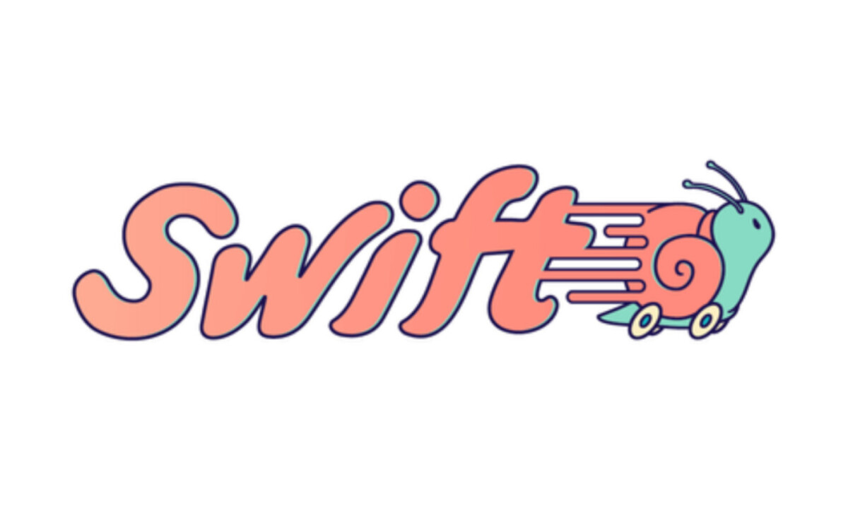
The Swift logo succeeds by using typography, symbolism, and color to communicate speed and trust without feeling cold or purely technical.
- Typography & Motion: Motion feels embedded in the custom script wordmark rather than added afterward. I like how the extended speed lines are built directly into the letterforms, which makes the sense of movement feel inherent to the brand instead of a visual effect applied on top.
- Mascot Concept: Choosing a snail as the mascot creates an unexpected but effective contrast. I find this inversion memorable and slightly humorous, using a traditionally slow symbol to communicate speed in a way that feels more distinctive than the arrows or map pins common in travel branding.
- Color System: The coral-forward palette adds warmth and optimism to the identity. I like how those tones soften the navigation experience, while cooler greens and dark outlines keep everything readable and structured across different contexts.
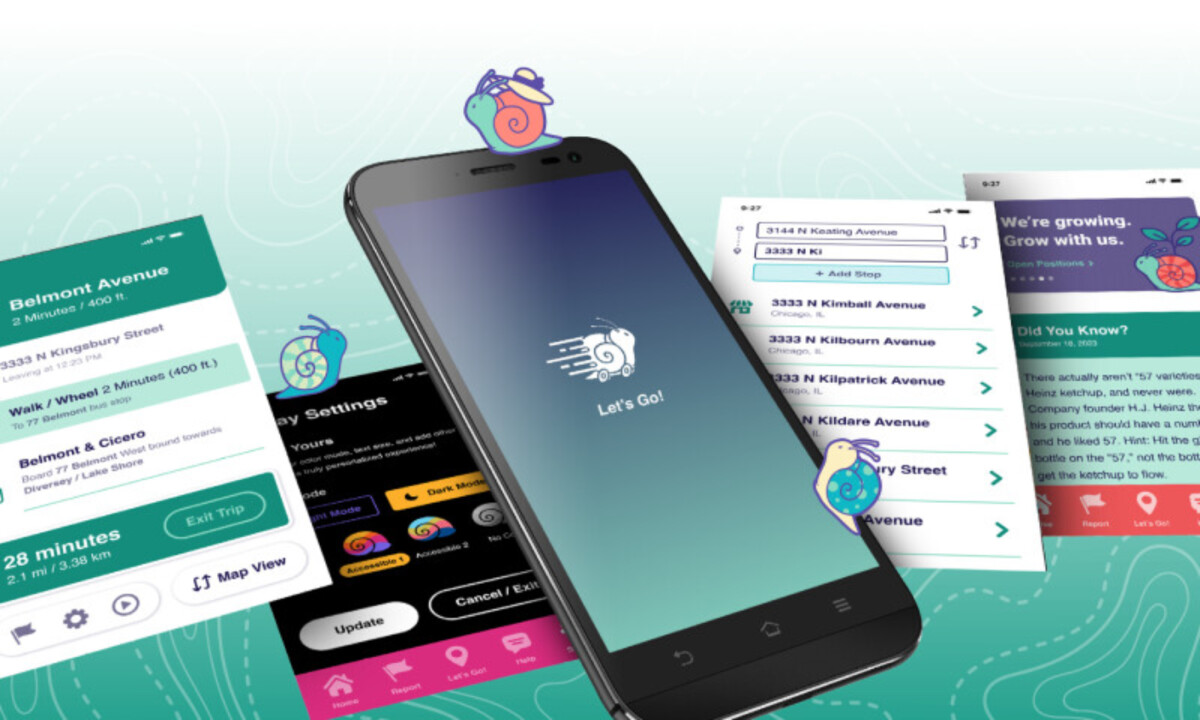
- System & Scalability: Beneath the playful look, the system feels well-controlled. I find that clear construction rules and consistent spacing help the logo stay recognizable from small mobile screens to large advertising formats without losing balance.
- Application Readiness: Seeing the identity applied across onboarding flows and promotional materials strengthens its credibility. I appreciate that the logo works as part of a larger system, shaping the interface and experience instead of sitting apart from it.
What Brands & Agencies Can Learn from Swift
1. Personality Can Differentiate Utility Products
Introducing character and humor into functional categories like navigation helps brands feel more human and memorable without sacrificing clarity.
2. Build Motion Into the Design Itself
Expressing movement through typography and form creates stronger brand signals across static and digital environments.
3. Playfulness Still Needs Structure
Even expressive logos benefit from clear construction rules and usage guidelines to ensure consistency at scale.