Standout Features:
- Black and white
- Modern typography
- Stag illustration
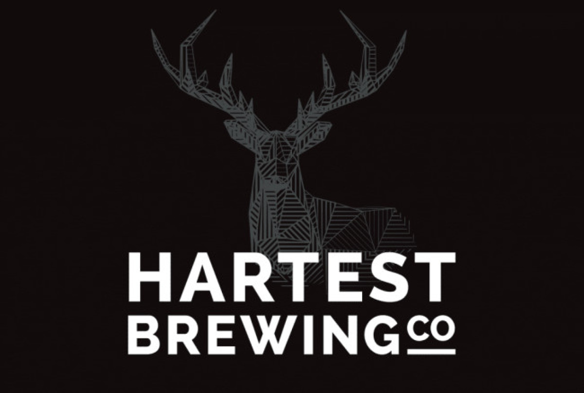
Designer Rik Barwick created The Hartest Brewing Co.'s logo with a monochromatic color scheme for that sleek and timeless feel. Black and white colors in brewery logo designs help the brand exude an elegant impression and drive more focus on the product itself.
The brand name in white sits on a black background with an enchanting stag illustration at the center. This simple yet attention-grabbing element makes the beer bottle stand out on shelves.
Get a chance to become the next Design Award winner.
SUBMIT YOUR DESIGN


