Standout Features:
- Unique, futuristic lettermark
- Strong blue and black color contrast
- Versatile and easily scalable design
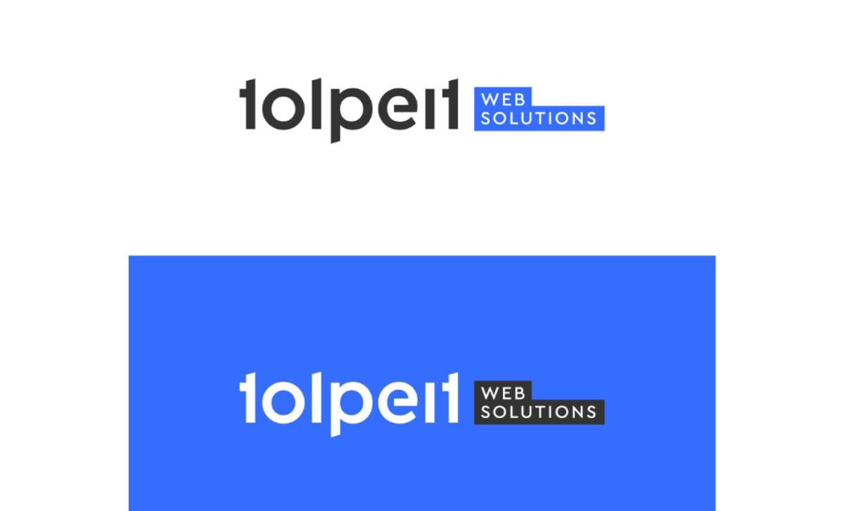
For over 15 years, Tolpeit Web Solutions in Bruneck, South Tyrol, has been helping businesses with web development, SEO, and online marketing. It needed a logo that felt as modern and skilled as it is. So, unicat designed a professional lettermark logo that aims to show off Tolpeit's innovative approach and deep expertise.
What really makes this logo clever is the lettermark itself. The name "Tolpeit" is in a clean, geometric sans-serif font. But look closely at the letters: they’re a unique sans serif that have unconventional elements such as its half crossbars. This makes the logo unique and memorable yet still highly readable.
The colors used in the logo also make a strong statement. Often, you'll see the black "Tolpeit" text on a bold blue background. Blue is a common color in tech because it makes you feel trust and security. The black text looks sharp against it, giving a modern, professional vibe.
Another great thing about this logo is how well it adapts. Because it's clean and simple, it looks good in small formats or larger contexts, like on a social media icon or on a website respectively. You’ll see it looks sharp and professional no matter where it’s used.
What you see in the Tolpeit Web Solutions logo is a strong, professional image. Unicat used a distinctive lettermark, a trustworthy color scheme, and a highly scalable design. This all comes together to tell you that Tolpeit is a reliable and innovative partner for your web development needs.