Team Behind the Design
Logo Design Analysis
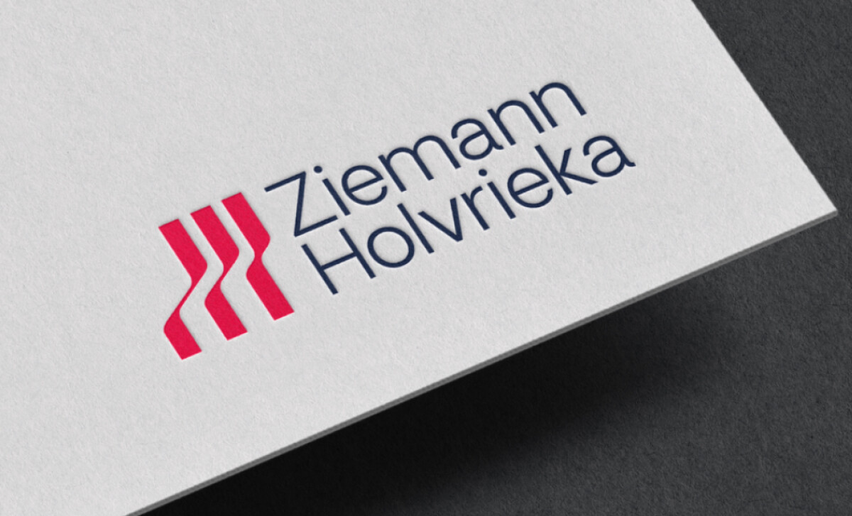
Manufacturing logo designs work best when precision feels natural, not forced. And I've found Ziemann Holvrieka’s design to show just how to do that...with confidence.
- Concept & Symbolism: The red monogram of three curved bars is smartly done. It feels engineered but still dynamic. It's a subtle nod to movement, process, and precision. I like how it introduces energy without relying on cliché industrial motifs.
- Typography: The clean sans-serif typeface is generously spaced and feels modern. It balances the bolder, colored icon and ensures legibility across different platforms.
- Color Palette: The combination of vivid red and deep navy is very effective. It's professional and high-contrast, which fits well within industrial design aesthetics.
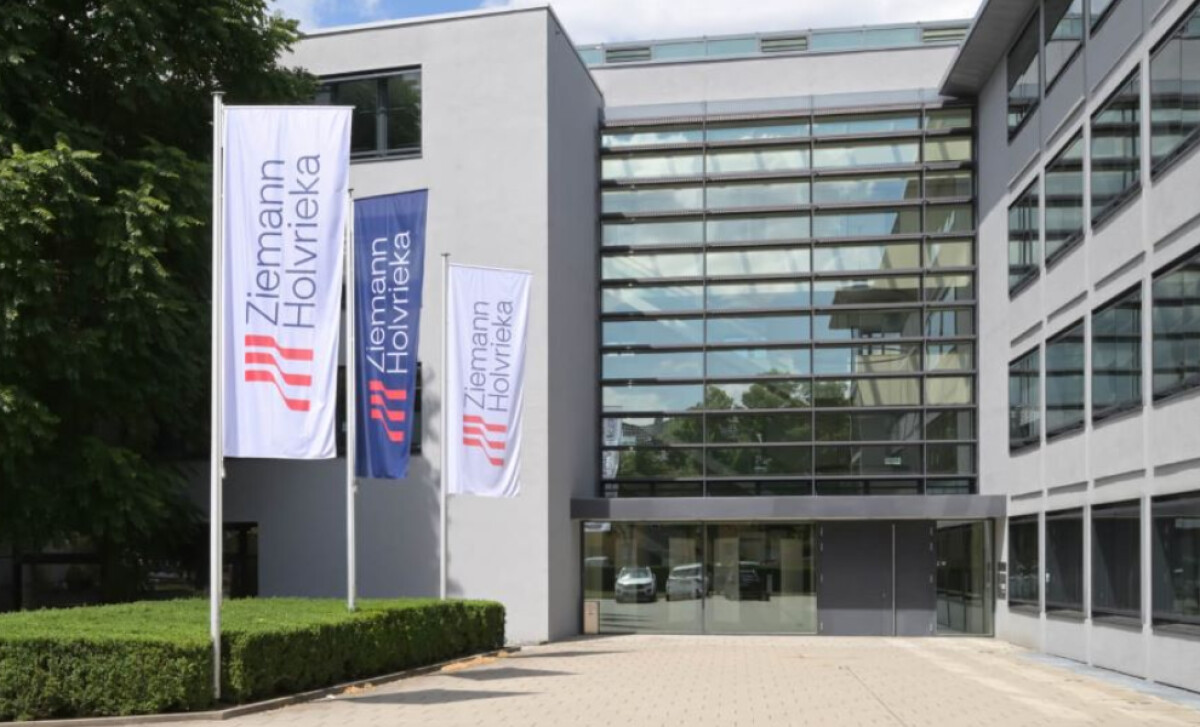
- Application & Scalability: The structure holds up everywhere: on screens, documents, and large-scale signage. I appreciate when a logo this minimal still feels distinct in every context.
What Brands & Agencies Can Learn from Ziemann Holvrieka
This logo provides a strong blueprint for any brand in the industrial sector.
1. Represent a Process, Not a Product
For a technical brand, a logo doesn't need to show what you make. It can represent the process behind it, or as a baseline, connect to your industry. This abstract approach also often creates a more sophisticated and modern identity.
2. Use Color to Show Duality
A two-color palette is an effective way to communicate a brand's dual nature, like pairing a vibrant color for energy with a darker one for professionalism.
3. Test Your Logo at Every Size
A great industrial logo must be as clear on a massive sign as it is in a tiny digital icon. Designing for extreme scalability from the start is essential.
About DesignRush Featured Designs
At DesignRush, we review hundreds of agency projects each month. These standout works showcase creativity, technical execution, and brand alignment across industries.
The most exceptional designs advance to be recognized as Monthly Design Awards winners, celebrating design excellence and innovation.
Discover more exceptional brand identities and visual design projects:
- Best Logo Designs
- Best Website Designs
- Best App Designs
- Best Print Designs
- Best Packaging Designs
- Best Video Designs
For a full list of design agencies and related services, see our Agency Directory.