“Design is intelligence made visible.” — Alina Wheeler, branding consultant and author
What causes you to purchase one brand over another? What catches your eye most in a sea of products on store shelves?
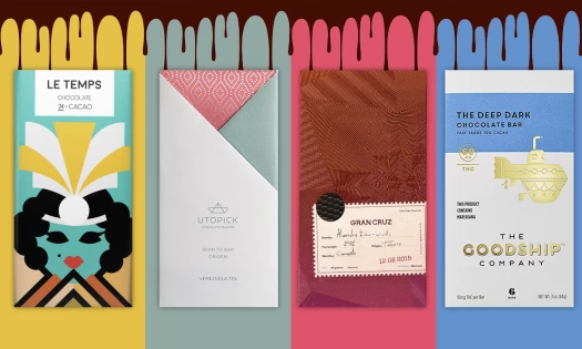
From chocolate bars to shampoo bottles, package designs matter. Believe it or not, they can make or break your brand. That’s why it’s wise to explore the services of professional packaging design companies. With that said, let's dive into the best creative packaging designs you can use for inspiration.
Packaging Design Importance?
The best packaging designs give consumers a sneak peek into what they can expect from your product. They grab attention and convince consumers to make a purchase.
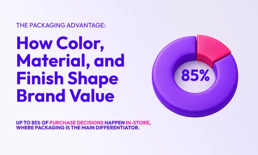
Aesthetics really do matter when it comes to the purchasing power of your product. If your product isn't wrapped in visually captivating and professionally designed box packaging from a packaging design company that demands attention and exudes authority, then your product will continue to line shelves while others fly off of them. Packaging design plays a crucial role in attracting customers, conveying your brand message, and influencing purchasing decisions.
What Do Consumers Search For In Packaging Design?
A recent study by Fast Co. Design found that there are four types of emotionally compelling content that consumers search for in a product or brand: Funny, useful, beautiful and inspiring.
If you can incorporate these elements into your designs, you’re already well on your way to making an impact that will leave users wanting to take your product home with them.
Wondering what goes into creating a package design that pops?
Look no further than the list below.
23 Best Package Designs For Instant Inspiration
- Green Gate London
- Woolf Sung Scotch
- Seed and Bean
- Public House Wine
- Säde Schnapps
- Absolut Vodka
- Jose Cuervo 222
- Thelma’s Treats
- Glossier
- Clutch Bodyshop
- Brooklyn Candle Studio
- Mr. Smith Shampoo and Conditioner
- Meow Meow Tweet Lip Repair Balm
- Ciderie Milton
- Corte Vetusto Mezcal
- Beau Cacao
- Owl & Dog Playbooks
- Stillhouse Whiskey
- Nutmeg and Hive
- Made With Local
- Dr. Feelgood Frozen Pops
- The Salvaged Wick
- Golden Bone
1. Green Gate London

These colorful and sophisticated health and beauty products look like they belong on display on a fireplace mantel — not shoved into the back of a medicine cabinet.
Dark and sleek, Green Gate London’s packaging starts out as a cylindrical tube encased in a shiny black exterior. And it’s this background that really helps the exquisite gold logo pop.
The gold foil and the funky font really add a majestic feel to this packaging as a whole.
But it doesn’t stop there.
Settled in the bottom half of this packaging is an intricate and colorful illustration of flowers, herbs and other greenery that emphasizes the all-natural and organic qualities of the product itself.
The package designers knew what their target audience was looking for and they gave it to them in this design.
More gold foil outlines these packaging design ideas and perfect symmetry brings all of the elements on this packaging together with simple sophistication.
And an added bonus? The founder individually places each of these labels on the products herself. Talk about caring about your brand!
2. Woolf Sung Scotch

This package design for Woolf Sung Scotch is definitely dark and mysterious — capturing the true essence of whiskey itself.
The bottle is wrapped in a clever and carefully created label, with intricate and deep illustrations of man and wolf on the front, and a sophisticated map on the back.
The label around the neck of the bottle gives vital information about the making of the whiskey, providing just enough information to keep you informed while also leaving some to your imagination.
There’s a definite air of majesty and regalness to this packaging and it continues with the box that holds the bottle. A matte black box with a simple metal plated etching of the brand name holds this whiskey in dark splendor.
This design really emphasizes secrecy, and it works. If you’re looking for a sophisticated bottle of scotch, you’ve come to the right place.
3. Seed and Bean

Simple, soft and fun, these Seed and Bean chocolate bars really capture the organic and homemade qualities of the chocolate.
These vegan chocolates start out with a matte paper covering in a variety of colors based on the flavor. Their lavender dark chocolate is wrapped in a lavender-colored wrapping, their chili and lime is wrapped in a lime green and so on.
It’s soft, elegant and all natural.
One of the first things to pop out at you is the logo design — a curly and fun cursive font that spells out the brand name. And underneath this wordmark is a collection of multi-colored circles, all taking on shades of complementary colors that work well with the background of the packaging.
For instance, lavender dark chocolate utilizes circles in a range of different purples to make it stand out.
Beneath the logo is a bit more information including the flavor, the amount of cocoa and the style of chocolate. These words and phrases are stacked on top of each other and alternate colors.
This chocolate bar package design is bold, balanced and fun.
4. Public House Wine

This modern and playful boxed wine package design really makes you want to pour yourself a glass of the good stuff.
Public House Wine was brought to life when three friends wanted to create a wine that was less intimidating to drink — and they nailed their goal with this fun and exciting package design.
The boxes are easy to carry and come in colors that correspond to the wine — burgundy for red wine and blue for white wine.
The colors are bold and bright, instantly grabbing your attention. The two other colors central to the design on both boxes is a dark blue and a bright white which tie the design together as a whole.
These creative packaging ideas are fun and full of life, providing fellow wine drinkers with an easy to carry box and cups to drink out of. The graphic designers really took their audience into consideration with this one.
The boxes utilize fun shapes to highlight key features — the type of wine, the way it was sourced, and the brand name as well. It’s fun and eye-catching, to say the least.
The typography is bold and uses space and alignment well. This package design certainly fosters a sense of community and friendship, urging people to share a glass with friends.
5. Säde Schnapps

Exquisitely in touch with nature and the world around us — Säde Schnapps embodies the all-natural wonders of the world in its package design.
Much like the liquor itself which comes from all-natural ingredients to match the restaurant dishes it pairs with, these design concepts also understand the importance of being true to nature.
You can see this in the sophisticated and elegant illustrations of greenery and natural formations that line the stark white labels.
The overall aesthetic is simple and minimalistic, only using the colors black, white and grey. The typography and layout also follow this simplicity, using Nordic elements as inspiration.
The lowercase, sans-serif font highlights purity and simplicity, bringing drinkers in.
There’s a beautiful balance of modernity and minimalism in these designs — from its simple color scheme and typography to its intricate designs. You don’t want to pass these schnapps up.
6. Absolut Vodka

Absolut Vodka is stepping up its package design game with its latest gift pack design which is sleek, colorful and fun.
Structured, playful and modern — these new boxes mix a bunch of design elements to create a design that engages, inspires and definitely gets you in the spirit to drink.
Each box has a bottle-shaped opening to give you a sneak peek at the vodka that sits within. And then the matte black box is covered with a range of multi-colored triangles, squares and splashes depending on the vodka flavor.
The typography is simple, bold and to the point. You see the signature Absolut Vodka logo in uppercase, sans-serif font. And that’s all that is necessary because it’s the bottle itself that takes center stage.
This package design really emphasizes the fun nature of the gift itself — the perfect box to get the party started.
7. Jose Cuervo 222

Jose Cuervo is having fun on its 222nd birthday with a playful new package design.
These limited edition bottles use religious and historical figures as characters to add life to the designs.
Each character has their own tale that is displayed beautifully and vividly on the front of each bottle. The color balance and symmetry of these designs does justice to the legacy of Jose Cuervo and its roots.
Using bright colors, and clever designs, these bottles make a clear and powerful statement — Jose Cuervo knows where it came from and is dedicated to preserving its history and the people, places, and stories that have helped shape it into the brand it is today.
One design is centered around a heart showing the birthplace of this tequila. Another design is centered around a devil creature, which is in line with the overall brand identity. Another bottle highlights the importance of music with the depiction of a musician.
Each design was carefully created to feature an aspect of the brand, and it sells.
8. Thelma’s Treats

Eating cookies just got even more fun with the Thelma’s Treats Oven Box.
Embodying its humble and homey roots, Thelma’s Treats brings cookies and ice cream sandwiches to consumers across the country. And when you order the oven box, you’re in for a playful surprise.
This package design quite literally replicates an oven. Using a clever cardboard design, the package designers at Thelma’s Treats created a miniature oven to house these warm and delicious cookies.
To access the cookies, you have to pull them out like you’re pulling out a sheet of freshly baked treats.
The colors used here aren’t your typical oven colors, of course. Instead, they draw inspiration from the brand itself, using deep browns and bright blues. The colors carefully balance each other while also adding a delightful contrast to the overall design.
This is a truly creative and innovative design that makes you feel at home when you get your hands on it.
9. Glossier

Simple, minimalistic and sophisticated — these three words can describe Glossier package designs as a whole.
This makeup line is targeted at a younger, millennial audience. That means they have to embody current trends like minimalism and simplicity to grab attention.
And Glossier goes all in, trying to exude as much simplicity and ease-of-use as possible across all of its product — most of which include a simple shape, minimal copy and little color.
This package design is unique because it is very text-light and utilizes a lot of empty space. It’s not messy or full. It’s not chaotic or busy.
The text gives all the necessary information and the colors create a light and brightness that gives off a very sophisticated and youthful vibe.
These skincare and makeup products are certainly items you want to keep in your arsenal — even if it’s just to look at.
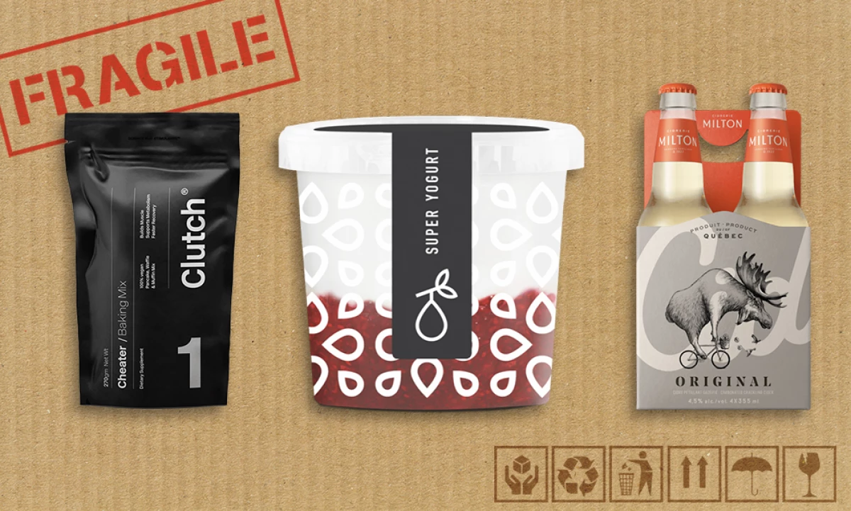
10. Clutch Bodyshop

These health and fitness supplements really do make a statement with their simplicity and minimalism.
Clutch Bodyshop specializes in health and wellness programs to inspire people to live their best and healthiest lives. And they emphasize simplicity and elegance through their designs as you can see here.
Simple, sans-serif font makes up most of the typography on the packaging. And the use of big, bold lettering immediately grabs your eye.
This, plus the integration of big numbers— sometimes in silver foil, really brings your focus to what matters, which is how these products can make your life better. And the monochromatic color scheme emphasizes the importance of keeping your routine clean, healthy and pure.
The orientation of the design is also interesting. The words and number are printed sideways causing consumers to tilt their head and get a closer look. This is a distinct style choice that makes an impact.
These products by Clutch Bodyshop are sleek and memorable. And considering the number of health product on the market today, it’s a good thing that these stand out in a positive way.
11. Brooklyn Candle Studio

These Brooklyn Candle Studio candles are sophisticated and elegant — the perfect little tin to show off on an end table, decorative shelf or mantel.
These pocket-sized tins are a matte gold, with a white label wrapped around, giving it a clean and simple look. The brushed gold tin is the perfect backdrop for the simple and minimal copy adorning the label.
In lowercase font, you see the name of the candle, as well as its ingredients. But the copy is extremely minimal, which makes for a soft and subtle look.
But it’s the design on the lid of these tins that really steals the show. Depending on the scents in the candle, an intricate black and white illustration embodies it.
From flowers to fruits and greenery — these delicate illustrations make these candles pop.
Modern, elegant and minimalistic — these candle package designs are truly works of art.
12. Mr. Smith Shampoo and Conditioner

Everyone loves a good shampoo and conditioner — and when their packaging looks this good, how can you resist?
Taking advantage of the minimalistic design trends that have been taking the world by storm, these simple bottles are both pretty and effective.
When you first look at these products, you see a strong, powerful and angular bottle design. The sharp squareness of these bottles gives off very authoritative vibes, and the cleanness of the overall design adds to that.
The bottles themselves are a bright, clean white with minimal copy in a dark black coloring.
At the center, you have the Mr. Smith brand name in a sans-serif font followed underneath by the product. At the top by the lid, you have a small illustration of the logo — an S inside a circle. Along the bottom, you have the phrase, “A Product By Mr. Smith” in a similar, miniature font.
This design exudes excellence in its clean simplicity. And the box that this bottle is encased in follows a similar design — only instead of a black font, you have a bright gold font.
If you’re looking for a shampoo that'll make you feel like a million bucks, this is the shampoo for you.
13. Meow Meow Tweet Lip Repair Balm

This lip repair balm packaging by Package Free embodies the all-natural aspects of the product itself.
Encased in a cylindrical, 100% compostable paper tube, this eco-friendly package design oozes strong ethics and a good moral compass.
The design uses minimal copy and subtle colors to grab attention and make a statement. There is the name of the product in a straightforward, sans-serif font, but very little additional typography.
What does grab attention is the way that this design uses different colored, fluid shapes to highlight the drawings on the tube.
This design has fun with little animal illustrations like whales and dogs. The colors correlate with the animals are splashed onto the packaging as opposed to on the illustrations themselves.
This design is ahead of its time with its forward-thinking nature and nature-conscious objective.
14. Ciderie Milton

Craft beer is in, and so is craft cider — which is where Ciderie Milton comes in. This Canadian brewery takes cider seriously, and it takes its packaging seriously too.
These designs are soft, simple and stylish — making the whole drinking experience fun from the time you pop the cap off, until the last sip.
The neck of each Cid cider is wrapped in a bright orange label with the ‘Milton’ wordmark in bold, white font.
On the base, a matte-colored label wraps around the bottle. Depending on the type of cider, you’ll get a new color — silver, pink, green and black. This soft and simple label is immediately inviting and engaging.
A delicate and intricate design takes center stage on this label, etched in a soft white and grey.
The word “Cid” fades into the background in a curly, white font. And beneath the illustration is the type of cider in a powerful, serif font.
This design walks the fine line between playful, fun and simple. It tells you exactly what you need to know, and does it with passion and flair.
15. Corte Vetusto Mezcal

Mezcal is fun and this package design for Corte Vetusto Mezcal proves it.
This artisan mezcal uses design in a fun and playful way to capture the Oaxacan spirit, which is part of the brand's history and culture.
The bottles are black which is very classic and sleek. The neck of the bottle is covered in a blue and white design, showcasing a drawing of a puma and intricate etchings that fall in line with the brand and its heritage.
The label surrounding the body of the bottle comes in colors that depend on the flavor of the mezcal itself — white, beige or dark brown.
The brand logo is the first thing you see, in an eye-shaped design with the wordmark in a bright and shiny gold typography.
The text on this label varies in size and font, but none are too obnoxious and overbearing for the consumer. This design uses shape and space to its advantage, playing with lines and lettering to provide balance and harmony.
Clear, clever and effective — this package design is one for the books.
16. Beau Cacao

The package designs for Beau Cacao chocolates are sleek, elegant and tasteful (pun intended).
Bright paper package coloring plus inlaid geometric maze designs equal a design that you can’t look away from — and you don’t want to!
One look at these bars and you’re probably already salivating.
The colors of the paper packaging are engaging and bright, with a shine that comes from the golden maze etched throughout. This offers a subtle glow that pulls people in like a rare diamond on display in a museum.
The colors of this chocolate food packaging fall in line with the flavor of the chocolate itself — some packages are coral, others are yellow and so on. But the golden typography remains the same, as does the embossed font on the back that depicts the nutritional facts.
Overall, this is a clean and tantalizing design that shows the majesty and elegance of the chocolate.
And it’s not just what’s on the outside that counts! Underneath the top layer of paper covering is a golden wrapping that exudes sophistication. Who needs a Willy Wonka golden ticket when you’ve got this?
17. Owl & Dog Playbooks

When it comes to the Owl & Dog Playbooks, you really can judge a book by its cover.
These children’s books are fun from the first glance.
Each package comes with three removable books that open up into the faces of the animals that they represent. In this instance, when you pop out the bear, panda and koala you also get a fun and playful surprise — your own little bear to play with!
Each design uses soft and pleasing hues to represent the animals they embody — orange for the bear, white for the panda and grey for the koala. And each design is decorated with tiny lines to give texture and depth to the image.
But it’s not just these three removable triangles that offer a playful edge to this design. Once you take out these little bears, underneath you are welcomed with exciting and colorful watercolor illustrations of the animals and their habitats.
This is a very immersive and interactive package design — one you won’t be able to look away from.
18. Stillhouse Whiskey

If you’re looking for a whiskey that’s going to put hair on your chest, look no further than Stillhouse Whiskey — seriously, this packaging design exudes toughness, authority and strength.
Sitting in a can like motor oil, this design is bright, bold and in your face. It looks like a can of petrol or gasoline that should be nowhere near the kitchen. But it works considering the strength of the whiskey itself.
These cans are angular and powerful and the bright red background sets off alarms in your head.
The logo design sits at the center of the can, angled up and to the right. It’s both regal and sophisticated but isn’t taking itself too seriously either.
Beneath the logo, there’s a banner in a variety of different colors depending on the whiskey flavor. Here you get a more comprehensive overview of the whiskey, which is exactly what serious whiskey drinkers are looking for.
This design is serious but fun and it gives consumers all the information they could possibly need to make their decision.
19. Nutmeg and Hive

It’s hard to make yogurt seem exciting, but Nutmeg and Hive achieved the impossible with this modern and stylish design.
The cups have fun and playful patterns that circle the entire container — from zig zags to floral designs. It adds a silliness to the design that instantly makes you smile.
The bottom half of the container is taken up by an image of the yogurt — the honey flavor has a honey image, the raspberry flavor has a raspberry image. This gives you a sneak peak into the yogurt — and it certainly makes you hungry!
The lid of this design is a matte grey with the name of the yogurt, its ingredients and a simple nutmeg outline. This bold, simple sans-serif copy leaves little to the imagination, but it does add an integrity that makes you feel good about diving in.
Overall, this design is silly, simple and fun — making your next yogurt experience one to look forward to.
20. Made With Local

Healthy eating is in, making granola a great choice for an afternoon snack, or a health-conscious breakfast. And this granola packaging puts an emphasis on purity, health and happiness.
This packaging starts off with a brown parchment pouch, emphasizing organic eating and all-natural ingredients. Across the center of the package is a line of illustrations based on the ingredients in the granola bar.
From little blueberries with smiling faces to coconut chunks, these clever and crafty illustrations add a level and fun and cuteness to the overall design.
At the center, you have a square shape with the logo on full display. The font is fun and creative, playing with the youthful and fun theme of the design.
The typography on this package design varies in shape, size and color but it's all flirty and cool.
Similarly, little designs decorate the front of the packaging — little bees, fruits and oats with smiling happy faces.
The packaging designers behind these granola bars really wanted to make eating granola fun and exciting. These are definitely packages that will make anyone — young or old — want to take a bite.
21. Dr. Feelgood Frozen Pops

These frozen pops don’t just taste the part, they look the part too.
Taking on a very vintage and rustic vibe, these ice pop package designs embody the comfort and ease of years passed. The playful typography and classic design elements remind you of your childhood.
Wrapped in brown parchment, these pops have a very circus-y vibe. Pair that with the banner logo, curly font and theatrical curls — and you’ve got a design that makes you feel good. (Just like Dr. Feelgood pops want you to feel — talk about great branding!)
Beneath the logo design you have the type of frozen pop, its flavor and its ingredients. The font varies in type and size, but the emphasis is entirely on fun.
In gold foil at the center of the packaging is the creamery name which adds a brightness and glow that is hard to ignore. And the coolest part? The copy and illustrations are all sitting in an ice pop shape — reminding you that this is an ice pop, after all.
This fun and flirty ice pop packaging gives you everything you want and more.
22. The Salvaged Wick

The Salvaged Wick is a producer of premium, handmade scented candles whose package design is a work of Neise Design.
The brand's messaging states that "to salvage something is to reclaim and repurpose, thus saving a memory and reliving that moment in time." This philosophy is reflected in full effect on a packaging that resembles old times in its simplicity and homey feel.
The black label features classy white font and a handwritten script in different colors, according to each specific scent. The candle container is a glass jar with a simple black lid that fits inside any interior and environment.
Other products in this brand's premium lines come in diverse packaging. Taller, white labels, a well-integrated logo at the top and embossed imagery of a leaf are a striking contrast to the black-labeled line of products.
23. Golden Bone

The packaging for Golden Bone pet treats is a creation of Horse & Water agency. The fresh new look jumps off the retail shelves with its adorable and 100% biodegradable packaging that decomposes within 10 weeks.
The custom cardboard box design features a die-cut that showcases the ingredients through the dog's nose. The flaps at the top of the packaging can turn into a dog's ears, adding to the playful character of this design. Check out our article on best custom packaging designs.
Each box comes in a different color that signifies a distinctive flavor. The typography is a legible sans-serif font, featuring the embossed Golden Bone bakery logo that adds a touch of class to the packaging.
The quirky packaging design combines the unique aesthetic details with the eco-conscious materials of which it is made, for a fully-rounded design that is sure to grab attention in stores.
Transforming Your Brand Identity Through Package Design
Good package design can steal the show and take your brand from mediocre to phenomenal. Custom packaging for small businesses is particularly important to help companies stay ahead of the curve.
Of course, you need a product that wows as well — but packaging can help make the purchasing process easier for the consumer by persuading them to act now.
Great design encompasses a laundry list of elements — from color, shape and texture to unity, balance and orientation.
You need to create a pleasing design that inspires, engages and demands attention if you want consumers to follow through.
Packaging Design Takeaways
The creators behind these 24 package designs knew how to ensure that the product interacted with its audience.
Every detail, from the colors, shape, logo, text, materials and other elements, serve a purpose and mesh together to form a cohesive and creative package design that stands out from the competition and attracts consumers.
With humor, intellect and a few fun surprises, these best packaging design ideas serve as great inspiration for designs of your own.

Our design experts recognize the most innovative and creative designs from across the globe. Visit Design Awards to see the:
- Best Logo Designs
- Best Website Designs
- Best Video Designs
- Best Print Designs
- Best Packaging Designs
- Best App Designs
Our team also ranks agencies worldwide to help you find a qualified agency partner. Visit our Agency Directory for the top Logo Design Companies, as well as:
- Top Web Design Agencies
- Top Video Production Companies
- Top Print Design Companies
- Top Packaging Design Companies
- Top Mobile App Development Companies