
DD.NYC's Antidote candle line packaging design elegantly realizes the concept of poison as a potential cure through its luxury packaging. Symbolic elements are complemented by tactile snakeskin texture and fang-mark details — resulting in a multi-sensory experience marrying danger and remedy.
Key Insights for Brands:
- Use symbolism to deepen the narrative and emotional connection to the product
- Incorporate tactile design features to enhance consumer interaction
- Create thematic consistency between product names, visuals, and packaging elements
DD.NYC Incorporates Symbolism for a Powerful Brand Narrative
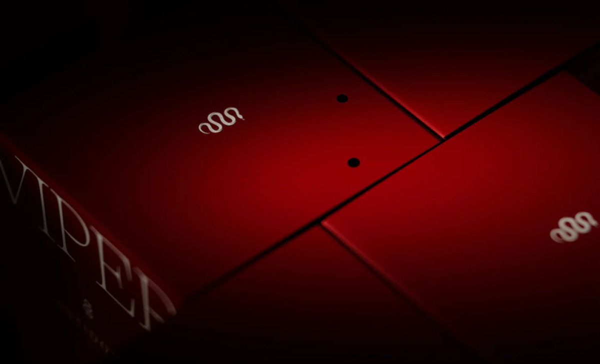
DD.NYC’s concept of a venomous snake as both poison and cure provides a powerful narrative foundation. The snake's venom represents danger and intrigue, while the brand’s name symbolizes healing and hope. This duality is seamlessly reflected in the packaging, evoking the sensation of danger with a sense of controlled elegance.
The luxurious feel of the packaging, combined with its symbolic depth, enhances the perception of the candles as not just objects of scent, but as elements of art and storytelling. Such symbolic details move beyond visual appeal, making each candle a luxury experience rather than just a consumable item.
Luxurious Textures and Tactile Details Provide an Immersive Experience

One packaging design trend that the Antidote packaging does successfully is its textural quality. The unboxing experience is designed to evoke a sense of exclusivity and excitement.
The box opens to reveal the candle nestled in the snake-skin patterned interior, which invites users to physically interact with the packaging, creating a tactile experience that is as much about touch as it is about sight. These details position the candles as more than just decorative items but as luxury art pieces.
On the other hand, the perforated lids, which resemble fang marks, create a subtle yet powerful nod to the venomous snake theme. These perforations are not merely decorative; they are added design elements that stimulates curiosity and interaction. When consumers lift the lid, they feel a subtle connection to the dangerous yet beautiful world of snakes, making the unboxing experience even more compelling.
Such tactile details invite consumers to engage in the product on a deeper level, enhancing the luxury experience while simultaneously embodying the brand’s thematic focus on poison and antidote.
The Brand’s Color Palette and High-Contrast Design Create a Visual Impact
The Antidote candle packaging uses a striking red-and-black color scheme, which not only creates a bold visual impact but also ties directly to the brand’s alchemical and snake themes. The deep red evokes a sense of danger, intensity, and passion, while the black elements add sophistication and a sense of mystery. This high-contrast design makes the product stand out on shelves.
The overall design is sleek and modern, with minimalist typography that reinforces the high-end nature of the product. The red packaging for the Sibon and Viper candle labels stands out in a crowd of more muted, neutral-toned luxury package designs. This approach ensures that the packaging doesn’t just serve as a container but commands attention and sparks intrigue.
Antidote Communicates Prestige Through Strategic Typography Choices

The design’s typography establishes Antidote candles as one of the best packaging designs. Serif fonts have long been associated with high-end branding due to their refined, traditional aesthetic that communicates authority and elegance. Thus, the bold serif font used for the candle names evokes a sense of classic sophistication and timelessness, aligning with the luxury concept of the brand.
The candle names, such as Sibon and Viper, are presented in large, commanding type, drawing immediate attention and enhancing the perceived value of the product. The packaging design agency’s use of minimalistic typography ensures that the focus remains on the product while reinforcing the idea of elegance through simplicity.
The size and weight of the typography also play a significant role in the design, giving the candle names a bold presence that feels appropriate for a luxury item. This design choice positions the candles as objects of desire — meant for individuals who appreciate the finer things in life.
Overall, the Antidote packaging exemplifies DD.NYC's mastery of brand identity. This venomous snake-themed design transforms a scented candle into a luxurious, memorable experience. It showcases the power of strong design to elevate a product beyond its function, winning it a Best Design Award for its exceptional use of symbolism and tactile design.
-preview.jpg)
-preview.jpg)