Standout Features:
- Fun fruit illustrations
- Fluorescent yellow as an accent color
- Bold, sans-serif typography
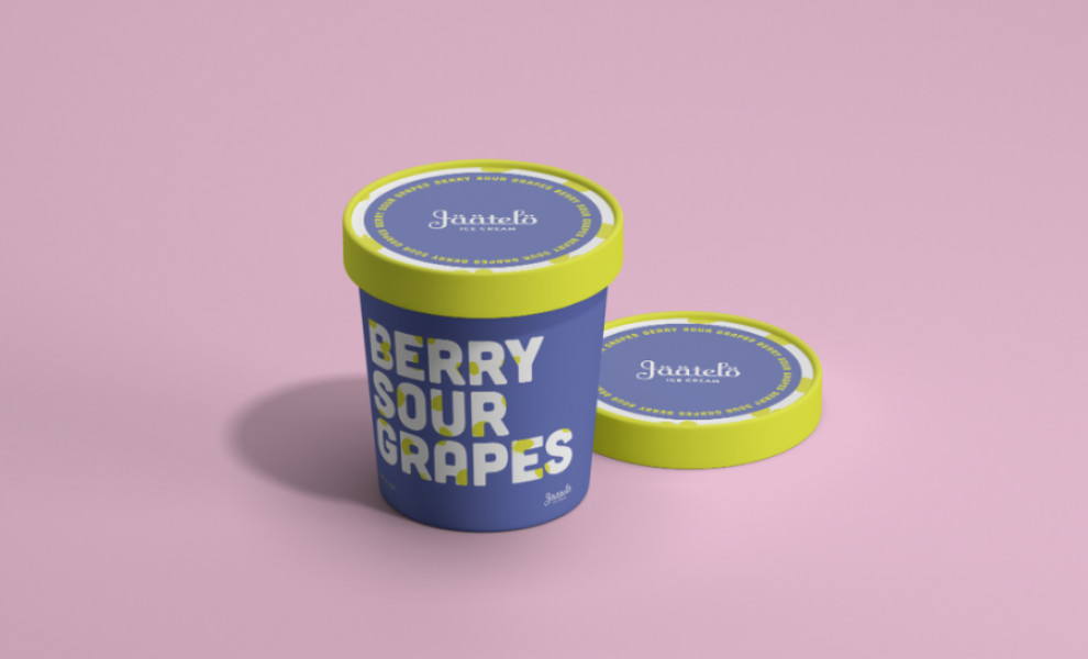
Berry Sour Grapes’ packaging, designed by Saira Thwaites, embodies a refreshing, zesty, and summer aesthetic that captures the product’s essence. The design’s key elements are its fruit illustrations cascading from the top of the design.
Its luminous fluorescent yellow color evokes a sense of fun and excitement and conveys the product's bold and tangy flavor. The rounded, bold sans-serif typography also adds a contemporary flair that complements the design. Proudly showcasing the product’s name in huge letters, it conveys confidence and clarity.
Get a chance to become the next Design Award winner.
SUBMIT YOUR DESIGN