Standout Features:
- A tribute to alchemy
- Esoteric, cabbalistic motifs
- Maintaining consistency through the color palette
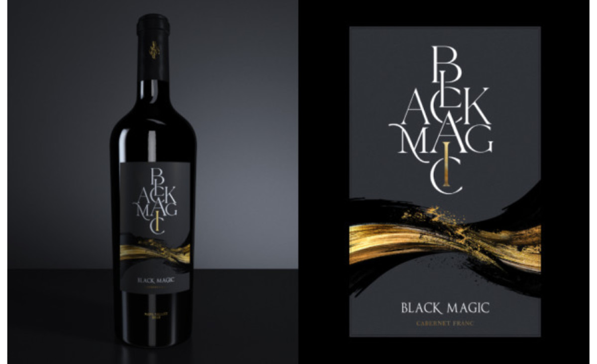
They say a bottle of good wine is essential to making your night magical. Catherine Polak, who designed the label for the Black Magic Wine, did an incredible job by staying loyal to the branding behind the name and further elevating it.
The label’s story is fundamentally presented as a tribute to alchemy. The narrative is built around two symbolic features – the logo and the black-and-gold flow below the emblem. The simple label design comes in two versions: black and white - as the typography’s color contrasts with the background color.
The homage to alchemy can be seen in both elements. The logo design is embossed in the center to add to its depth. The font choice is mystical and gothic-like, and the positioning symbolizes alchemy symbols.
As for the artwork, while it’s not a secret that the liquid-like motion represents the product’s flow, the color combination is meant to further extend the depiction of these ancient practices. Alchemists were known for their ability to turn lead into gold – just as the Black Magic Wine turns grapes into liquid gold for your palace. If you’re a wine and design lover, check out these wine packaging designs that each wine enthusiast will enjoy.