Standout Features:
- Sleek, matte glass bottles
- Uncluttered, minimalistic layout
- Elongated, rounded sans-serif typography
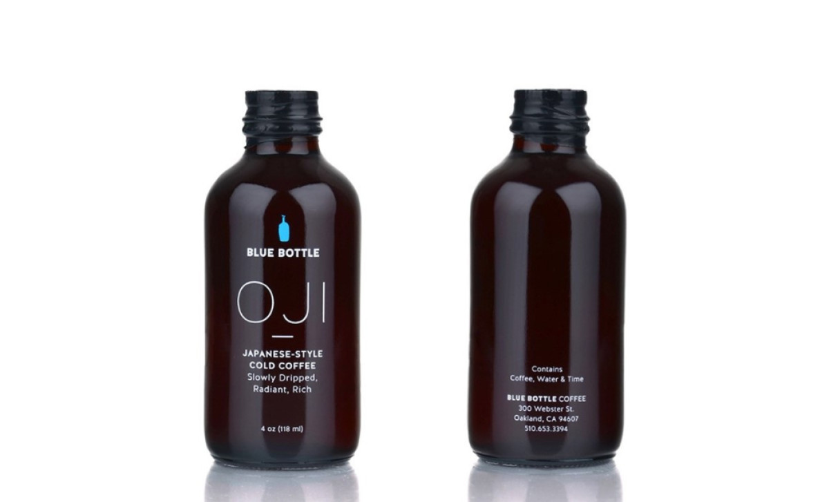
In order to understand how the Blue Bottle Oji Slow-Drip Coffee package design shows off the best qualities of a product, we have to delve into the process of making this caffeinated beverage.
In essence, this is a coffee extract whose preparation takes a lot of time, thus the name “slow-dripped.” Oji is a Japanese style of cold brewing. When we look at the coffee branding and package design, we see that the lines are soft but bold and placed in a minimalistic layout that fits subdued ingredients it contains — coffee, water and time.
Since the beverage is potent, dense and strong, the packaging reflects that strength with a sleek and small matte bottle. Typography is elongated and rounded, without the brash edges, but also kept to a minimum. The small blue bottle at the top is the only color apart from the dark background and white text, which makes it stand out on such a small canvas, making sure people will remember it. In a nutshell, Oji slow-drip coffee: Blue Bottle’s packaging design proves that less is more.