Standout Features:
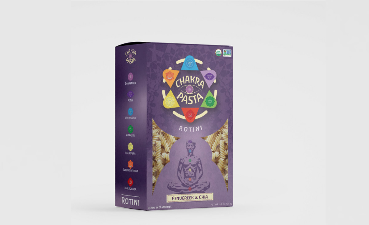
- Spiritual symbolism and mandala pattern
- Integration of chakras with packaging design
- Balanced color gradient for visual harmony
Chakra Pasta is a health-conscious brand that needed packaging which not only showcases their product but also resonates with their target audience on a deeper, spiritual level. To achieve this, they partnered with YeraDesigns, a design agency led by Luis Yera, whose expertise in integrating nature-inspired patterns and spiritual symbolism made him the perfect fit for the project.
At the heart of this design is Chakra Pasta’s packaging, centered around spiritual symbolism with a mandala pattern and a meditating figure prominently displayed. The mandala represents balance and peace, communicating a sense of calm and well-being — key traits of the "chakra" concept. Such design positions the brand as more than just a pasta product but one that ties into a holistic lifestyle.
Further emphasizing this connection is the integration of the seven chakras into the packaging design. The side panel depicts each chakra, corresponding to their positions on the meditating man on the front. Linking the logo to the crown chakra, associated with creativity and imagination, reinforces the spiritual aspect and makes the product more memorable.
Finally, complementing these symbolic elements, the color gradient provides both visual interest and balance. A subtle combination of dark purple and soft pink creates a calm yet striking background. The darker tones suggest a meditative atmosphere, ensuring that the packaging feels cohesive and aesthetically pleasing to its target audience.