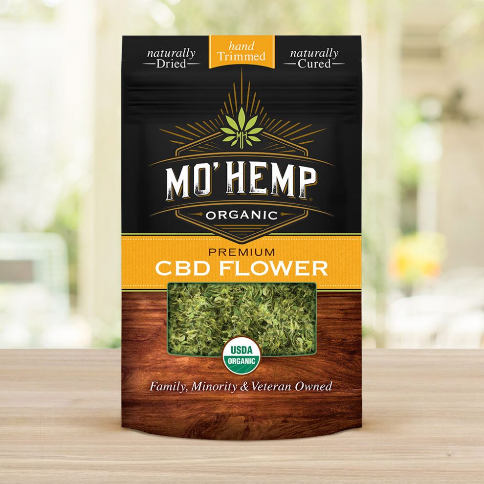
MoHemp CBD’s Packaging Design Leverages On The Power Of A First Impression
Lien Design is a San Diego-based design agency that helps companies create appealing graphic design across a full range of media, including branding, logo development, print design, marketing and most importantly, package design.
The agency believes that a quality design isn’t achieved simply with a “pretty package;” it is a result of a thorough examination of all design elements needed to create a product that exceeds both client and customer expectations.
Their design philosophy is perfectly encapsulated in their latest project: MoHemp CBD’s packaging design.
With the CBD industry at an all-time high in California, MoHemp knew their brand had to stand out and the agency delivered a design that utilizes the first impression of a product to its fullest.
Even at first glance, MoHemp CBD’s packaging weighs into the consumer’s subconsciousness and increases the chance of purchasing, thanks to the premium quality packaging that showcases the product’s natural origin.
That's because experienced packaging designers understand the power of first impressions and the crucial role packaging plays in communicating a product's value proposition.
Lien Design created packaging that is approachable and eye-catching with an earthy flair, to represent the product’s all-natural brand essence.
MoHemp’s Design Uses Stylish Typography And Clear Organization Of Visual Elements
You’ve probably heard the saying, “You shouldn’t judge a book by its cover.” Although the old proverb still holds some weight, more and more businesses invest heavily into quality packaging these days.
The impact of an excellent package or label design exists to accentuate product quality, help it stand out among the crowd and foster brand loyalty.
MoHemp’s packaging aims to excite consumers about what’s inside, without concealing the contents.
The minimalist linework envelops and highlights three distinctive and symmetrically laid out fonts.
The visual hierarchy smartly guides customers’ eyes towards the main logo that utilizes a variation of the Forthland font, most commonly associated with the craft beer and whiskey industry, which is a play on consumer expectations in itself.
Even though the design relies heavily on modern, minimalistic design trends, the whole packaging is more akin to traditional, almost “wild west” iconography. It suggests the longevity of the brand, as well as premium quality in the ever-growing hemp CBD industry.
The CBD Package Design Reflects New Industry Trends
At this moment, marijuana is legal in more than half of the US and with more states expected to follow, this trend has led to a rapidly growing industry that, in turn, opened a door to a previously untouched market.
However, the whopping rise of cannabis-related products comes with its own share of controversies.
MoHemp’s product smartly avoids any debate by focusing on CBD-rich products that are legal on a federal level and classified as hemp under the 2018 US Farm Bill. Consumers that smoke CBD flower experience the same benefits of regular THC-rich cannabis but without the overwhelming psycho-active side effects.
MoHemp’s packaging design embraces an up-to-date interpretation of the product, steering clear of the cliches that may lead to negative connotations.
The design does, however, utilize:
- Leafy imagery
- Health and organic nature (with prominently showcased USDA seal of approval)
- Minimalism
The pointy leaf is an instantly recognizable icon as it’s the fastest way to make the product instantly recognizable on the shelves. Branding professionals often leverage iconic symbols or imagery that are quickly identifiable and tied closely to the product or industry. This strategy not only strengthens brand recall but also increases the product's visibility in a retail environment.
MoHemp packaging does recognizable with a twist. It utilizes a modern, highly stylized version of the leaf with the brand’s initials at the stem, while simultaneously playing on a familiar theme to emphasize the premium aspect of the product itself.
Green In Color And Green In Ethos: The Packaging Color Palette Stresses The Product's Organic And Natural Roots
Going “organic” is what makes MoHemp’s packaging especially up to date and the color palette reaffirms it.
Aside from the aforementioned leaf design and scarce highlights, MoHemp’s packaging interestingly enough doesn’t utilize the muted greens usually related to the product.
In fact, a large open “window” in the packaging fills the lack of green hues with the CBD flowers themselves, wonderfully complementing the wood browns on the bottom half of the packaging.
The logo that suggests an established heritage lies on the washed-out black, contrasting the rich sun-scorched yellow strip.
Apart from its “premium-like” design qualities, the whole packaging seems as if it would naturally fit in on a household shelf, right beside espresso cups and jars of tea.
MoHemp Packaging Design Employs Microcopy That Smartly Covers Multiple Socio-demographic Groups
Many cannabis-oriented brands are tapping into the natural organic and medicinal properties of their product to add legitimacy to their business and appeal to a larger market.
Although MoHamp packaging doesn’t shy away from that trend, it builds upon it by adding a third layer to the origin of the product.
The packaging copy emphasizes three aspects: It is a family, minority and veteran-owned business. This is not just a neat marketing trick but an actuality that reflects brand values with just one short sentence, while simultaneously breaking the stigma related with the product.