Standout Features:
- Sophisticated, vertical labels
- Stamp-like logo
- Tactile, gold-foil lettering
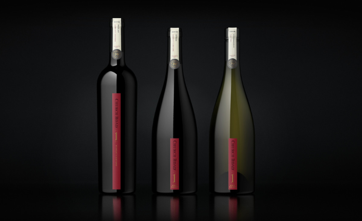
The Church Road Single Vineyard packaging, crafted by Tried&True Design, stands out in a competitive market with its sophisticated and elegant design.
Vertical labels creatively distinguish the bottles. By placing the labels vertically, the designers leave ample space for the bottle and the wine inside to shine. This minimalist approach emphasizes simplicity as the ultimate sophistication, reinforcing the brand’s premium quality.
In addition, the stamp-like logo with the brand’s initials adds a timeless quality to the packaging. It is surrounded by circular lettering that evokes heritage and tradition. This approach conveys authenticity, reinforcing the brand’s reputation for excellence.
Another luxurious element of Church Road Single Vineyard’s packaging is the tactile, gold-foil lettering that creates a sensory experience. This feature complements the overall design, accentuating the wine's high-end positioning.