Standout features:
- A contemporary bottle shape
- Distinctive label colors
- Classic typography
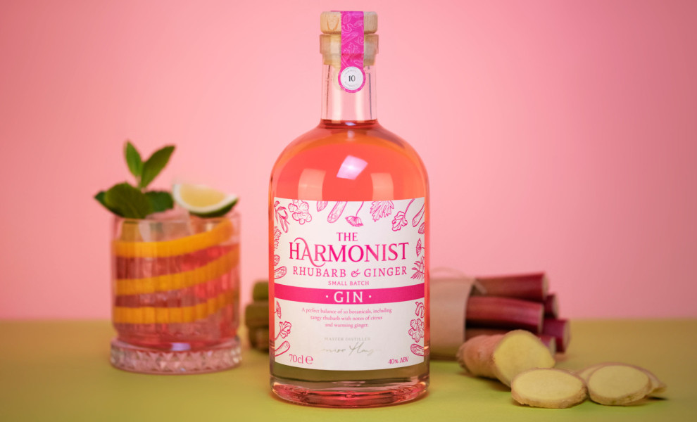
The Harmonist is a brand of multiflavored gin alcoholic beverages whose remarkable package design is the work of Graphic Brands. The client approached the agency to get their premium brand in touch with the current market and their target audience’s expectations.
To achieve this, the agency worked live with the client through a series of “live amends” during which they incorporated suggestions to give the bottle its final shape. According to the Graphic Brands team, “This ensured feedback was acted on immediately, which helped the client visualize various design options during the online meeting.”
The agency used its vast knowledge of the retail food and beverages market to formulate a concept for a premium label that works within an affordable price range.
The final design is a sleek yet sturdy bottle with a wide base and a short neck, featuring a label with plenty of hand-drawn illustrations of flowers, herbs, and plants. These illustrations – as well as a distinctive label color – depict the gin’s specific flavors and ingredients.
The highly stylized and flamboyant typography doesn’t break away from the tradition of gin drinks’ fonts, keeping the welcome familiarity and historical continuity with this particular product throughout the decades.
The letter “A” in “harmonist” with its two elongated wings portrayed harmony and equilibrium to bring together a brand name that complements the flavor’s exquisite balance.

-preview.jpg)
