Standout Features:
- Minimalist design paired with geometric accents
- Benefit-focused info hierarchy
- Quality marks and icons
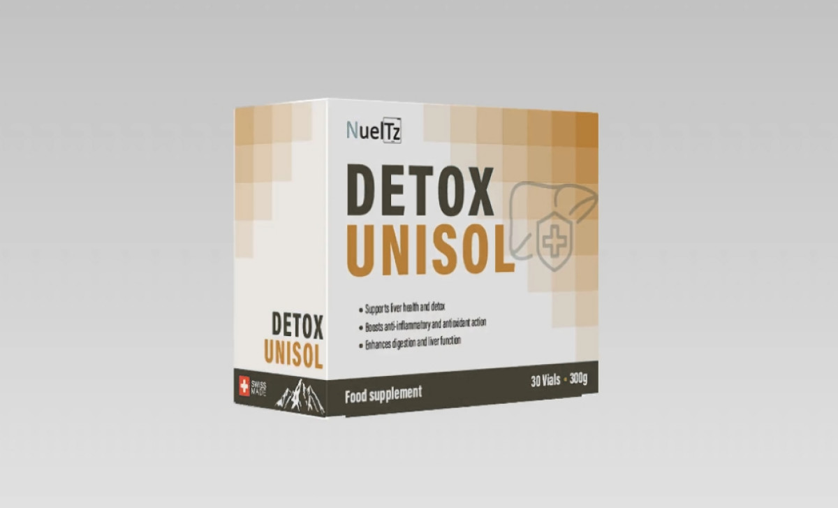
Packaging design for health supplements requires a delicate balance: creating a look that feels highly credible for a medical product yet is still appealing on shelves and understandable to consumers. Andreea Juganaru achieved this crucial objective for the Detox Unisol brand through the following design choices:
Firstly, the packaging utilizes a predominantly white background that signals credibility. This clean canvas is accented on the front panel by a geometric pattern of pixelated shapes in muted beige and gold tones. While decorative, it does not disrupt the overall clinical feel. It’s restraint like this that makes or breaks a health product.
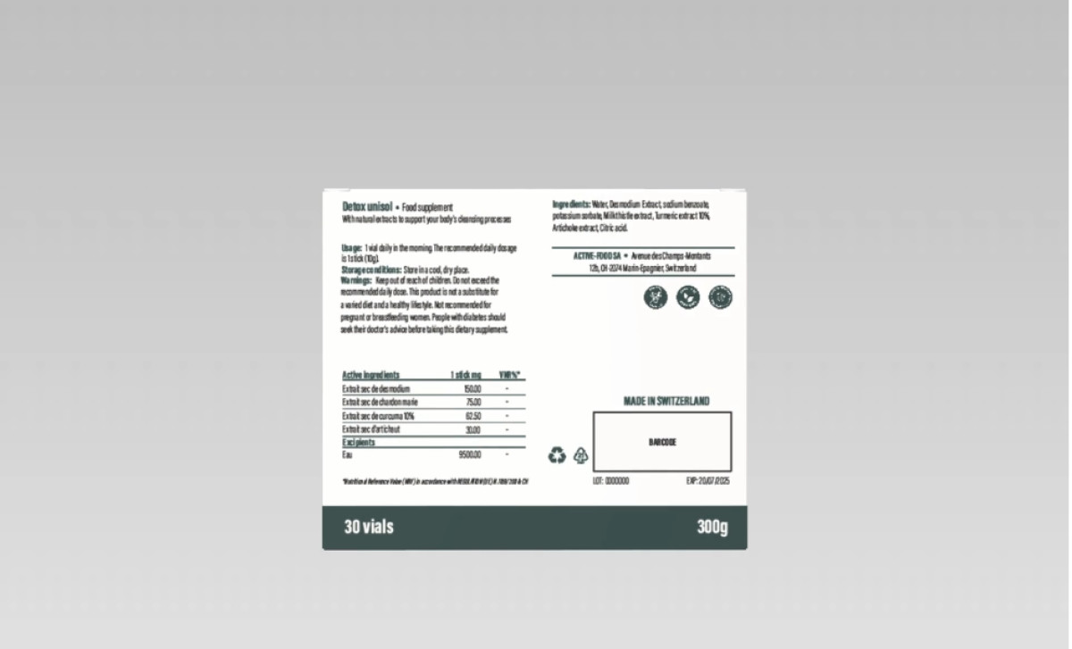
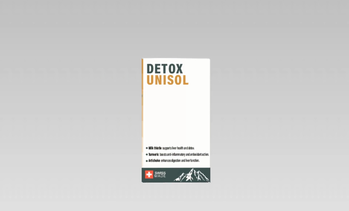
Next, information hierarchy is managed through a modern sans-serif font and a well-considered layout. On the front, the product name stands out in bold, all-caps text, followed by the brand, a clear bulleted list of key benefits, and essential details housed in a distinct dark bottom panel. This level of clarity extends to the detailed ingredients and usage information on the back.
Finally, the designer came up with a subtle line art icon near the product name, featuring a simple symbol of a liver and a shield with a medical cross. A "SWISS MADE" mark, complete with the Swiss cross and mountain motif, is also prominently displayed on the front and side panels. This acts as a significant quality indicator, leveraging Switzerland's strong reputation in pharmaceuticals and supplements to build consumer confidence.
So, what's the main takeaway here? When medical and pharmaceutical packaging looks this clean, people just automatically tend to feel it’s safer and more professional. That’s a really big win for any health supplement brand working hard to earn customer trust on a crowded shelf.

-preview.jpg)

