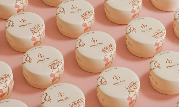
Standout Features:
- On-brand font styles
- Creative product shots that catch the eye
- Imaginative illustrations as accents
A brand that renders an eco-friendly message and appealing packaging can be tricky to execute. However, design agency did an awesome job in executing the EarthProof Protein packaging.
The design elements reflect and communicate EarthProof Protein’s identity from the colors incorporated to the quirky cartoonish illustrations at the front. And the way the agency has managed to balance all these elements is commendable. There’s barely any visual noise to come across here. The colors used for the covering were carefully picked as well, taking away any distractions that readers might come across. That said, the visuals remain high-quality with the use of clear, color-balanced images and graphics with just the right size and resolution.
Also, the agency made sure to inform the customers about the product’s ingredients and claims. On the lower-left corner, consumers can read some of the ingredients along with the flavor. Then, at the center, following the product name right after is the brand’s claim of sustainability. Written in white text enclosed in a green rectangular block. Color-wise, it exudes a playful tone that reflects the brand’s spirit.
Along with the actual words, the shapes, font, and style bear meaning. In this packaging design, the agency only used two different font styles to differentiate the brand. Texts in slight italics are the more important information, while the ones in straight-facing style are the little details about the product.
Whether the market is new to the brand or adept in EarthProof’s products, everything on the packaging is organized, defined, and rounds off one another. Make sure to check out our article on best green technology branding examples.
_a9ea6e06c8ce-desktop.jpg)


-preview.jpg)
-preview.jpg)