This article explores the best green technology branding examples you can take inspiration from, created by the best branding firms today.
Since green technology is on the rise, many green-tech companies aim to deliver a strong branding strategy that will set them apart from the competition. And in the long run, gain a solid customer foundation that supports their causes.
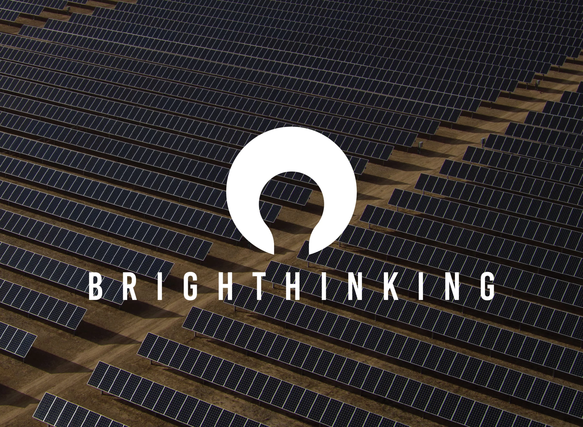
1. Brighthinking by Jimie
Standout Features:
- Sunny color story
- Sleek yet friendly typeface
- Abstract logo
Brighthinking’s branding design by Jimie stands out because of its sunny color story and attractive visual assets.
The client wanted to establish the brand as one of Africa's most trusted tech brands. Thus, the branding experts used sleek typefaces that looked professional yet friendly.
The abstract logo takes inspiration from the sun, featuring a curved figure representing the sun's power. The agency also used the sun as a focal point for its branding because of its symbolism in African cultures.
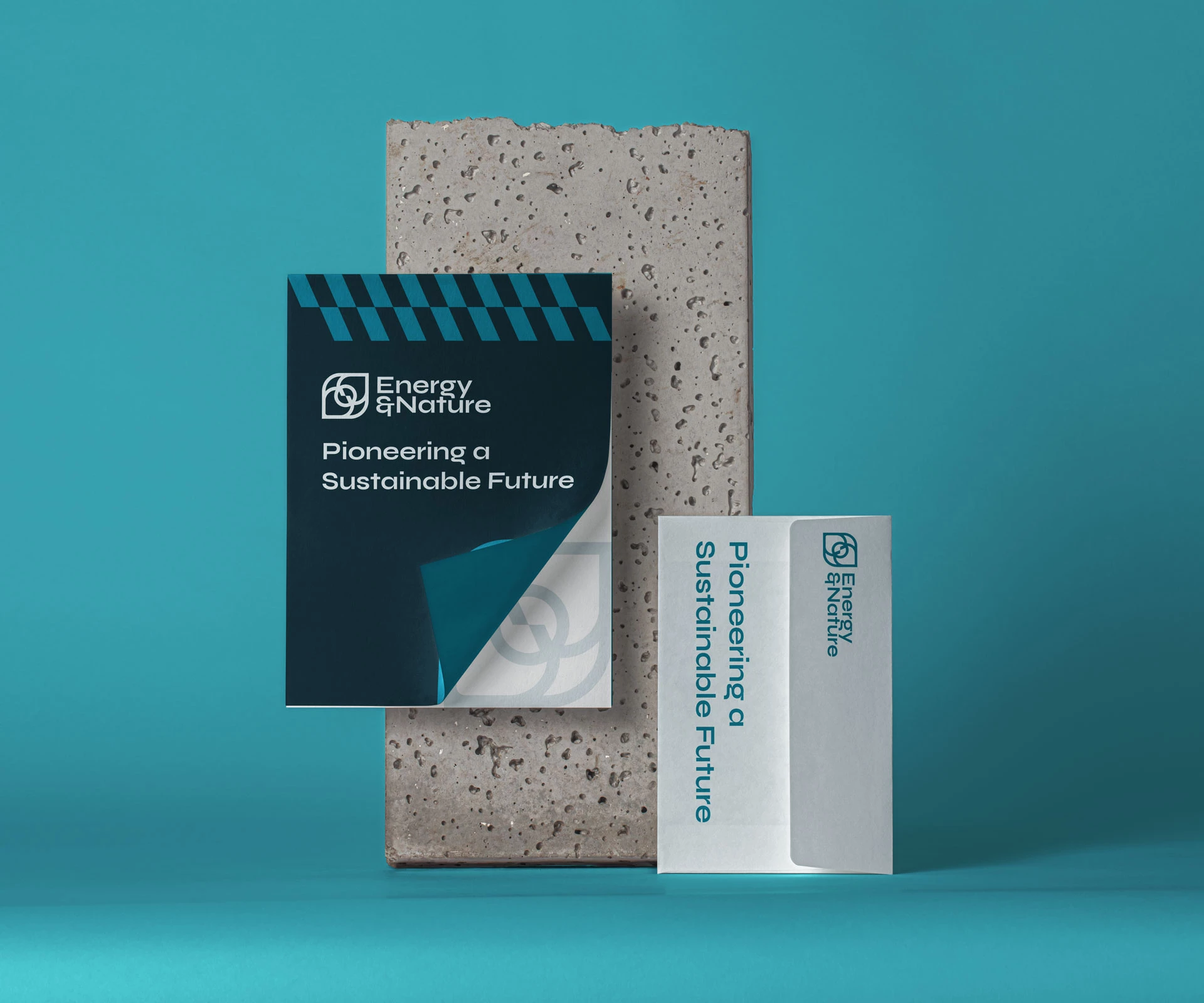
2. Energy & Nature by Babel LLC
Standout Features:
- Abstract logo
- Useful symbols
- Invigorating colors
Energy & Nature's branding by Babel LLC is noteworthy for its stunning abstract logo, featuring symbols that are cohesive with the brand identity and strengthens brand recall.
The logo features a clever use of abstract shapes symbolizing the sun, nature, and energy, all crucial factors in the green technology company. In addition, the cool shades of blue and white induce a calming feeling.
3. Infra Norway by Potting Shed

Standout Features:
- Scandinavian feel
- Northern lights-inspired colors
- Thick and thin sans-serif typeface
Infra Norway's branding design by Potting Shed features Scandinavian elements, with precise details that deliver and instill brand recall to its target audience.
The logo features a circle cut in half by a wavy line, symbolizing the waters where the company focuses, tapping Norway's potential as a hydroelectric powerhouse in Northern Europe.
Given its rich natural resources, the thick and thin sans-serif typeface emphasizes Norway's potential to be a green power country.
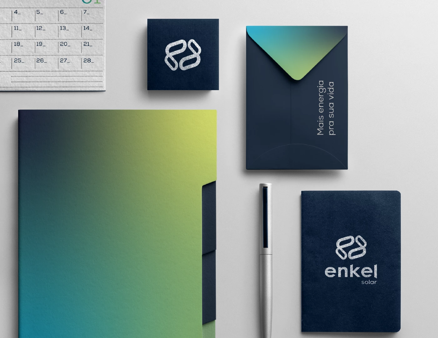
4. Enkel Solar by Pedro Azevedo Estudio
Standout Features:
- Cubed infinity symbols
- Abstract initials
- Gradient colors
Design agency Pedro Azevedo Estudio crafted a beautiful green technology branding strategy for Enkel Solar. This Brazilian solar power company focuses on strengthening its brand identity through its innovative logo design.
The agency created an abstract version of the E and S letters, symbolizing renewal, infinity, and innovation. The abstract initials serve as brand recall tools for the company, while the logo's dark blue and yellowish-green colors give it a serious yet approachable look. The gradient effect blends both colors seamlessly and makes the logo look more fluid.
5. Soluon Energy by Drakus Agency
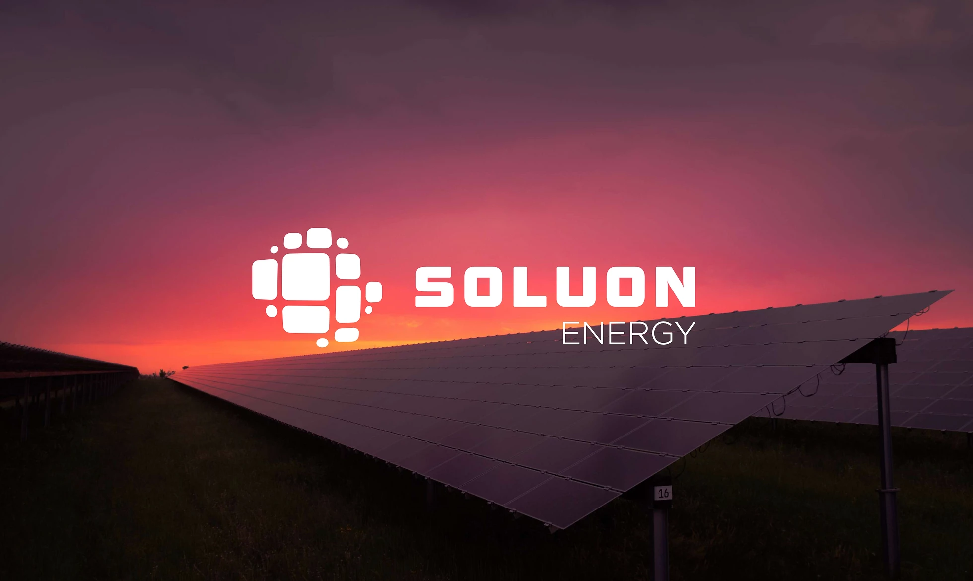
Standout Features:
- Warm gradient colors
- Geometric logo
- Digital-inspired typeface
Drakus Agency channeled its creativity with Soluon Energy's stunning logo design as part of its branding strategy, using warm gradient colors to strengthen the company’s vision and connect to its target audiences.
The colors purple and magenta, then gradating to warm yellow, are a unique take on the sun's colors. Its shape combines the sun and solar panels, with squares and small circles making up the logo. This highlights the brand’s love for nature through sustainable and renewable energy.
Tying this powerful branding strategy is the digital-inspired typeface representing the company's modernity.
6. BWA by Agência Destrava
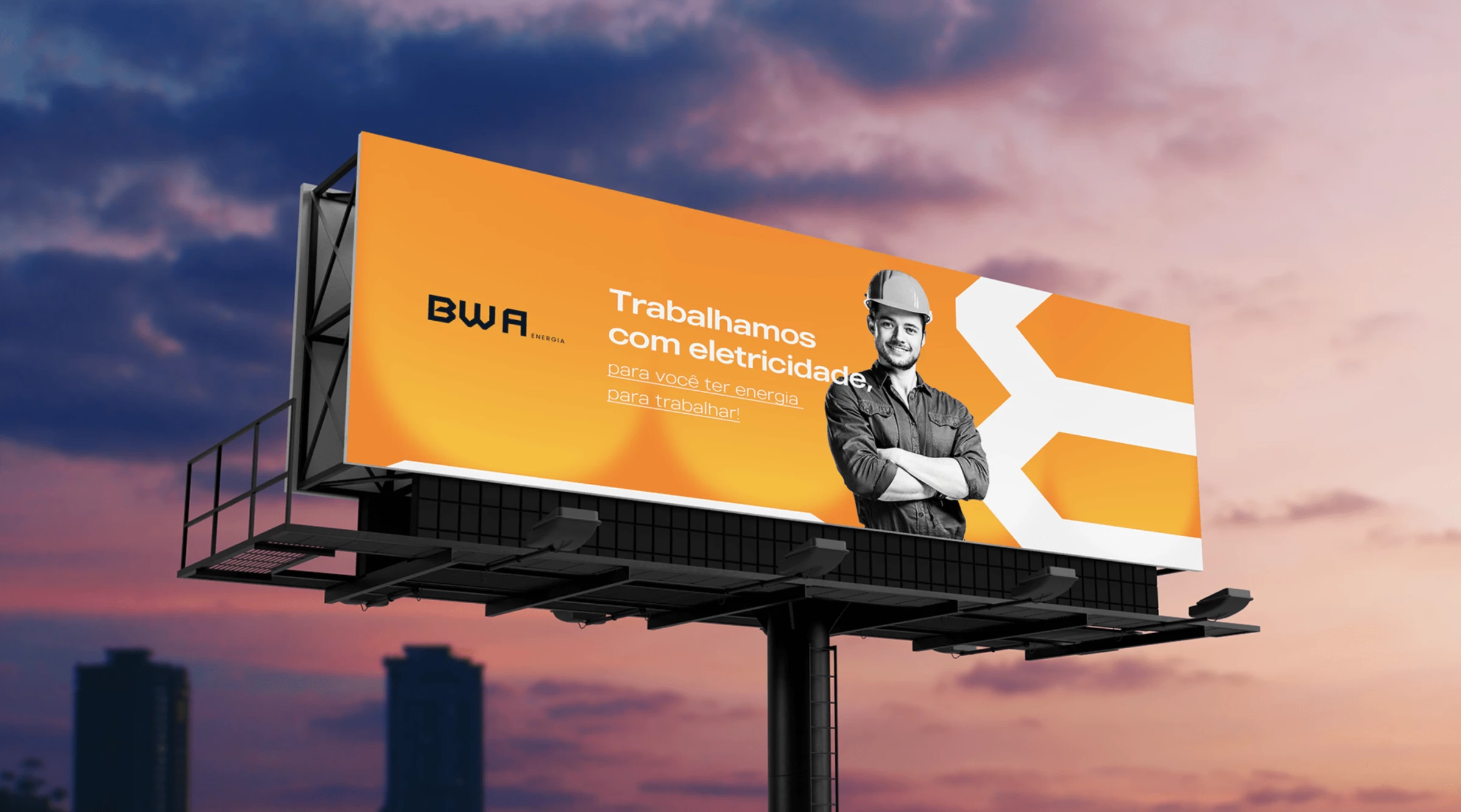
Standout Features:
- Geometric logo design
- Minimalist logo concept
- Lively color palette
BWA’s branding strategy by Agência Destrava combines minimalist logos and an energetic color palette, making it stand out among other green technology companies.
In line with the goal of creating a serious and professional brand, they used straight lines, simple symbols like joined brackets, and other geometric features. The minimalist logo in bright oranges and bold blacks works amazingly in any concept.
Look at some of the best technology branding examples.
7. VoltSolar by Creative Shell
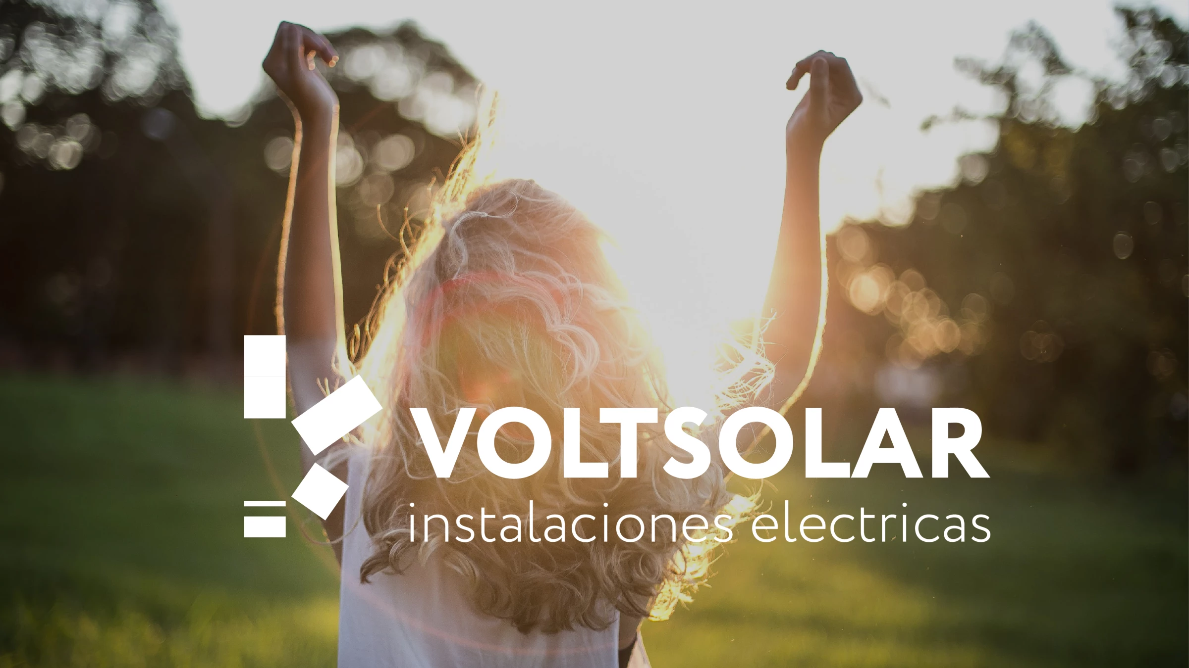
Standout Features:
- Meaningful logo
- Warm color scheme
- Flexible design concept
With its symbolic logo design, VoltSolar’s branding strategy by Creative Shell deserves a spot in our list of the best green technology branding examples.
The logo combines various aspects of the company’s identity consisting of the letter V, the sun, the peace sign hand symbol, and the solar panels. It creates a simple yet meaningful logo representing solar power and what it can do for modern-day society. Aside from using the primary brand colors blue and warm yellow, the agency created other logo variations in black and white, which works well with colored backgrounds.
8. PowerGardens by Michael Pushkaryov
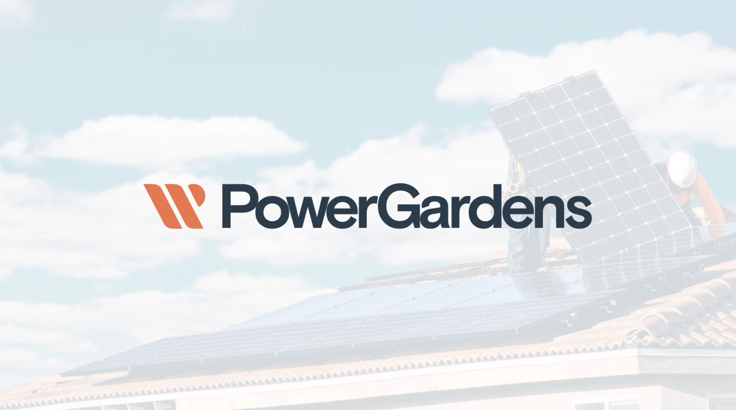
Standout Features:
- Legible typeface
- Presence of solar elements in the logo
- Warm color story
For PowerGardens, it is essential to have the logo with a legible typeface as it aims to be easily recognizable from afar. Branding expert Michael Pushkaryov considered that and created an impressive branding strategy for the Spanish solar equipment company.
The logo has the elements of the industry, such as the W for watts, the sun, and solar panels. The simple yet recognizable logo design also uses warm colors to direct the reference to the sun. Unlike other brands that use colors like bright blue, yellow, or green, PowerGardens uses light blue, gunmetal blue, and coral.
9. Meu Financiamento Solar by Felipe Lufa
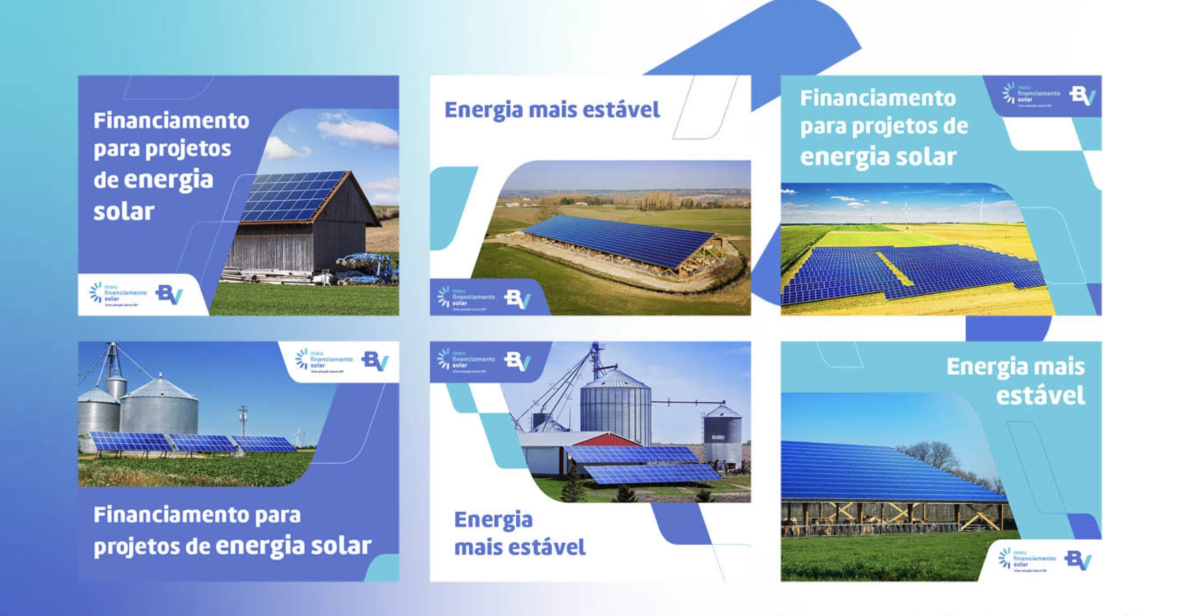
Standout Features:
- Sun elements in the logo
- Cool blue colors
- Legible typeface
Designer Felipe Lufa used the sun’s rays for Meu Financiamento Solar’s branding design uniquely, setting it apart from the other solar energy companies.
The half-sun showed its rays in various lengths to show authenticity, while white and blue perfectly show the clear skies on a sunny day. The colors are also perfect, as they could be more striking to be added to visual assets. In addition, the legible font used is very helpful with brand recognition.
10. L. Sun Energy by Leone Design Studio
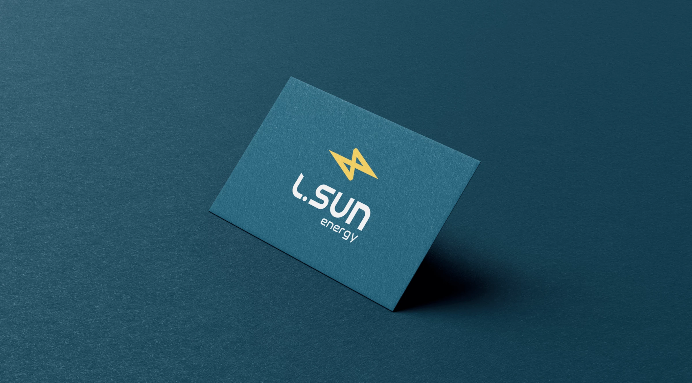
Standout Features:
- Enticing color story
- Stylized lightning bolt
- Tech-inspired font style
Leone Design Studio used an enticing color palette to introduce L. Sun Energy as a respectable and dependable choice for solar and renewable energy solutions.
The stylized lightning bolt on the logo and the tech-inspired font style add layers of character to the brand identity. The colors teal, white, and mustard yellow are effective in sending the right message across without being too obvious. In addition, the logo can be interpreted in several ways, including the letters L, S, and the infinity sign.
11. VISTA by Meta 108

Standout Features:
- Symmetrical lettering
- Solar elements
- On-brand color story
The client wants VISTA to be seen as a premium green tech company, so design agency Meta 108 did its best to reflect professionalism throughout the branding strategy, with symmetrical lettering adding a layer of polish to the mix.
The logo comprises the solar panels inside the sun, radiating on a closed circle. It shows how the sun provides everyone on Earth with energy, life, and warmth, like what VISTA wants to offer its customers. The colors used, reminiscent of the desert, are also perfect for the professional branding identity.
Explore some of the best-illustrated branding examples.
12. Quaise Energy Africa by zeti creative
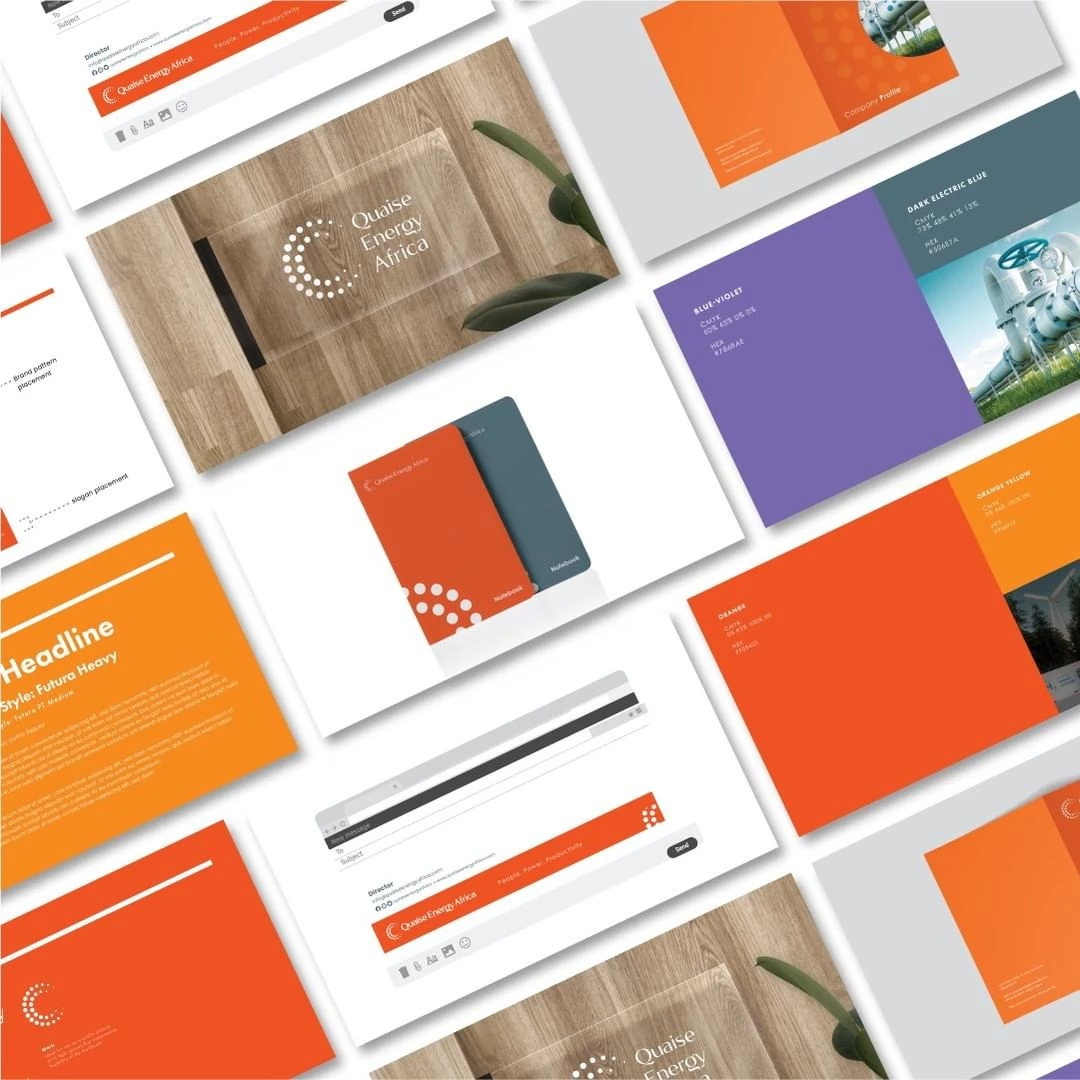
Standout Features:
- Circles forming a half-circle
- Sleek typeface
- Flexible color story
What sets Quaise Energy Africa’s branding design by zeti creative apart from the other brands in this list is the simplicity of the logo design, which evoked professionalism and reliability in the target audience.
The logo design features two bands of half-circles formed by smaller circles, symbolizing the solar power they offer customers. The sleek typeface and flexible colors lend the brand a more polished vibe.
13. RES4AFRICA by Giacomo Felace
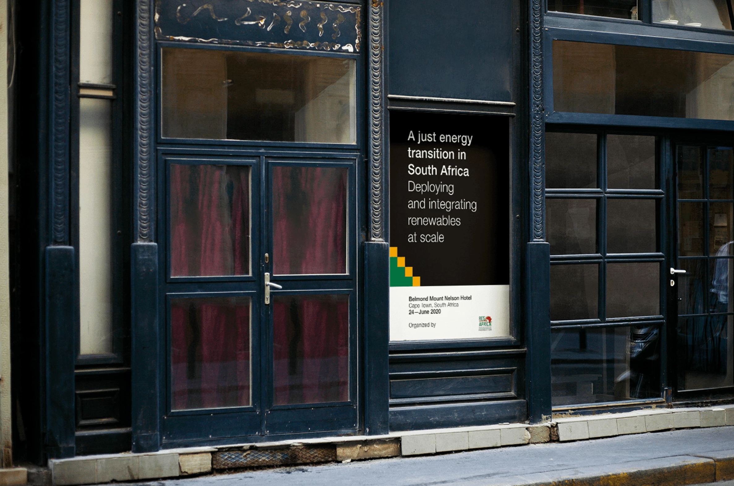
Standout Features:
- Recognizable font style
- Professional color story
- Sleek yet sensible
RES4AFRICA's branding strategy by Giacomo Felace combines substance and style with how sleek yet sensible the visual assets look, from the colors to the layout.
The recognizable font style allows the contents to be easily read, and the colors of black, white, green, and yellow perfectly align with the company's identity as South Africa's rising star in the green tech field.
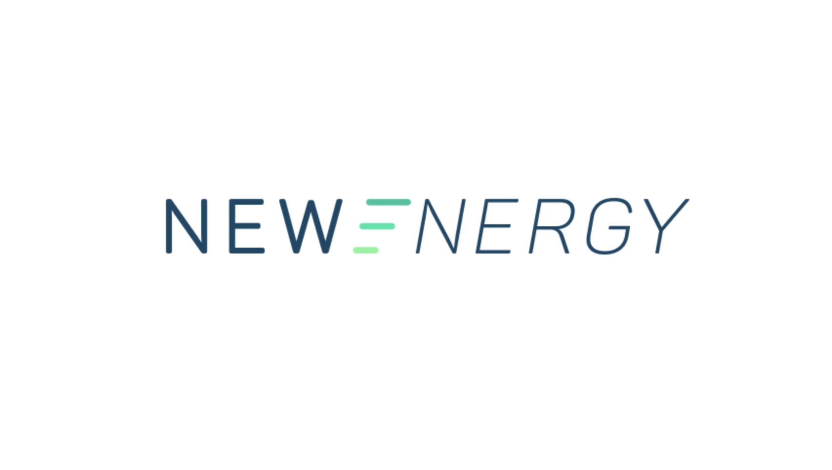
14. New Energy by Kel Corbett
Standout Features:
- Thin sans-serif font
- Cool and calming colors
- Simple logo design
New Energy’s branding design by Kel Corbett shows how simple logo designs can still be a significant part of any branding strategy, especially in the green tech industry.
The logo design features a stylized E for Energy, which shows three lines decreasing in length with blue-to-white gradient colors. The thin sans-serif font and the cool colors allow for easy recognition and stronger brand recall.
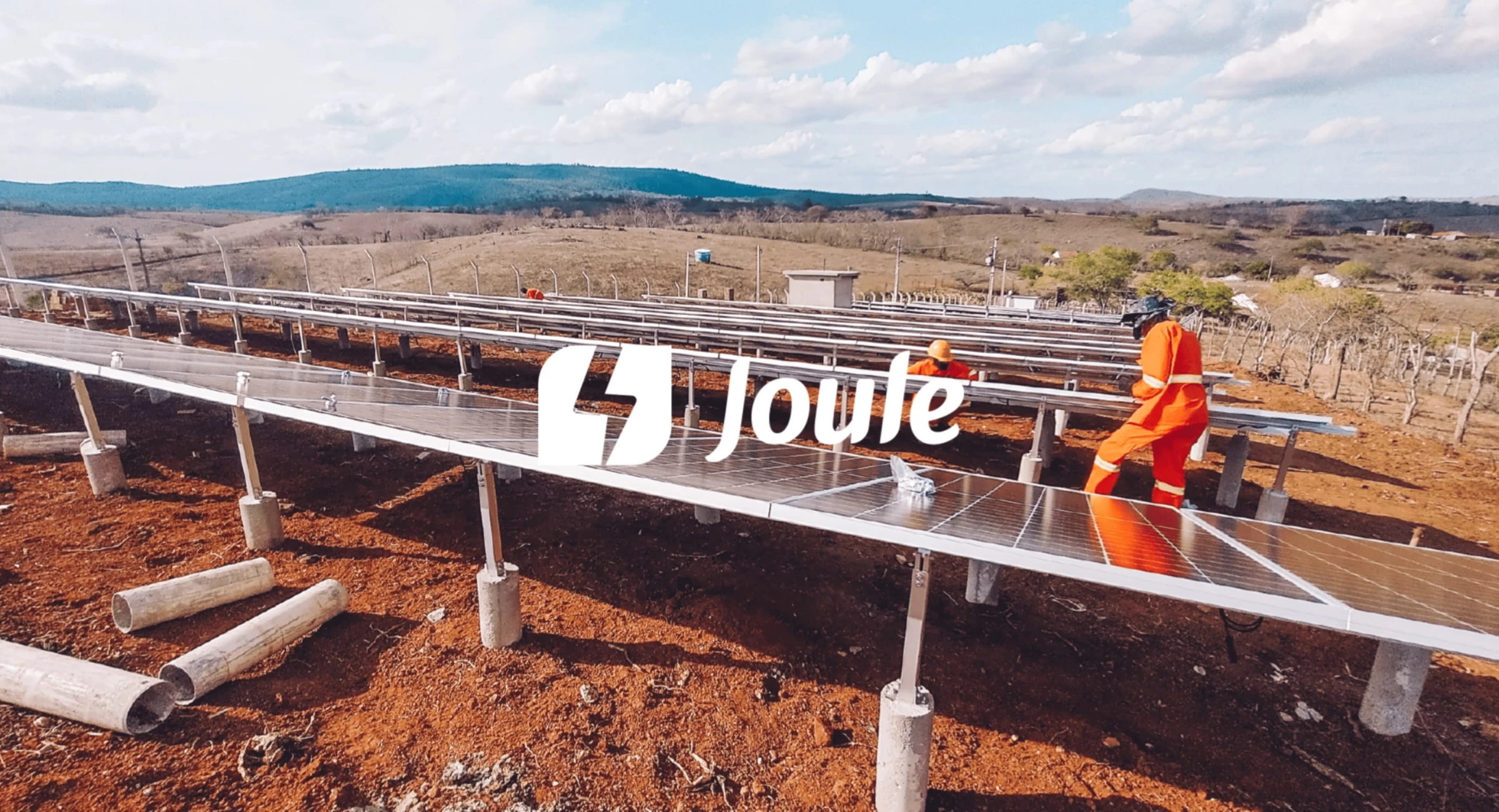
15. Joule by Elizabeth Torres
Standout Features:
- Negative space logo
- Lightning bolt
- Friendly typeface
Branding expert Elizabeth Torres rebranded Joule, a Brazilian renewable energy company, into a friendlier and more approachable brand for customers.
Check out some of the best rebranding examples.
The new logo features a rounded cube with a lightning bolt in the middle, representing what the brand offers. Meanwhile, the friendly font style makes it look warmer and more approachable. As such, the new branding is simpler and easier to recognize.

Our design experts recognize the most innovative and creative designs from across the globe. Visit Design Awards to see the:
- Best Logo Designs
- Best Website Designs
- Best Video Designs
- Best Print Designs
- Best Packaging Designs
- Best App Designs
Our team also ranks agencies worldwide to help you find a qualified agency partner. Visit our Agency Directory for the top Logo Design Companies, as well as:
- Top Web Design Agencies
- Top Video Production Companies
- Top Print Design Companies
- Top Packaging Design Companies
- Top Mobile App Development Companies


-preview-webp.webp)