Standout Features:
- Bold and playful graphics
- Vibrant color scheme
- Icon-based pattern
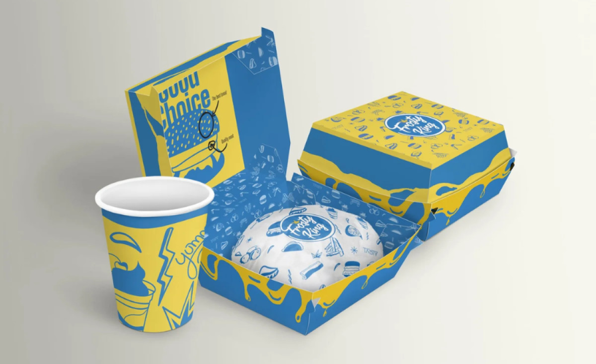
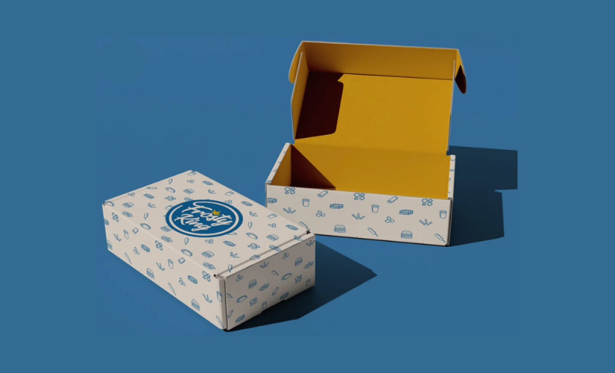
Frosty King is a food and beverage brand that focuses on offering various delicious treats, aiming to deliver fun and indulgence with every bite. The branding and packaging, designed by Vida Estudio, plays a crucial role in reflecting the brand's joyful and energetic personality.
The packaging design features bold graphics and playful icons, with elements like burgers, fries, and corndogs. The line art illustrations are clean, straightforward, and immediately recognizable. This type of visual language gives the packaging a youthful and friendly tone, perfectly suited for a fast-food brand that wants to feel approachable and fun.
Its vibrant yellow and blue color palette brings warmth and energy, making the packaging highly eye-catching and creating a sense of excitement. Yellow evokes happiness and appetite, while blue adds a sense of trustworthiness and refreshment — key elements to stand out in the competitive marketplace.
Additionally, the packaging incorporates simple and clear typography, ensuring that the brand name, Frosty King, is prominent. The modern sans-serif font inside the packaging enhances its fresh and contemporary feel, ensuring it aligns with the fun and upbeat nature of the brand.
Vida Estudio has successfully translated the brand’s identity into this food and beverage packaging design, using vibrant colors, playful visuals, and clean typography to create an engaging experience that customers will remember and associate with tasty frozen treats.