Standout Features:
- Clean typography
- Minimalist aesthetic
- Soothing color palette
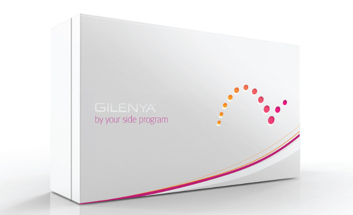
Packaging for pharmaceutical products carries a weight beyond simply holding medication. Pharmaceutical company Novartis chose Mireille Fiset to develop the packaging for GILENYA, a drug aimed at multiple sclerosis patients. GILENYA achieves a balance of practicality and communication through a quieter, more considered approach.
The selected fonts provide legibility and convey modernity and trustworthiness. Given the importance of clarity in this industry, this straightforward approach aids patients in quickly identifying their medication and understanding essential information. It avoids ambiguity — which is a critical consideration for medical products.
The minimalist aesthetic also plays a key part in the design's effectiveness. The removal of unnecessary visual elements helps the packaging convey sophistication and a clear sense of focus. This simplicity contributes to building trust, allowing the medication's intended purpose to become the central point.
Additionally, the use of soft, muted tones creates a calming visual experience, which can be particularly beneficial in medication packaging. Because dealing with a medical condition can be stressful, the gentle colors of the GILENYA packaging can support a sense of peace and reassurance.
The design of GILENYA's packaging demonstrates that strategic simplicity can be a potent tool in conveying complex information. Brands across industries can learn from this approach: clarity and focus, achieved through minimalist design, can enhance brand perception and build stronger customer relationships.


