
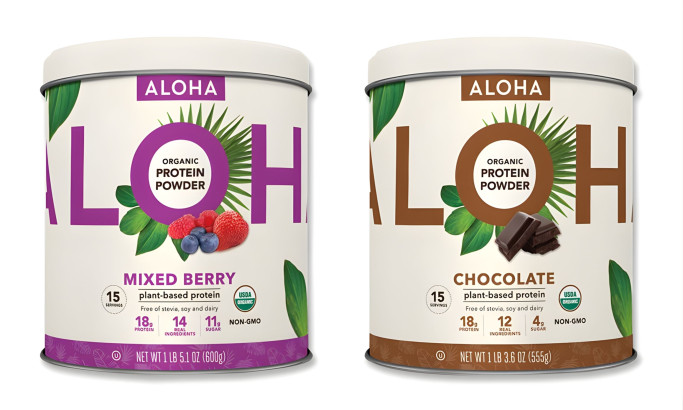
Standout Features:
- Different colors for product variation
- Easy-close lid
- Combination of thin and bold fonts
Bariatric Complete’s packaging uses different colors for product variations: orange for the Orange Flavor and blue for the Berry Flavor. This visual differentiation by K2 Graphix simplifies consumer selection, aligning the product’s taste with its visual identity.
The packaging includes an easy-close lid, adding convenience for users, and speaks to the thoughtful design intended to accommodate consumers with limited mobility.
Using a combination of thin and bold fonts on the label creates a clear information hierarchy, making it easier for users to read and understand the product details. Bold fonts highlight the product name and key benefits, while thinner fonts describe additional information, balancing the label's design and function.


-preview.jpg)