Team Behind the Design
Agency: Gaby Branding
Client: beHealthy
Category: Packaging Design (Food & Beverage)
Location: Merida, Mexico
Project Brief: Design beHealthy's packaging that enhances shelf appeal and communicates nutritional benefits with clarity and modernity.
Packaging Design Analysis
Related Articles
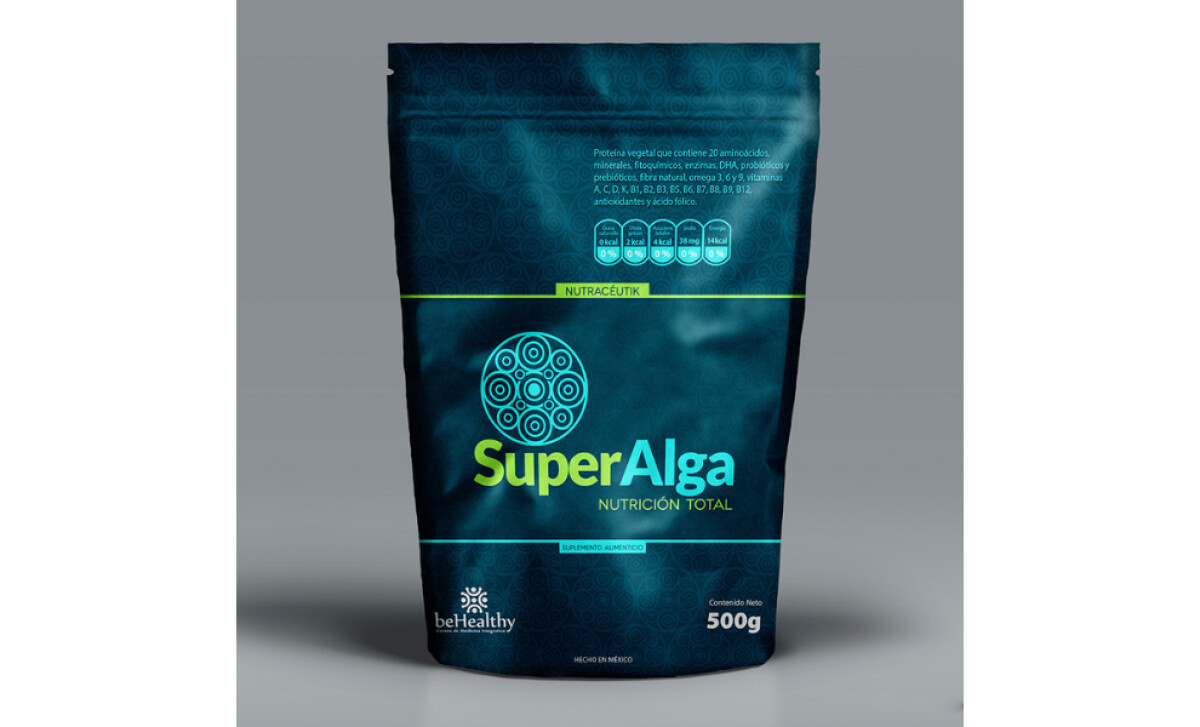
When I review food and bevergae packaging designs, I often focus on structure, shelf impact, clarity of information, and visual hierarchy.
- Shelf Impact: I like how the deep teal background with neon green accents gives the product strong visibility in a crowded retail space. The color contrast immediately draws attention.
- Information Hierarchy: The brand name “SuperAlga” is placed centrally and in large type, ensuring easy recognition. Supporting details like “Nutrición Total” and “500g” are clearly legible.
- Typography & Layout: The clean, sans-serif typography works well with the circular iconography, making the design modern yet approachable.
- Brand Consistency: The use of repeating circular motifs ties back to natural and nutritional themes, reinforcing brand credibility.
Get connected with the right packaging design agency for your project.
GET STARTEDAbout DesignRush Featured Designs
At DesignRush, we review hundreds of agency projects each month. The featured designs stand out for creativity, brand alignment, and execution quality.
The most remarkable ones advance to our Monthly Design Awards, gaining recognition across the industry.
Packaging design in the food & beverage industry is critical for shelf impact and consumer trust. Explore more standout work here:
- Best Packaging Designs
- Best Website Designs
- Best App Designs
- Best Logo Designs
- Best Print Designs
- Best Video Designs
For a full list of design agencies and related services, see our Agency Directory.
Get a chance to become the next Design Awards winner.
SUBMIT YOUR DESIGN-preview.jpg)