Standout features:
- Mission-oriented
- Attention-grabbing logo
- Prominent USP
The retail haircare sector is highly saturated. Its industry brands more often than not rely on packaging differentiation to forge a connection with consumers. However, there is a multitude of unwritten rules that make various brands in this particular segment share some visual cues.
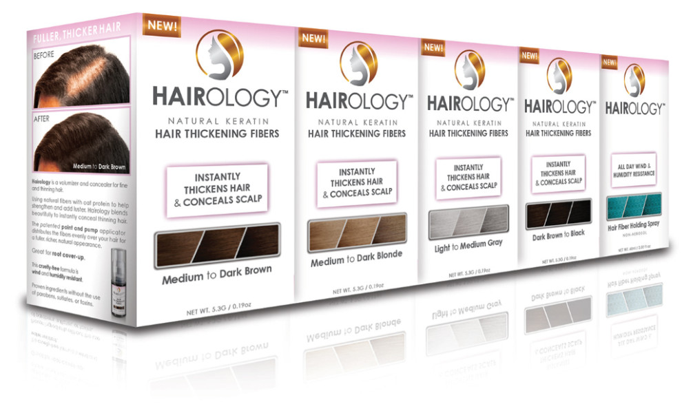
Hairology packaging design, inspired by Juggernaut Illustration and Design follows some of these “rules” and expands them with a slew of details, including color gradient, usage of gold accents, and boosting the logo presence.
Besides the pleasing elements, the packaging relies on the product’s USP or benefits. The slightly larger and emphasized list inspires trust and positions Hairology as a go-to brand for those suffering from (or fearing) hair recession and/or hair fiber thinning.