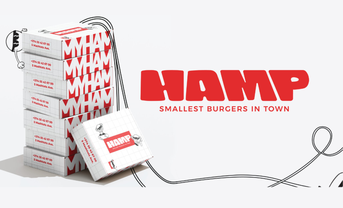
Standout Features:
- Bold, rounded typography
- High-contrast red, white, black color palette
- Quirky character illustrations and branded patterns
How do you make typical fast-food packaging truly stand out as genuinely fun and unique, not just another generic box? Aurora Barealisse focused on achieving such a feat by utilizing friendly typography, a high-energy color scheme, and plenty of playful illustrations consistently across the entire packaging system for the Armenian brand HAMP.
Bold type is foundational to the HAMP brand feel. The logo uses a chunky, rounded sans-serif, often in that bright red. Together, these create an immediate impact and a sense of fun. Choosing such a confident, straightforward look and applying it consistently across elements like flavor names and fun little text snippets reinforces the brand's personality.

That signature color is where the brand gets its energy from. Its simple two-toned, high-contrast palette is exciting and grabs attention — great for this food category. It's balanced nicely with clean white and stark black used for backgrounds and smaller details. Used boldly everywhere, this limited palette makes for a striking and very modern presence.
Beyond the main logo and colors, quirky line art illustrations add lots of personality too. There's a recurring character mascot (often sporting sunglasses) playing around the logo and packaging. This character, simple food icons, and fun text like "OMG!" create branded patterns used on things like wrapping paper, adding to the unique system.
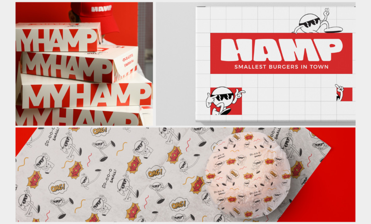
It seems that these extra little details — playful fonts, unique repeating pattern work, colors that pop — are what can define a brand's unique voice and character. The agency's plan of adding welcome layers of personality beyond just the main logo and chosen colors definitely helped build upon HAMP’s already memorable food packaging design.