Standout features:
- Color-driven system for clear product categorization
- Textured materials with an eco-forward presentation
- Minimalist typography with intentional rotation and positioning
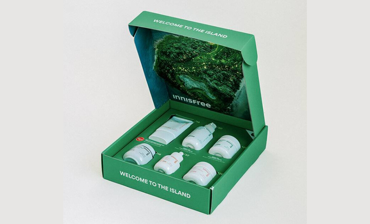
Innisfree’s packaging, with design work by Gemnote, captures the essence of its Jeju Island-inspired natural skincare. The system for its boxes and kits harmonizes earth-conscious messaging with a sharp, minimalist aesthetic.
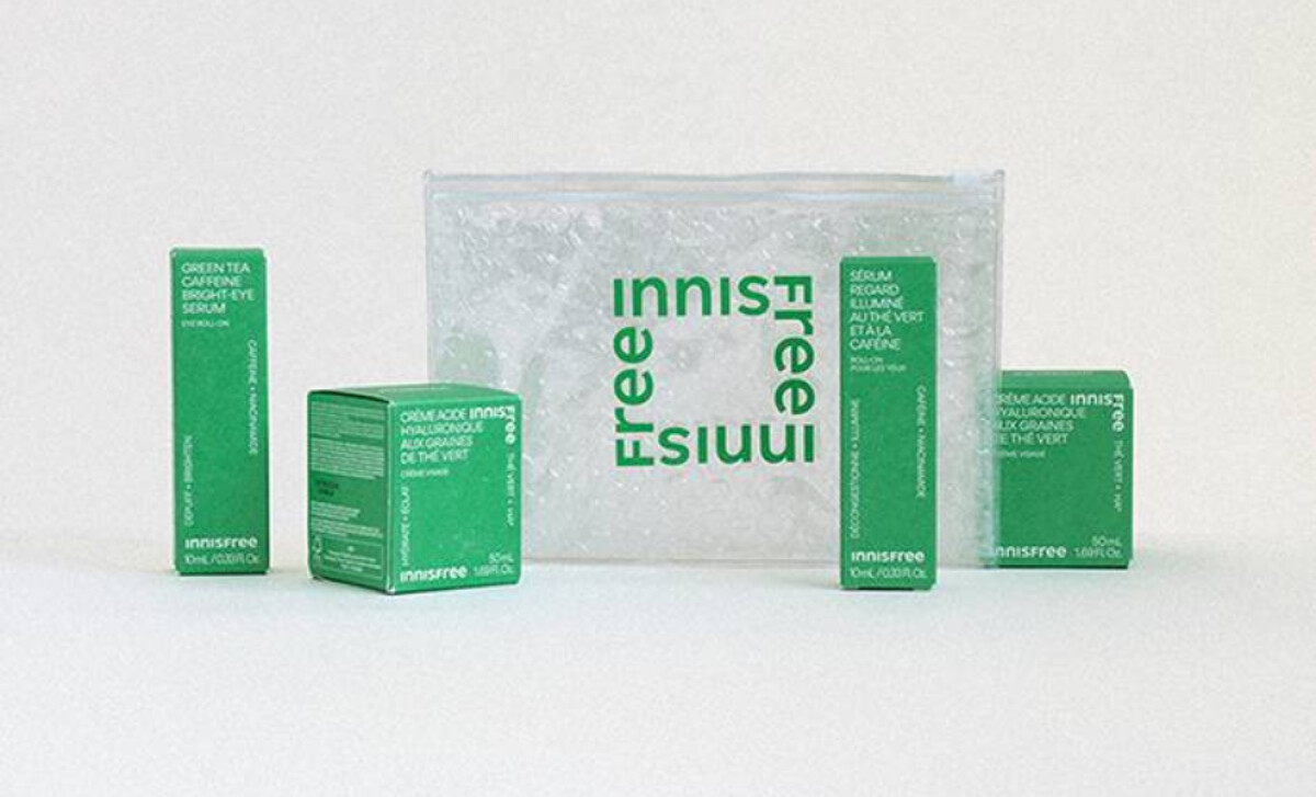
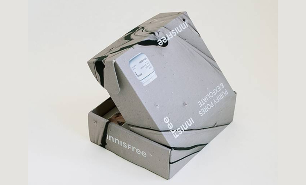
A dominant, solid color — like Innisfree’s signature green or muted pebble gray — anchors each product set across cartons and labels, with contrasting white text. This color system is functional, not just decorative. Green signals freshness (e.g., Green Tea Serum), while gray can denote mineral elements.
Its textured materials are central to the packaging. Matte paperboard, marbled recycled boxes, and reusable pouches emphasize sustainability. The gray exfoliant box with its volcanic stone texture is particularly evocative of Jeju Island. This tactile approach makes the unboxing experience feel artisanal and intentional.
Such attention to a premium unboxing experience can be a strong factor in customer loyalty, as 61% of shoppers report being more likely to buy a product again if it is presented in premium packaging.
Text elements use small, flush-left or rotated white sans-serif fonts. Product names are often oriented vertically on the sides of boxes. The "Innisfree" brand itself is presented with understatement — lowercase and off-center. This restraint suggests environmental mindfulness and a sophisticated, non-traditional brand personality.
This packaging system highlights that for natural skincare beauty brands, a design approach emphasizing sustainability through material choice and minimalist aesthetics can significantly enhance perceived value.


