The best packaging designs in the world cement their brand identity in the minds of consumers and reinforce familiarity. Many achieve this through relevance, uniqueness and compelling design elements.
Enter Ozmetics. Visually designed by Sara Ozvaldic, Ozmetics is a line of skincare products with a personalized approach that satisfies the needs of each individual.
Notice the spectacular labeling of each product. Right off the bat, we have an injection of relevance that aligns the company values with the consumer.
But how? You may ask. Ozmetics’ competitive advantage comes from designing products for each individual. The product labeling takes the form of a prescription bottle. The typography, text alignment, and barcode all resemble a personalized doctor’s prescription, but for the consumer.
This makes the product unique. It sets it apart from other boring skincare product package designs. It also reinforces the relevant message of Ozmetics to the consumer: This is designed by us, for you.
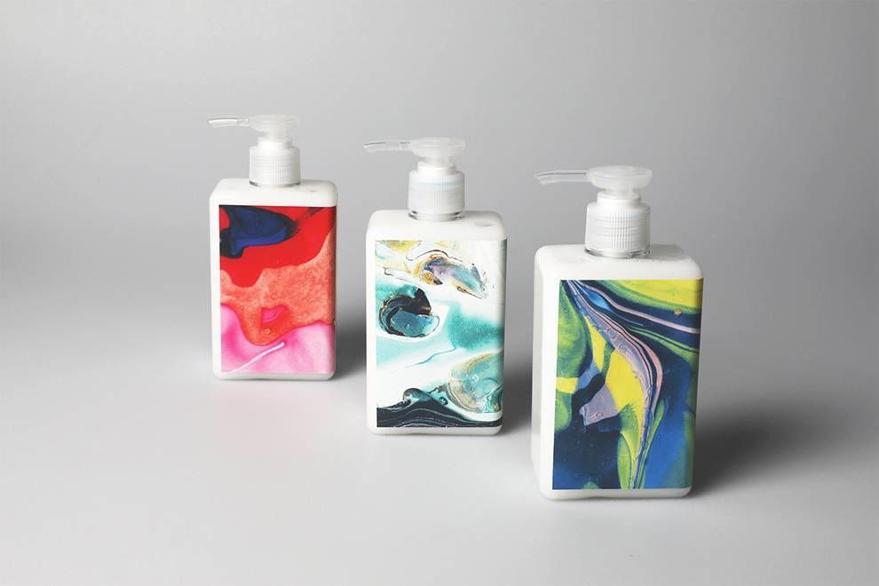
The front of the lotion dispensers features dazzling marble prints that swirl around the eyes like some sort of cornucopia of psychedelic euphoria. This marble swirling represents more than just eye candy.
The marble swirls represent the blend of ingredients individually plucked from the genius minds of Ozmetics before being thrown into the pot of a skin care miracle mixture.
The use of minimalism through white space radiates in the above canisters. The white space allows the colors to become robust and jump out of the packaging to hold your attention hostage.

This use of white space and bright colors also adds another relevant and thoughtful aspect to the design: Cleanliness.
A clean design allows a consumer to really soak in all aspects of a design and connect with a product -- the ultimate goal.
What's more? Skincare products facilitate the cleansing of one’s skin. So, it wouldn't make much sense to have a chaotic illustration.
(The swirls, by the way, are not chaotic. They blend together cohesively, like tye-dye.)
Ultimately, Ozmetics attracts positive consumer attention by using elements like white space, contrasting colors and flowing illustrations to create a package design that's one-of-a-kind.
Ozmetics is an artistic package design in the Fashion & Beauty industry.