MEW Provides the Best Premium Smartphone Accessories for People’s Everyday Needs
MEW is a unique brand that makes fancy accessories for smartphones. You can find them online and in over 200 Vivo stores in Brazil.
The name MEW comes from the Portuguese word "meu," which means "my," like "my cell phone."
The brand changed the letter U to W to make the name extra special and unique. People in Brazil often use this word when they talk, which helps them feel connected to the brand.
Design agency Zanon Studio developed a clever packaging design that lets customers see the smartphone accessories without having to take them out of the box packaging. This design move hits two birds with one stone: style and function. This is what every packaging design agency strives to achieve, and Zanon Studio did it successfully.
Check out some of the best modern packaging designs.

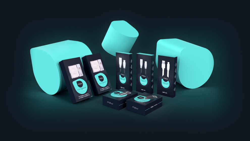
MEW’s Packaging Showcases the Items Perfectly Through a Clear Front Design
MEW's packaging design has a clear plastic front style that allows customers to take a peek at the contents inside effortlessly. This excellent feature lets you inspect the product, its color, and its design before buying.
The agency ensured excellent product quality by adding a protective transparent plastic film to avoid damage or tampering.
Additionally, this design makes the packaging more attractive and eye-catching since it allows buyers to focus more on the products and their features.

MEW’s Packaging Design Exudes a Dynamic Feel Through a Modern Color Story
The agency combined cyan, neon blue, white, and black to create a modern, stylish packaging design for MEW.
These colors deliver a striking look for the packaging. The cyan and neon blue colors add a pop of brightness and energy, making the packaging stand out on the shelves.
White conveys neatness and modernity, which helps emphasize the premium and high-tech feel of the brand.
Lastly, the black color adds a touch of elegance and sophistication, making the packaging look even more luxurious. Like some of these black packaging designs, it exudes luxury and refinement that doesn't overwhelm the viewers.
Combining these colors creates a perfect balance, making the packaging attractive and appealing to customers.

The MEW Packaging Design Exudes Premium Quality Despite Affordable Price Points
Despite its affordable products, MEW's packaging design looks like a premium brand. It elevates the brand further from the competition, targeting more audiences and being a true packaging design inspiration for other designers.
This is achieved through clean lines, minimalistic design, and an excellent color story. Particularly the black color that adds a high-end feel to the brand.
In addition to the color scheme and design, the image placement of the product on the packaging also plays a significant role in showcasing the product's quality.
While we see the actual product in front through the transparent plastic film, the agency added a product shot at the back of the packaging to ensure that viewers don't miss the product from any angle.
In a nutshell, MEW's packaging design deserves a spot in our Best Designs collection because of its excellent product presentation.


